Knorr Seasoning Mix Box
Topics
Details
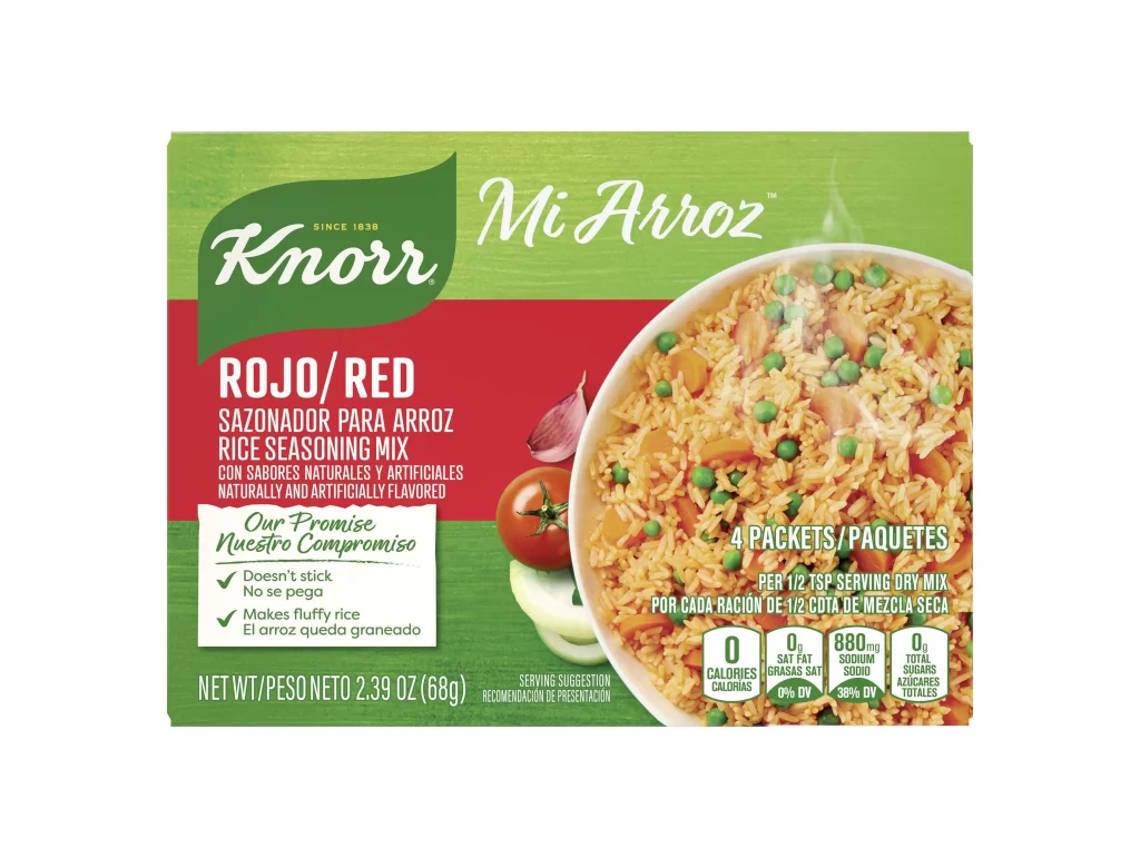
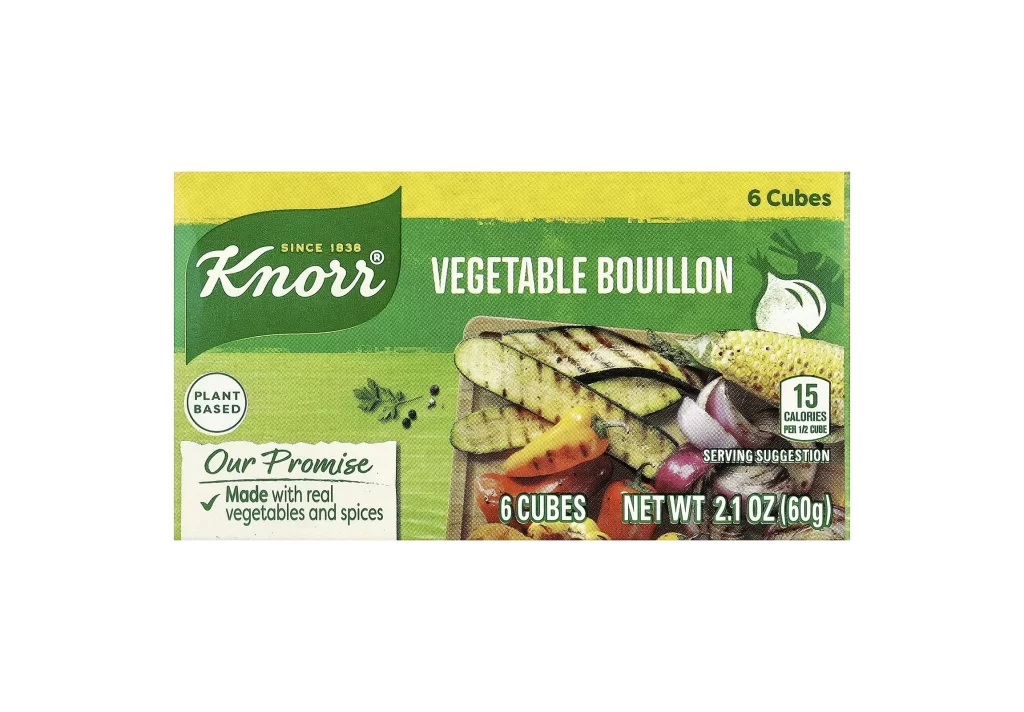
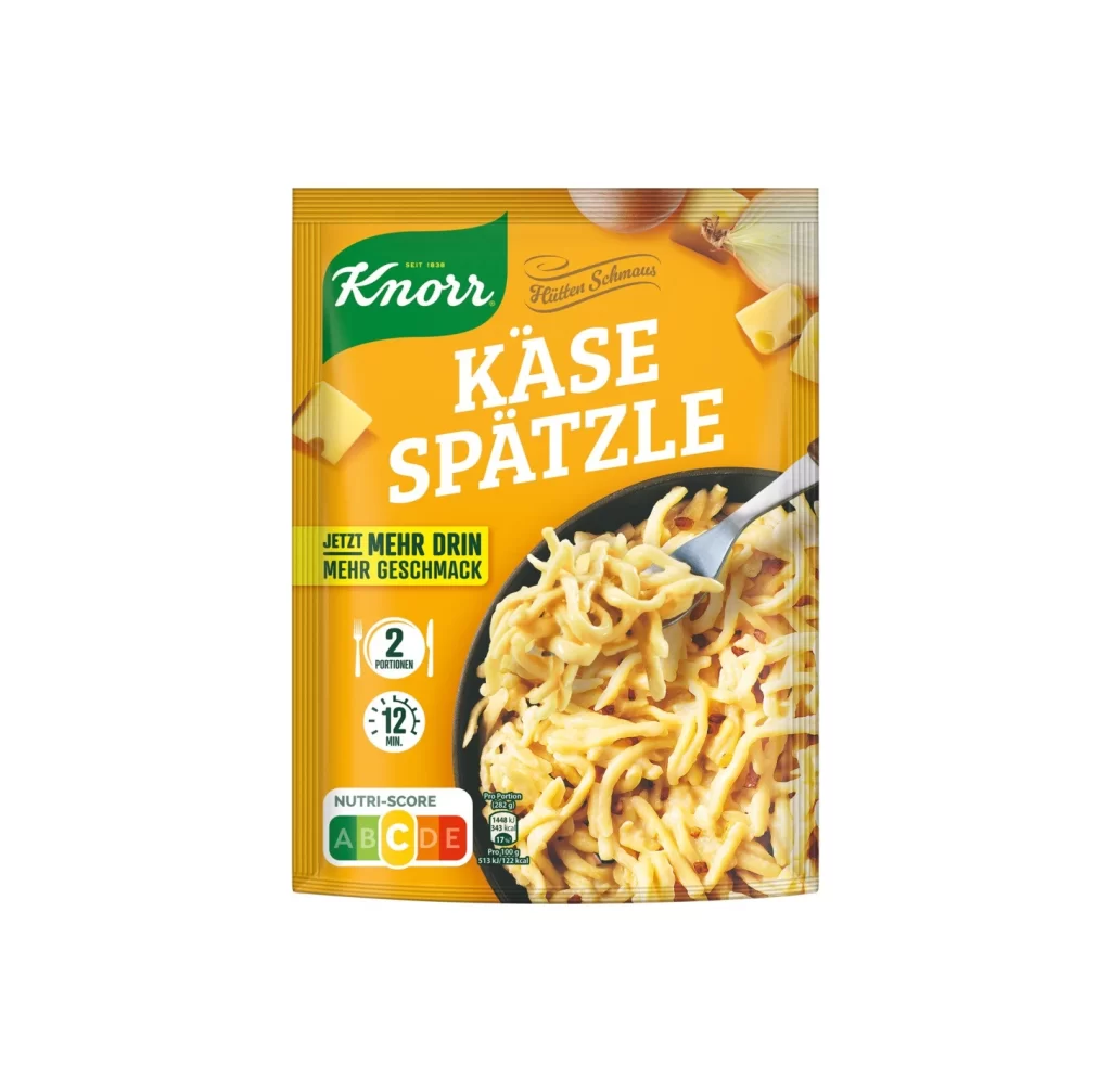
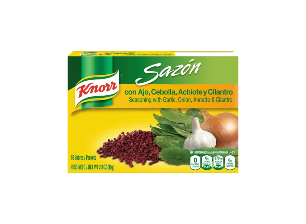
A vibrant yellow background dominates the packaging, transitioning into a deep green header where the Knorr logo sits in its signature red and white script. The product name 'Sazón' appears in a large, elegant white cursive font, positioned above an orange band that lists the ingredients: garlic, onion, annatto, and cilantro. Below this text, a realistic photographic arrangement displays a whole onion, a bulb of garlic, fresh green leaves, and a pile of dark red annatto seeds, all captured from a straight-on camera angle with even, studio-quality lighting that eliminates shadows.
Visual interest comes from the bold color blocking that separates the brand identity from the flavor profile, creating immediate visual hierarchy. The contrast between the artificial brightness of the packaging and the organic textures of the photographed ingredients draws the eye toward the center of the box. Nutritional information is neatly contained within small circular badges in the bottom right corner, maintaining the clean layout without cluttering the main imagery.
Food photographers might study this composition to understand how to arrange multiple ingredients without overcrowding the frame. Packaging designers could analyze the typography choices to see how script fonts balance against sans-serif ingredient lists for readability. Illustrators working on cookbook covers or recipe cards would find the color palette and spatial relationships useful for creating appetizing yet organized food presentations.