Knorr Chicken Flavor Bouillon Powder Can View
Topics
Details
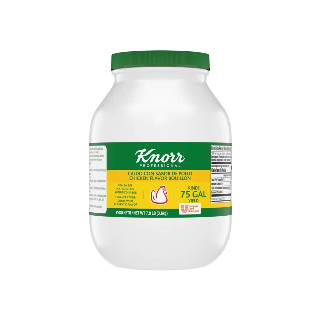
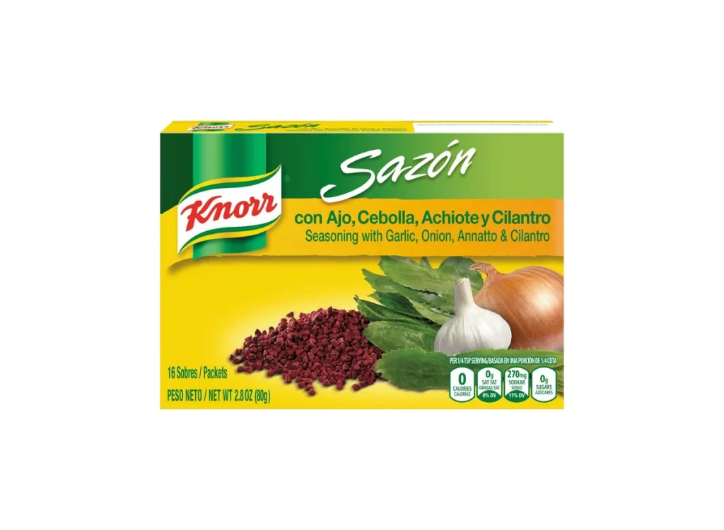
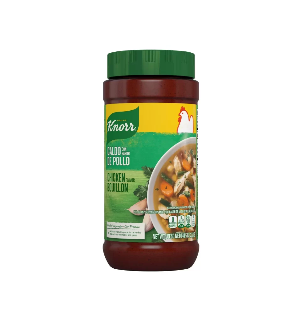
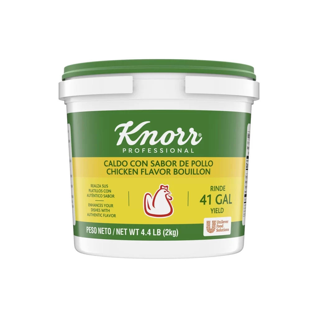
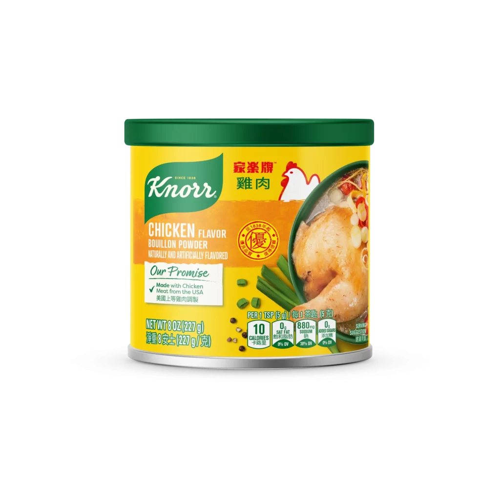
Centered within a seamless white void, a cylindrical metal canister presents itself with a bright yellow body and a dark green plastic lid. The front label features the Knorr logo in white script against a green shield, positioned above bold orange text reading 'CHICKEN FLAVOR BOUILLON POWDER.' To the right, a photographic inset displays a roasted chicken leg alongside green onions, while nutritional data and bilingual weight measurements occupy the lower portion of the composition.
Visual distinction arises from the strategic layering of typographic hierarchies and the high-contrast color palette of primary yellow and forest green. The inclusion of both English and Chinese characters, alongside a circular red seal containing traditional script, signals specific regional market targeting that differs from standard Western packaging. Photographic realism on the curved surface creates depth, while the 'Our Promise' badge adds a secondary focal point that breaks up the horizontal text flow.
Product photographers might study this specimen to understand how reflective metallic surfaces interact with saturated label graphics under studio lighting conditions. Packaging engineers could examine the spatial arrangement of mandatory nutritional information versus marketing imagery to optimize their own container designs. Brand strategists analyzing cross-market adaptations would find the dual-language layout particularly useful for comparing localization approaches in consumer goods.