Knorr Chicken Concentrated Stock Bottle
Topics
Details
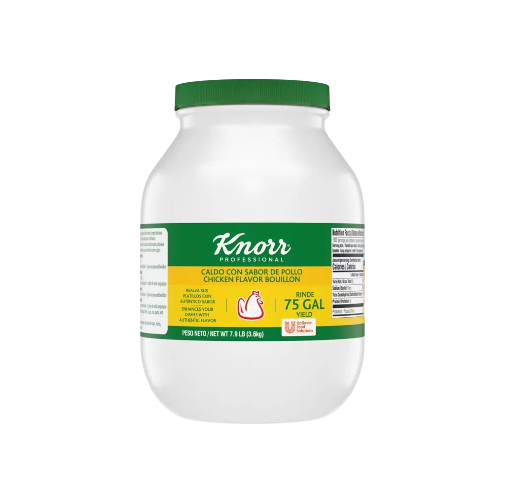
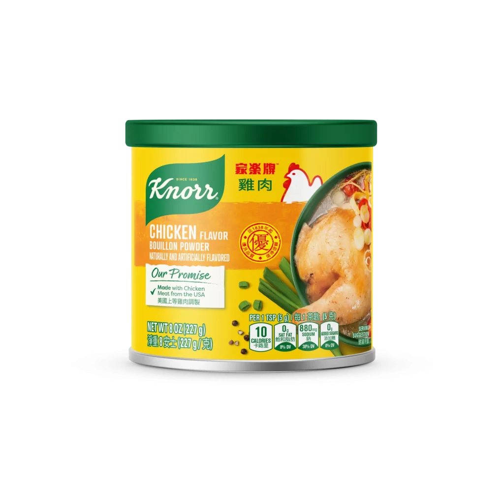
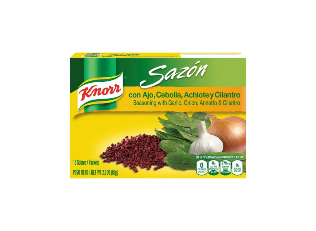
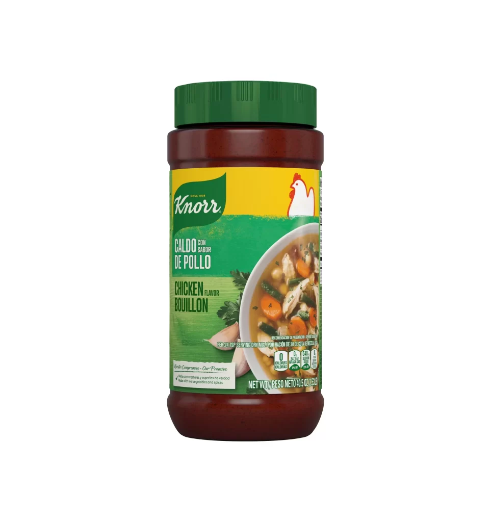
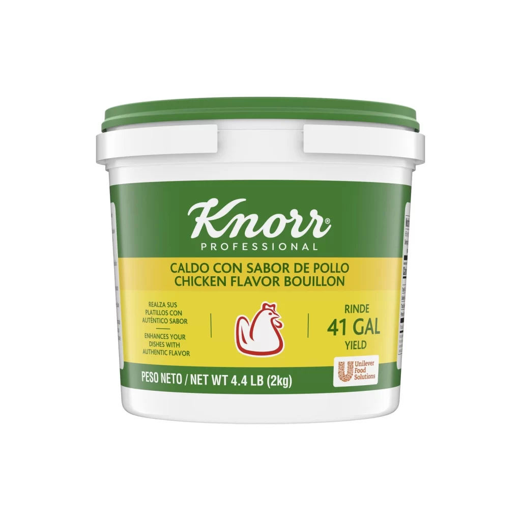
Centered within a seamless white void, a dark amber plastic bottle stands upright, capped by a cylindrical forest-green screw top. The label wraps the midsection with a distinct tripartite composition: a deep green upper band bearing the white cursive 'Knorr' logotype and 'SINCE 1838' microtext, a vibrant golden-yellow central field displaying 'CHICKEN CONCENTRATED STOCK' in bold sans-serif capitals, and a lower green zone featuring a circular photographic inset of chicken soup with visible carrot slices, celery, and parsley. Soft studio lighting creates subtle specular highlights along the bottle's curved shoulders while maintaining even illumination across the matte label surface.
Visual hierarchy operates through disciplined color blocking, where the saturated yellow band functions as an optical anchor between the darker green zones. The typographic contrast between the organic script logo and utilitarian product descriptor establishes brand personality while ensuring legibility at retail distances. Photographic realism in the food inset provides tactile appetite appeal that balances the abstract geometric purity of the packaging architecture, creating a tension between industrial design and culinary warmth.
Packaging designers analyzing condiment category conventions would examine this specimen for color-coding strategies across stock varieties. Brand identity specialists might reference the logo integration techniques when developing premium food product systems. Culinary photographers could study the lighting ratios on the soup inset to understand how liquid translucency is rendered against opaque container materials.