Knorr Minestrone Soup Pouch View
Topics
Details
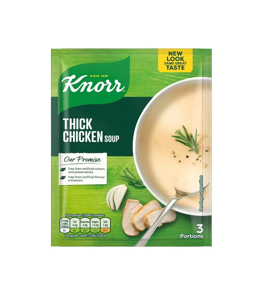
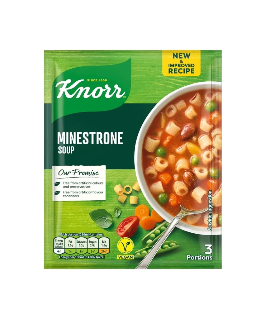
Vibrant green packaging dominates the frame, featuring the Knorr logo in white script against a darker green leaf-shaped background. A circular window on the right side reveals a steaming bowl of minestrone soup filled with pasta, beans, and colorful vegetables, while fresh ingredients like tomatoes, peas, and basil leaves scatter across the lower portion. Bold white text announces 'MINESTRONE SOUP' beneath the brand name, accompanied by a yellow 'NEW & IMPROVED RECIPE' badge and nutritional information displayed in small boxes at the bottom.
Visual hierarchy plays a crucial role here, with the bright yellow ‘NEW & IMPROVED RECIPE’ badge immediately drawing the eye to the upper right quadrant. The packaging cleverly balances informational density through color-coded nutritional boxes and the ‘Our Promise’ text block, while fresh ingredient illustrations—tomatoes, basil leaves, and carrots—scatter across the lower portion to reinforce the natural, vegan-friendly positioning. This particular iteration stands out due to its confident use of deep forest greens contrasted against the warm, appetizing photography of the prepared dish.
Packaging designers studying FMCG branding would find this example particularly useful for analyzing how established food brands communicate recipe updates without alienating existing customers. Marketing teams could examine the placement of dietary certifications like the Vegan logo and the specific typography choices used for nutritional data presentation. Anyone working on soup or ready-meal packaging concepts might reference the way fresh produce imagery is integrated alongside the cooked product shot to suggest both convenience and quality ingredients.