Knorr Chicken Stock Pot Box
DownloadTopics
Details
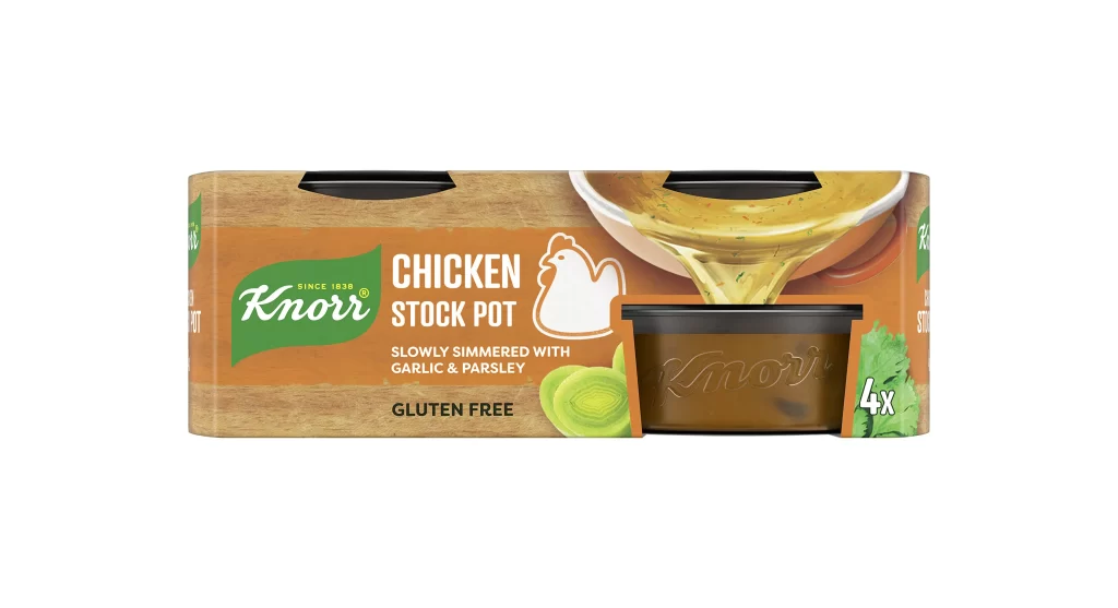
Warm orange and wood-grain textures dominate the rectangular packaging, which features a prominent green Knorr logo in the upper left quadrant. Bold white sans-serif text announces 'CHICKEN STOCK POT' beside a minimalist white chicken silhouette, while smaller gold lettering below details the garlic and parsley flavoring. A photographic cutout on the right side reveals a dark brown plastic pot embossed with the brand name, partially obscured by a ladle pouring golden liquid, all set against a clean white studio background with even frontal lighting.
Visual hierarchy is established through the strategic layering of photographic realism against flat graphic elements, creating a sense of depth within a two-dimensional retail format. The contrast between the organic wood texture and the smooth plastic window draws immediate attention to the product itself, while the '4x' badge and gluten-free claim provide essential dietary information without cluttering the primary branding area. Designers studying packaging composition will appreciate how the pouring action implies viscosity and freshness through dynamic motion frozen in time.
Food photographers and packaging analysts often utilize such clear product shots to study lighting techniques and color accuracy across different material surfaces. Marketing teams might reference this layout when developing similar stock or broth containers, noting how the flavor ingredients are subtly represented through iconography rather than overwhelming photography. The complete high-resolution asset can be accessed at no cost for those requiring detailed texture work or typographic analysis of the Knorr brand identity.