Knorr Chicken Bouillon Cube Box
Topics
Details
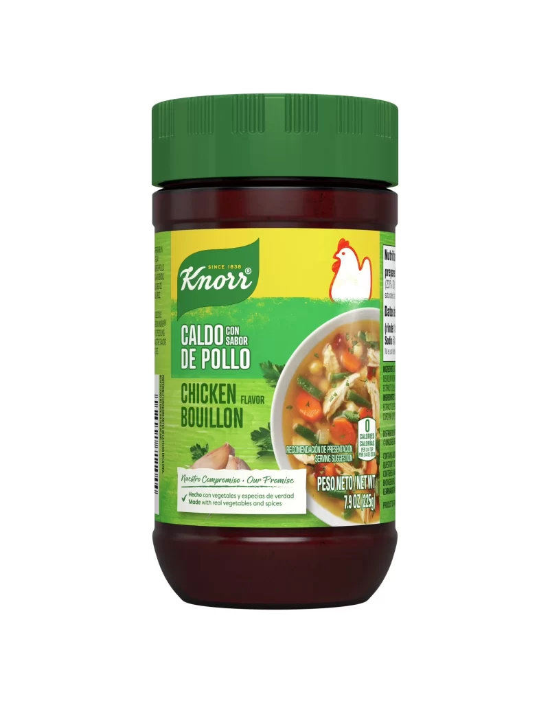
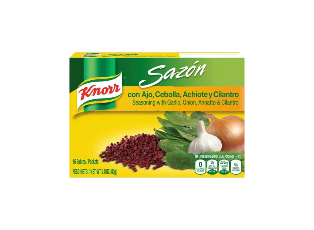
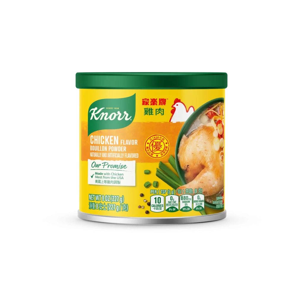
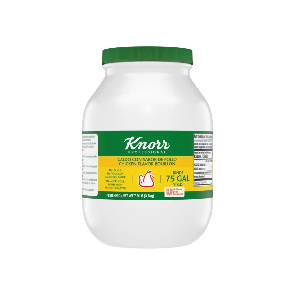
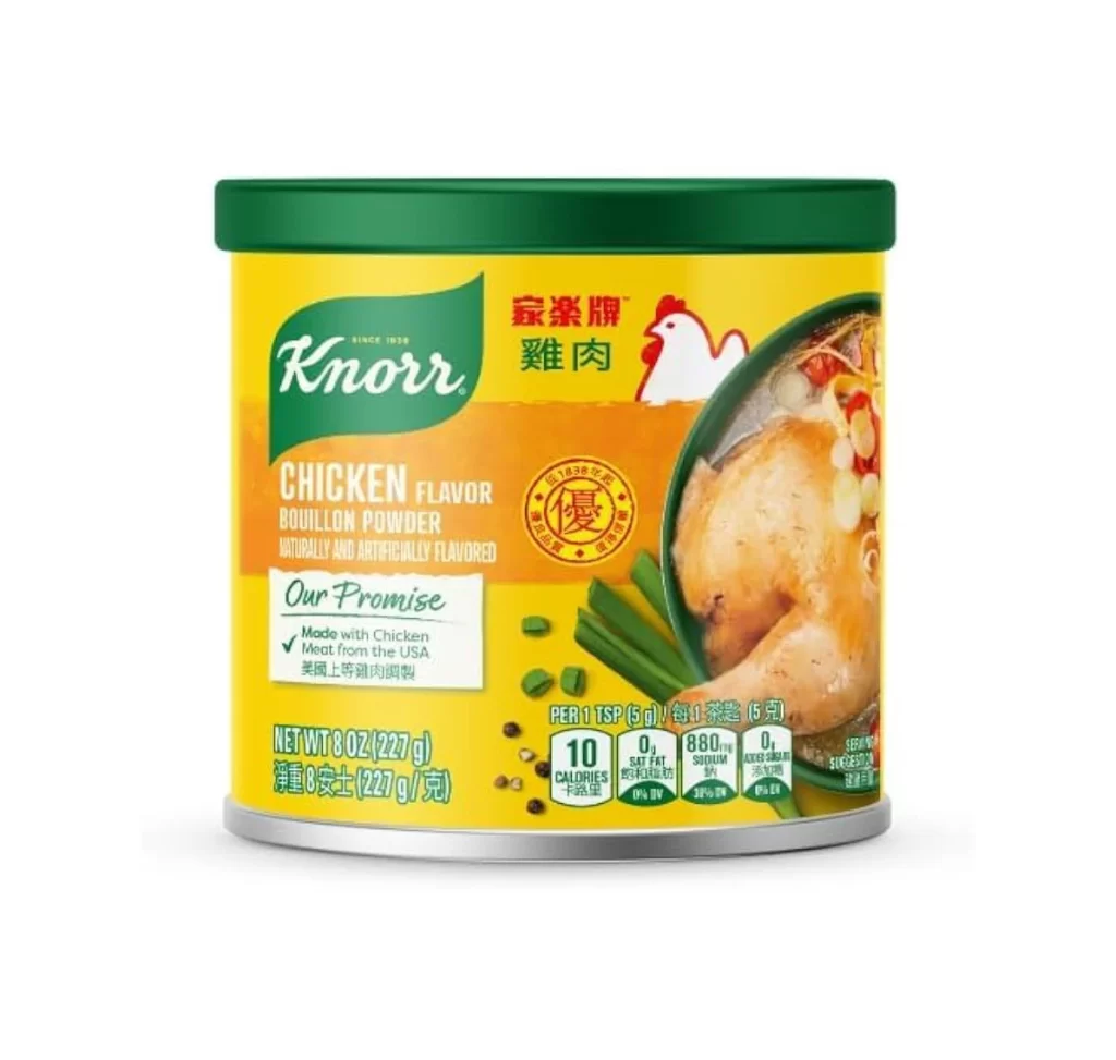
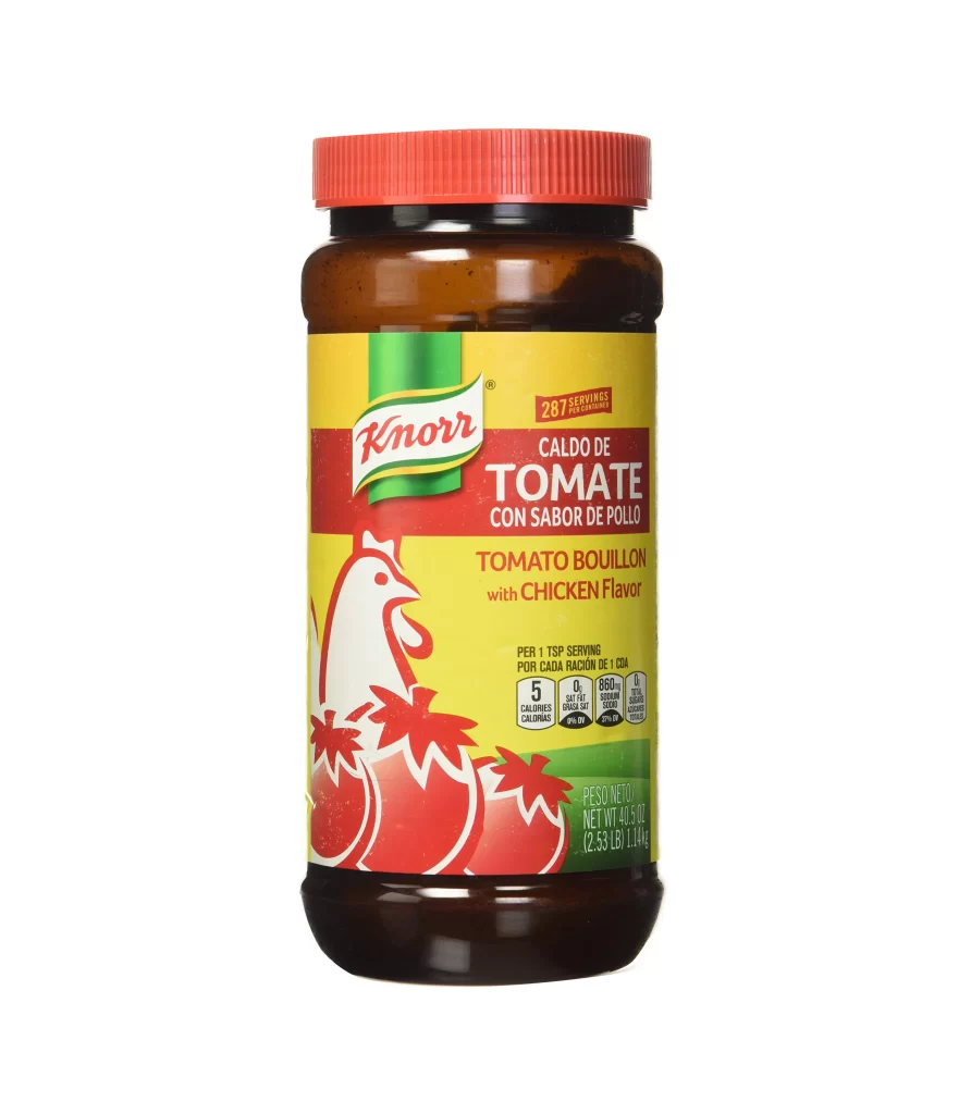
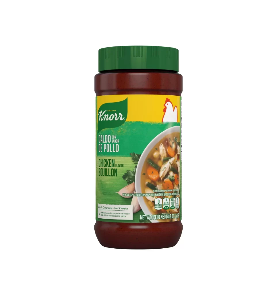
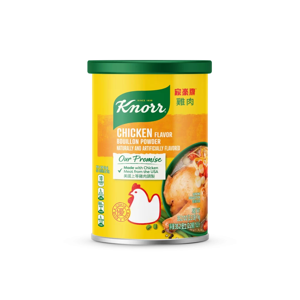
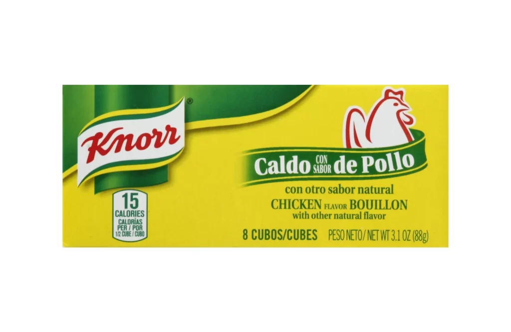
A rectangular package displays a vibrant yellow field that serves as the primary background, accented by a deep green curved band sweeping across the upper left quadrant. The Knorr logo appears in red cursive script within a white banner outlined in green, positioned left of center, while a stylized white chicken head with red outlines sits inside a green ribbon on the right side. Black and green text identifies the product as Caldo de Pollo and Chicken Flavor Bouillon, with nutritional information showing 15 calories per cube in a small white box near the bottom left corner.
Visual hierarchy relies on the bold color blocking between the green and yellow fields, guiding the eye from the brand mark to the flavor indicator. The ribbon-like green band holding the product name creates a sense of traditional labeling, while the rooster icon provides immediate species recognition without relying solely on text. Caloric information is tucked into a clean white badge near the logo, balancing nutritional data with marketing elements.
Packaging designers studying food branding might examine how bilingual text is integrated without cluttering the layout. Illustrators looking to render consumer goods could use this as a study in reflective surfaces on foil boxes and the specific typography of international food products. Researchers analyzing color psychology in grocery retail would find the yellow-green combination a clear example of appetite-stimulating palette choices.