Knorr Chicken Flavor Bouillon Powder Can
DownloadTopics
Details
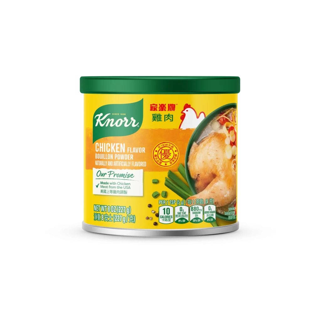
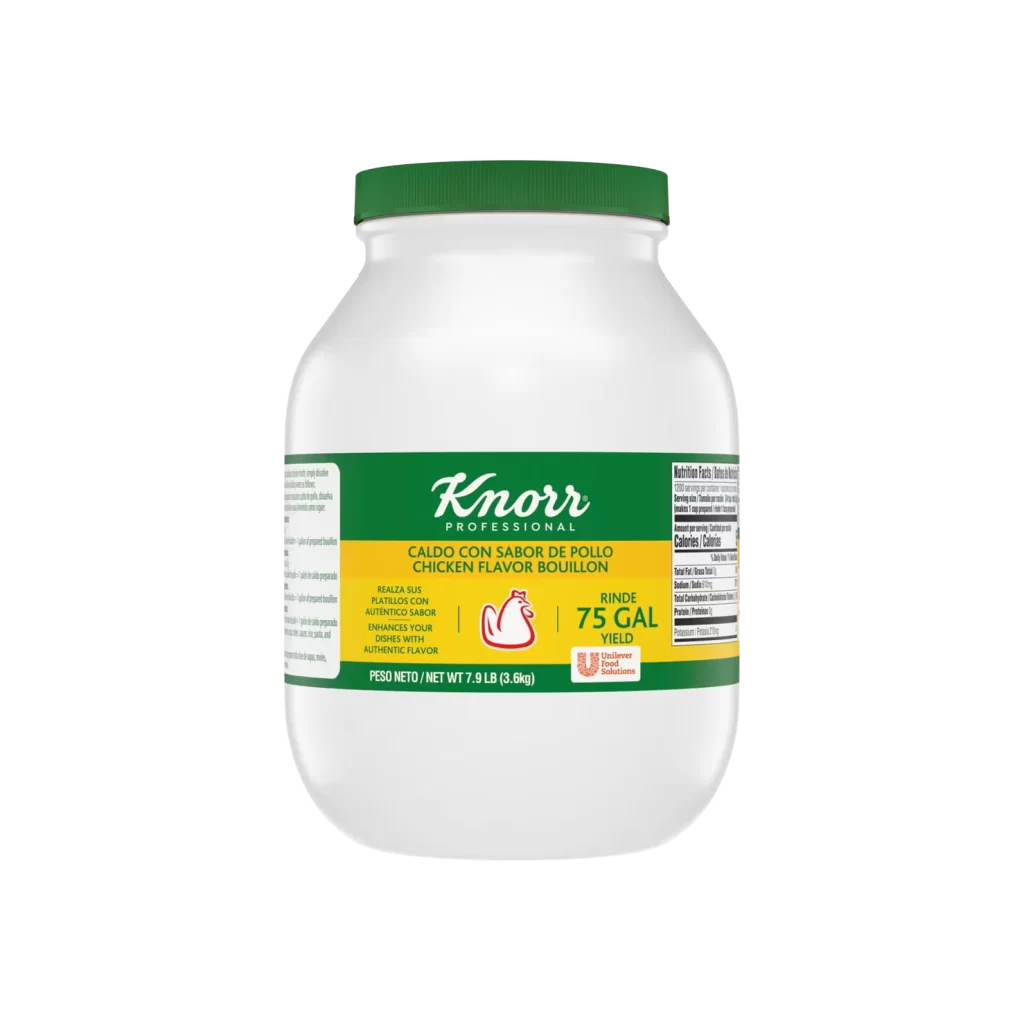
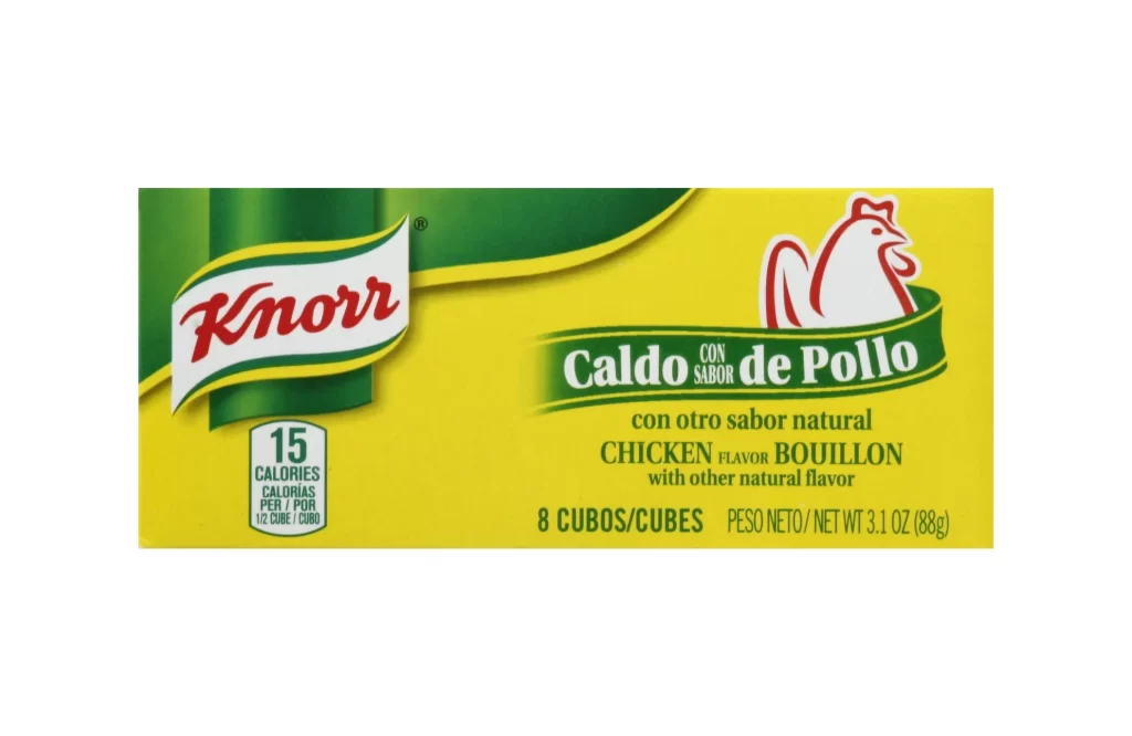
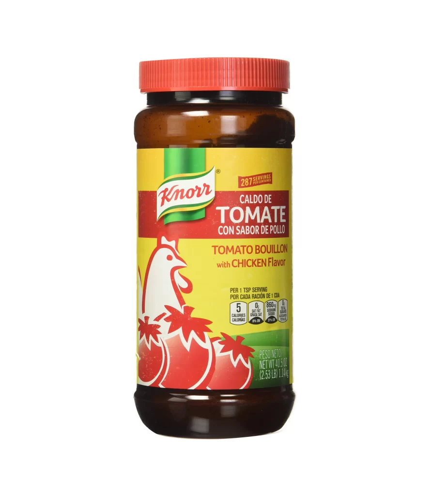
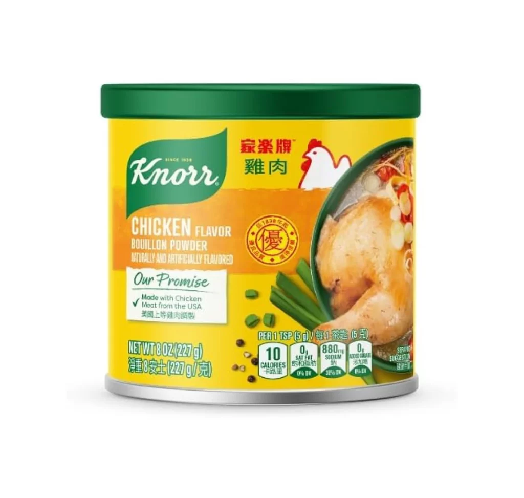
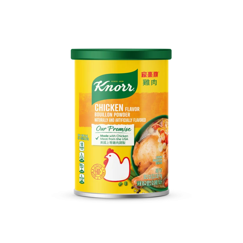
Bright yellow dominates the cylindrical container, capped with a solid green lid that creates a bold color contrast. The central composition features the iconic green Knorr leaf logo positioned above the product name, while a vibrant orange band stretches across the middle to highlight the 'Chicken Flavor' text in white. To the right, a realistic photograph of roasted chicken and vegetables peeks through a circular frame, balanced on the left by a simplified red-and-white chicken icon and vertical nutritional information bars.
Visual hierarchy is established through the strategic layering of bilingual typography, combining English branding with Chinese characters that indicate this is a market-specific variant. The packaging cleverly merges photographic food imagery with flat graphic elements, creating a dynamic tension between appetite appeal and clean label design. Designers studying international packaging will appreciate how the color blocking guides the eye from the brand mark down to the promise of American-sourced chicken meat.
Product photographers and packaging students can analyze the even studio lighting that eliminates harsh shadows while maintaining the metallic sheen of the can's base. 3D artists requiring accurate texture maps for grocery store scenes will find the specific font weights and spacing particularly useful for modeling authentic shelf displays. Anyone needing crisp details of the nutritional icons or the exact Pantone-like yellows used in the labeling can access the full-resolution file without cost directly from the resource library.