Sandro Desii Pesto Sauce Jar
Topics
Details
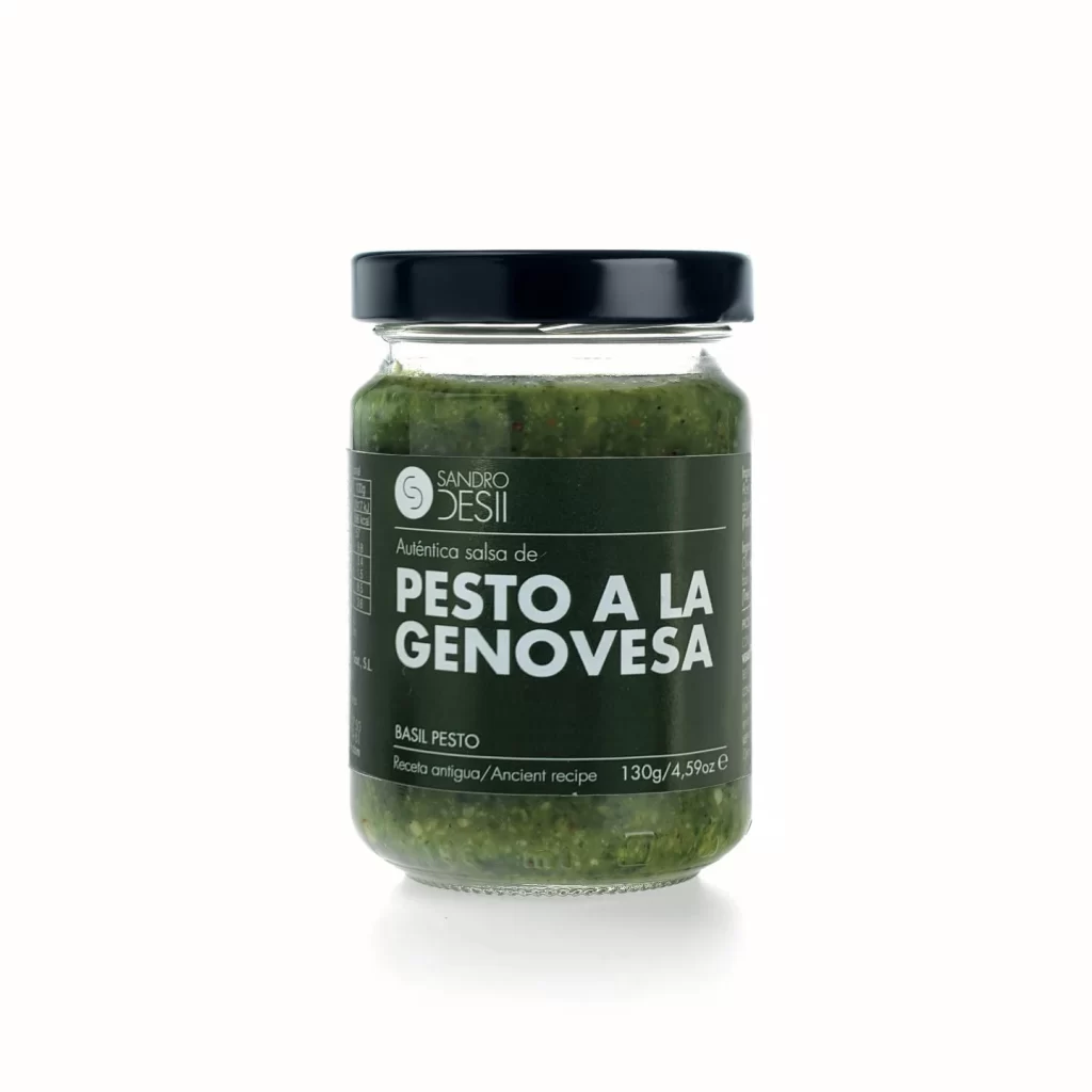
Centered within a void of pure white, the glass vessel reveals its chunky emerald contents through transparent walls. A matte black metal lid caps the cylindrical form, while the label employs a deep forest-green ground with crisp white typography announcing 'Sandro Desii' and the bold declaration of 'PESTO A LA GENOVESA'. Subordinate text indicates an ancient recipe and 130g net weight, all captured from a straight-on eye-level perspective under diffuse studio lighting that eliminates harsh shadows.
Visual hierarchy operates through stark tonal contrast between the dark label field and pale lettering, ensuring legibility despite the organic texture visible through the glass. The decision to allow the coarse herb mixture to remain fully exposed rather than obscured by opaque packaging emphasizes product authenticity and freshness. Such transparency creates immediate material honesty, distinguishing this presentation from heavily branded or illustrated alternatives that might obscure the actual food substance.
Packaging designers studying condiment market positioning will find value in how minimal color palettes communicate premium quality without ornate graphics. Photographers requiring benchmarks for food-product lighting can analyze the even illumination across curved glass surfaces and the absence of distracting reflections. Art directors developing Italian culinary branding might reference this specific typographic weight distribution and spatial arrangement for their own label systems.