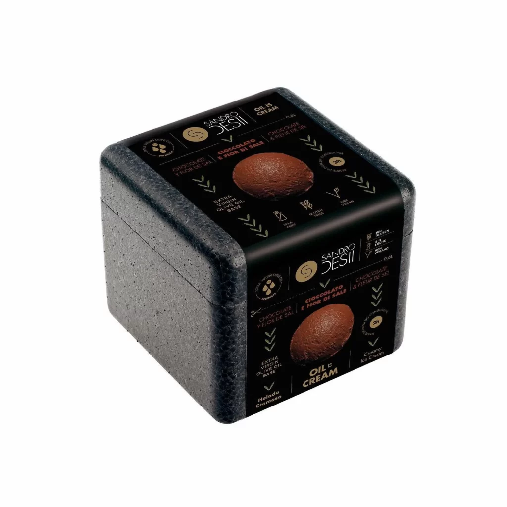
Sandro Desii Oil & Cream Box
Topics
Details
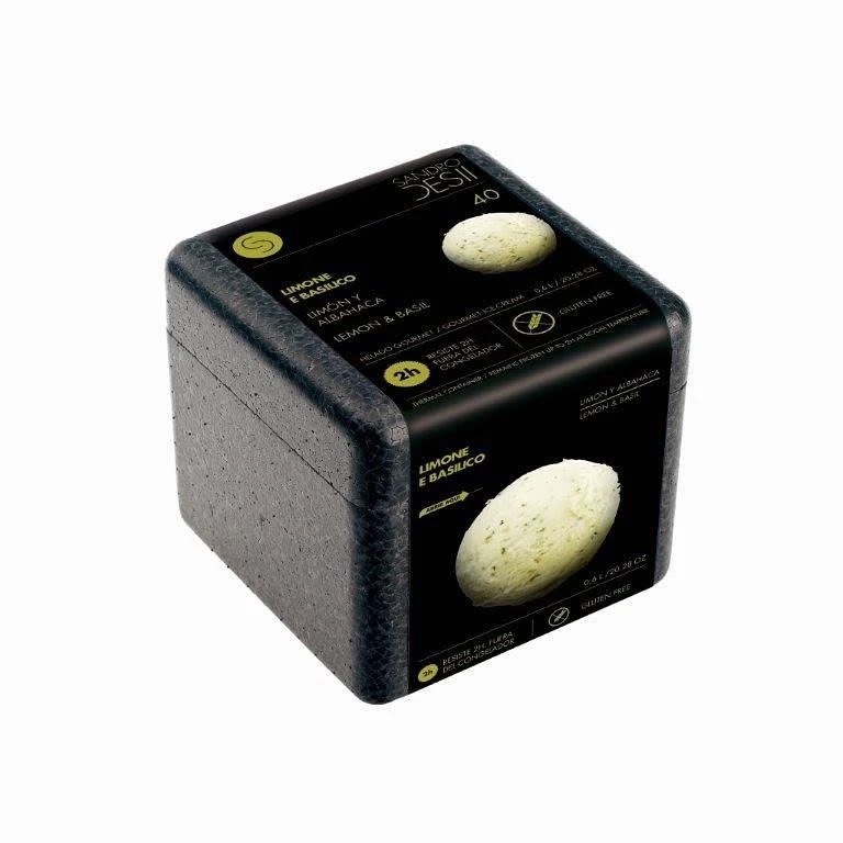
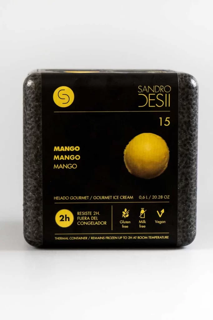
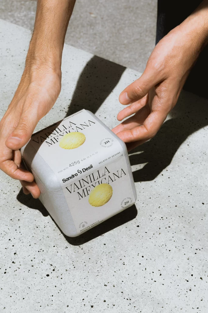
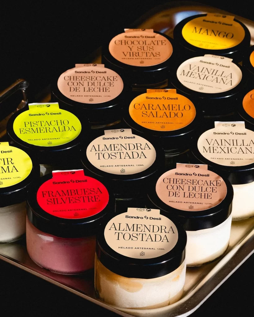
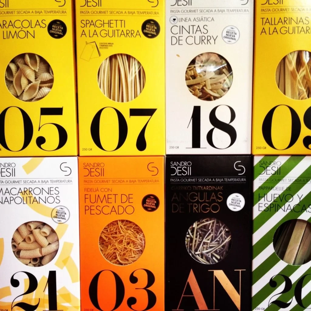
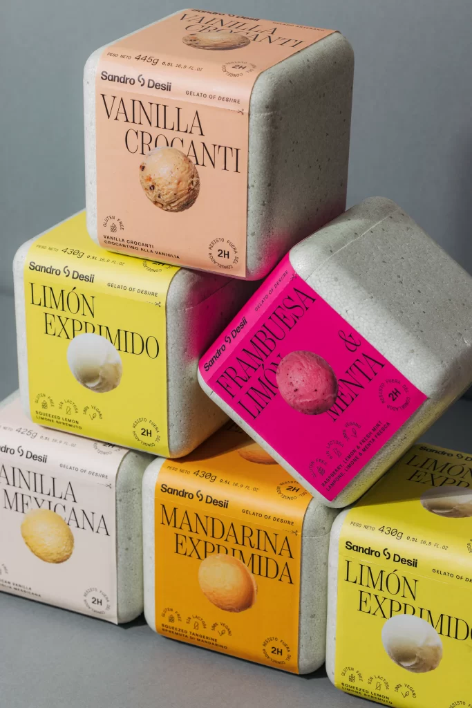
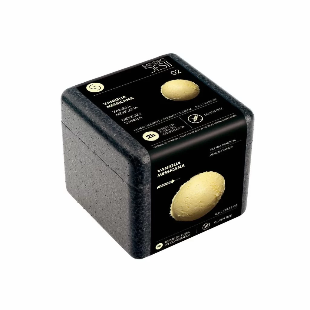
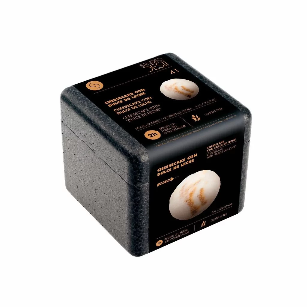
Captured from a three-quarter perspective, this cubic container features a dark, speckled exterior that resembles compressed foam or textured stone. A glossy black label wraps around the front and top surfaces, displaying the brand name 'Sandro Desii' in a clean white font alongside a circular gold logo. The central visual element is a realistic photograph of a chocolate gelato scoop, surrounded by Italian text reading 'Cioccolato e Fior di Sale' and various icons indicating product attributes like vegan and gluten-free status.
What sets this packaging apart is its unconventional material choice for frozen desserts, moving away from traditional cardboard tubs toward something that feels more premium and insulated. The contrast between the matte, rough-hewn body of the box and the sleek, high-shine label creates an interesting tactile interplay that suggests both durability and luxury. Typography is arranged in a dynamic, slightly angled layout that guides the eye toward the appetizing center image while maintaining clear hierarchy among the nutritional claims.
Product photographers studying food packaging will find the lighting setup particularly useful for understanding how to make reflective labels pop without losing detail in darker materials. Brand designers working on artisanal or organic product lines could analyze how earthy color palettes combine with modern sans-serif typefaces to convey sophistication. Anyone developing e-commerce visuals for temperature-sensitive goods might study how the physical form suggests protection and quality before the customer even opens the package.