Sandra S Desil Chocolate Colonial Jar
Topics
Details
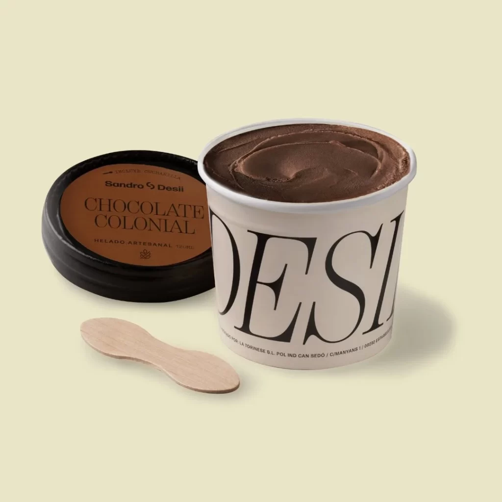
Against a pale buttercream backdrop, a cylindrical paper tub of chocolate ice cream sits slightly right of center, its white rim contrasting with the dark, swirled dessert inside. To the left rests the black plastic lid, revealing an orange-brown label that reads 'Sandro S Desi' above 'CHOCOLATE COLONIAL' in elegant serif typography. A light wooden spoon lies casually in the foreground, completing this minimalist arrangement shot from a straight-on eye-level perspective with soft, even studio lighting.
What stands out here is the bold typographic treatment on the container itself, where 'DESI' appears in massive black serif letters wrapping around the off-white paper body, creating immediate visual impact. The color palette feels deliberately restrained—warm chocolate browns against creamy neutrals and stark black—while the mix of materials (matte paper, glossy lid, natural wood) adds tactile depth to the overall composition.
Food photographers studying product styling might study how the spoon placement creates implied movement without cluttering the frame. Brand designers working on artisanal packaging could reference the hierarchy between the lid's detailed information and the container's oversized branding. Anyone crafting mood boards for gourmet ice cream concepts would find value in how the lighting emphasizes texture while maintaining a clean, appetizing aesthetic.