Sandro S Desi Chocolate Stick Tube
Topics
Details
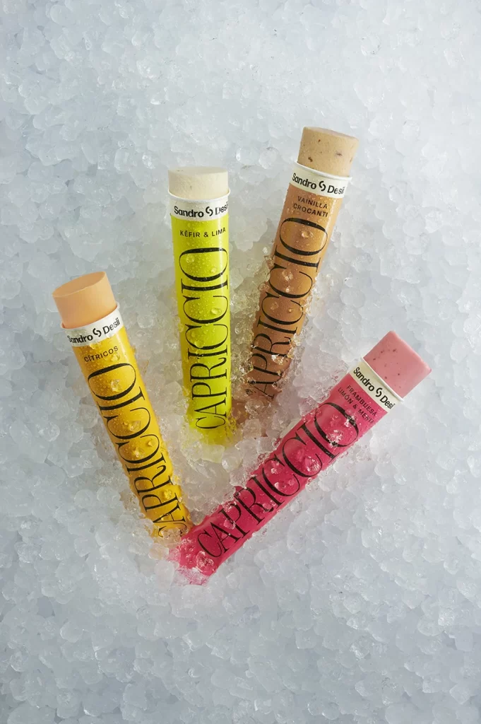
Four cylindrical frozen treats rest diagonally across a bed of crushed ice, each encased in a brightly colored tube. The packaging features bold, vertical black typography spelling 'CAPRICCIO' against backgrounds of mustard yellow, neon lime, toasted brown, and vivid pink. White bands near the top display the brand name 'Sandro S Desi' alongside flavor descriptions such as 'Citricos,' 'Kefir & Lima,' 'Vanilla Crocanti,' and 'Frambuesa, Fresa & Yuzu.' Soft overhead lighting illuminates the crystalline texture of the ice and the matte finish of the paper tubes.
Visual distinction emerges from the deliberate contrast between the organic, irregular ice crystals and the precise geometric forms of the product containers. Each tube's hue corresponds directly to its interior contents, creating an intuitive color-coded system that bridges packaging design with culinary expectation. The typographic hierarchy balances the dominant vertical brand mark with smaller horizontal text elements, establishing a clear visual rhythm across the composition.
Food photographers might study this arrangement to understand how translucent backgrounds enhance product visibility while suggesting temperature and freshness. Branding professionals could analyze the color psychology employed to differentiate flavors within a unified product line. Packaging designers may reference the spatial relationship between the cylindrical forms and their supporting surface to inform similar cold-product presentations.