Grape Soda Can Japanese DyDo Beverage packaging
DownloadTopics
Details
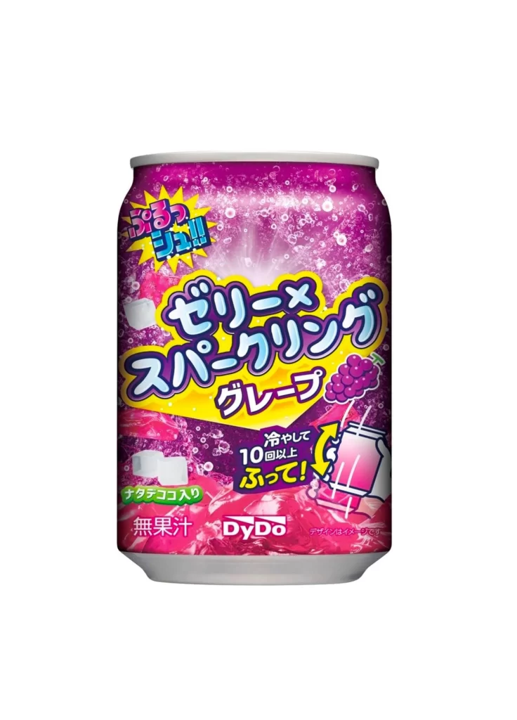
A cylindrical aluminum beverage can stands upright, its surface dominated by a vibrant magenta and purple gradient that simulates carbonated bubbles. Bold, rounded Japanese characters for "Jelly-Bean Sparkling Grape" occupy the central band in yellow and blue outlines, flanked by a yellow starburst graphic containing the onomatopoeia for fizzing. The composition includes a small grape cluster illustration near the bottom right, green text indicating zero sugar content, and the red DyDo brand logo anchoring the lower section against the effervescent background pattern.
Visual energy radiates from the saturated color palette and dynamic typography that mimics the sensation of popping candy or bursting fruit flavors. The packaging cleverly combines realistic bubble textures with playful graphic elements like the shaking-hand icon, creating an immediate tactile association with refreshment. Designers studying Japanese convenience store aesthetics will appreciate how the high-contrast lettering maintains legibility despite the busy, sparkling backdrop, and the complete asset pack includes this shot at full resolution for detailed texture analysis.
Product photographers and 3D texture artists often seek out such clean, frontal views to study metallic sheen interactions with printed graphics under even studio lighting. Brand strategists analyzing Asian market trends could compare the typographic hierarchy here against Western soda packaging conventions to understand regional flavor-coding systems. Illustrators working on food-related concepts might trace the bubble patterns or color transitions to inform their own refreshing beverage artwork.