Mi Campo Tequila Duo
Topics
Details
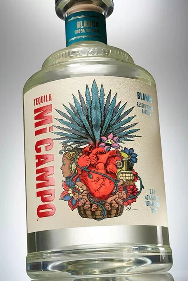
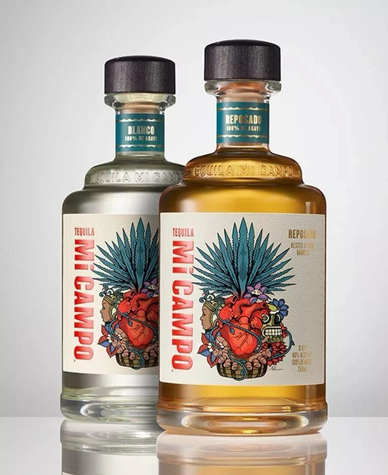
Two bottles of Mi Campo tequila stand side-by-side against a neutral gray background, featuring a clear Blanco variant on the left and an amber Reposado on the right. Both feature dark wooden caps, embossed glass shoulders reading 'TEQUILA MI CAMPO', and neck labels indicating '100% AGAVE' in teal text. The main labels display the brand name in bold red vertical typography alongside intricate folk-art illustrations.
Label design employs a cream-colored background that makes the vibrant red sans-serif lettering pop, while detailed illustrations depict anatomical hearts, agave plants, and traditional Mexican motifs in a tattoo-inspired style. The composition balances modern minimalism with cultural storytelling through its centered layout and carefully chosen color palette of crimson, turquoise, and gold. Photography utilizes soft studio lighting to highlight the liquid's clarity and the tactile quality of the packaging materials.
Packaging designers frequently reference this image when developing spirits branding that requires authentic cultural elements without resorting to clichés. Brand identity professionals study the integration of illustration with typography to achieve visual hierarchy on curved surfaces. Label design specialists examine how the artwork scales between the two variants while maintaining consistent brand recognition across product lines.