Freiheit 1848 Single Malt
Topics
Details
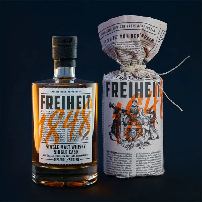
Bold yellow accents highlight the year '1848' on the label of the Freiheit 1848 Single Malt Whisky bottle, which is displayed alongside its cylindrical packaging wrapped in newspaper-style material. The amber liquid is visible through the clear glass, and German text appears on both the bottle and the packaging, which is tied at the top with white string.
Design elements combine vintage newspaper aesthetics with modern minimalist labeling. The layout utilizes a monochromatic base of black text on white paper, accented by vibrant orange for the historical date. Illustrations depicting 19th-century figures adorn the packaging, while the bottle label employs a clean grid structure with sans-serif fonts for the brand name and product details.
Packaging designers reference this image when developing heritage-themed alcohol branding or studying single cask whisky presentation. Brand identity professionals examine the integration of historical narrative into contemporary packaging systems. Label design students analyze the typographic hierarchy between the bold ‘FREIHEIT’ lettering and the flowing orange numerals.