Amstel Beer Bottle Label Design
DownloadTopics
Details
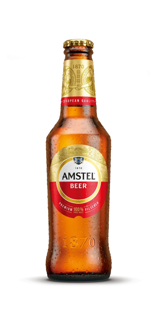
A chilled brown glass bottle of Amstel Beer stands upright, its surface beaded with condensation droplets that catch the light. The main label features a circular design with a gold upper arc containing architectural line art and a crest above the bold black 'AMSTEL' wordmark on white, while 'BEER' appears in white against a red lower semicircle. A gold neck label displays the year 1870 between ornate emblems, separated from the main body by a red band reading '-EUROPEAN QUALITY-', and the embossed founding date repeats near the bottle's base.
The label's color-blocking strategy creates strong visual hierarchy through the contrast of metallic gold, deep crimson, and crisp white fields. Typography varies deliberately across zones—serif numerals for heritage dates, heavy sans-serif for the brand name, and smaller caps for quality claims—establishing a clear information architecture that balances tradition with modern legibility. Designers studying this composition can note how the circular motif echoes the bottle's cylindrical form while the condensation texture adds organic realism to the product photography. Anyone needing precise color values or typographic specifications can grab the full-resolution file at no cost from our asset library.
Packaging designers analyzing European lager branding conventions will find this specimen useful for comparing label proportions and material finishes across market segments. 3D artists constructing beverage scenes can reference the specific condensation patterns and glass refraction qualities visible on the curved surface. Brand historians documenting Heineken-owned legacy labels might also consult this image when tracing visual identity evolution since the nineteenth century.