Hawkers Beer Can Pilsner
DownloadTopics
Details
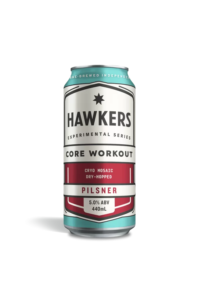
A cylindrical aluminum beverage can stands upright, displaying a layered label system that combines silver metallic surfaces with teal, white, and deep crimson graphic fields. The typography features bold black sans-serif lettering for the brand name HAWKERS positioned above EXPERIMENTAL SERIES in smaller capitals, while CORE WORKOUT and PILSNER occupy distinct horizontal bands separated by thin rule lines. Soft directional lighting from the upper left creates a subtle gradient across the curved metal surface and casts a faint shadow toward the lower right against an unadorned light backdrop.
Shield-like geometric framing and a centered eight-pointed star establish a structured visual hierarchy that balances industrial utility with craft-beer aesthetics. The strategic deployment of the red band for technical brewing details—CRYO MOSAIC DRY-HOPPED—creates focal contrast against the cooler surrounding tones while maintaining legible information architecture. Designers studying packaging systems will appreciate how this composition manages multiple text weights within confined vertical space, and the complete high-fidelity asset can be obtained without cost from the resource library.
Brand identity developers examining contemporary beverage labeling trends would find value in analyzing the color-blocking strategy and typographic scale relationships presented here. Packaging engineers requiring documentation of standard 440mL can proportions and label application zones could utilize these visual specifications for production planning. Illustrators seeking accurate material references for metallic surface rendering or print designers researching experimental series badge layouts would both benefit from incorporating this specific artifact into their working collections.