Asahi Super Dry Zero Sugar Beer Dry Crystal 35 Alcohol
DownloadTopics
Details
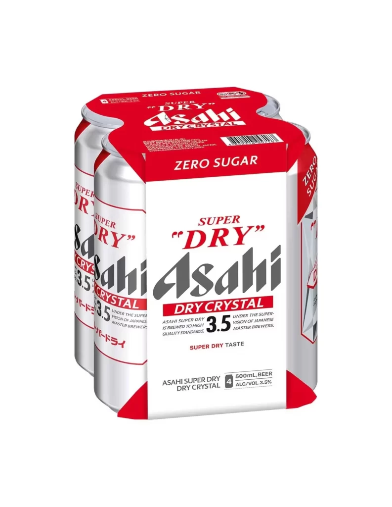
Four silver aluminum cans of Asahi Super Dry Crystal 3.5 beer are bound together by a red and white cardboard carrier, photographed from a three-quarter frontal angle that reveals the left side of the pack. The dominant visual elements include the bold black 'Asahi' logotype, the red 'SUPER DRY' and 'DRY CRYSTAL' branding, and a prominent red banner at the top declaring 'ZERO SUGAR'. Each can displays 500mL volume and 3.5% alcohol content specifications alongside Japanese characters, while the packaging features a clean white field with sharp red geometric accents and a barcode positioned on the upper right shoulder of the carrier.
The design leverages a high-contrast palette of crimson, jet black, and metallic silver to create immediate shelf presence, with the oversized 'Asahi' wordmark serving as the primary visual anchor against the white label area. What distinguishes this particular SKU is the aggressive typographic hierarchy that emphasizes the zero-sugar proposition through repeated red banners across both the carrier wrap and individual can surfaces. The interplay between the cylindrical metal forms and the flat paper carrier creates interesting dimensional intersections that would be valuable for studying product photography lighting and material rendering.
Packaging designers analyzing Japanese beverage market aesthetics will find this composition useful for examining how alcohol brands communicate health-conscious attributes without abandoning traditional color codes. 3D artists requiring accurate surface reference for aluminum beverage containers can utilize the full-resolution file to study specular highlights and print registration on curved substrates. Brand strategists researching low-alcohol, sugar-free beer positioning might also employ this visual to compare typographic weight distribution across international brewing portfolios.