Asahi Rich Beer Cans Advertisement
Topics
Details
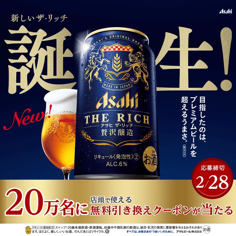
Arranged beside a glass of amber beer with a thick white head, a dark blue Asahi The Rich beer can featuring gold heraldic lions and a wheat crest is centered in the frame. Large gold Japanese characters for ‘Birth!’ dominate the deep navy background, while red and white text elements announce the ‘New!’ status and a February 28 release date. The composition includes vertical promotional text on the right and a bold red banner at the bottom detailing a coupon offer for the first 200,000 customers.
The visual hierarchy relies on massive serif typography that dwarfs the product, creating an immediate sense of importance and celebration through scale. A sophisticated palette of midnight blue, metallic gold, and crimson red conveys luxury and premium quality, contrasting sharply with the photographic realism of the chilled can and fresh pour. Ornate illustrative details on the aluminum surface add texture and heritage, balancing modern advertising冲击力 with traditional brewing aesthetics.
Graphic designers often examine this layout to understand how to integrate multiple text weights and languages without cluttering the central focal point. Marketing analysts reference the campaign to study how premium positioning is achieved through color psychology and symbolic imagery in the Japanese beverage sector. Packaging specialists utilize the can’s detailed artwork as a benchmark for applying classical motifs to contemporary metal container designs.