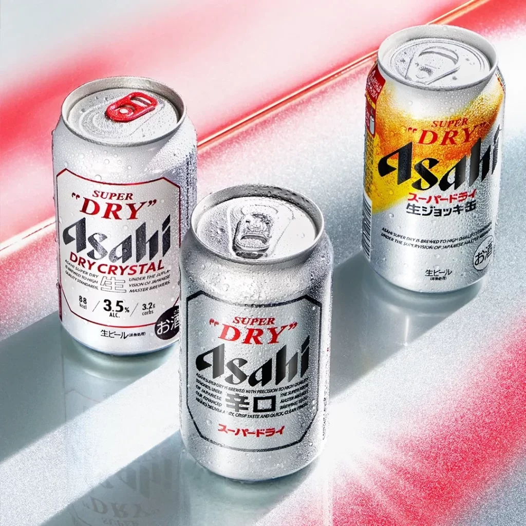
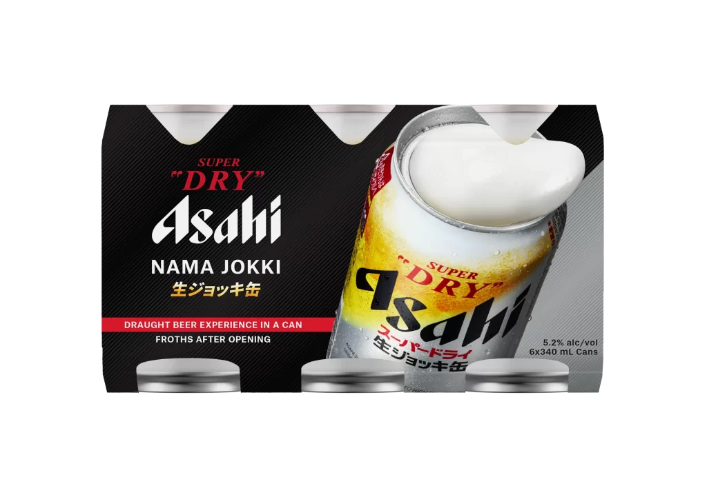
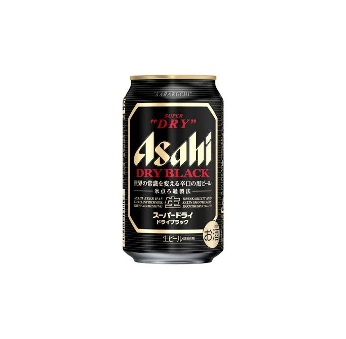
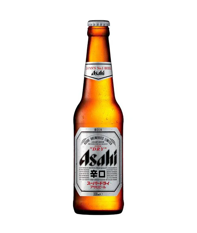
Asahi Beer Advertisement
Topics
Details
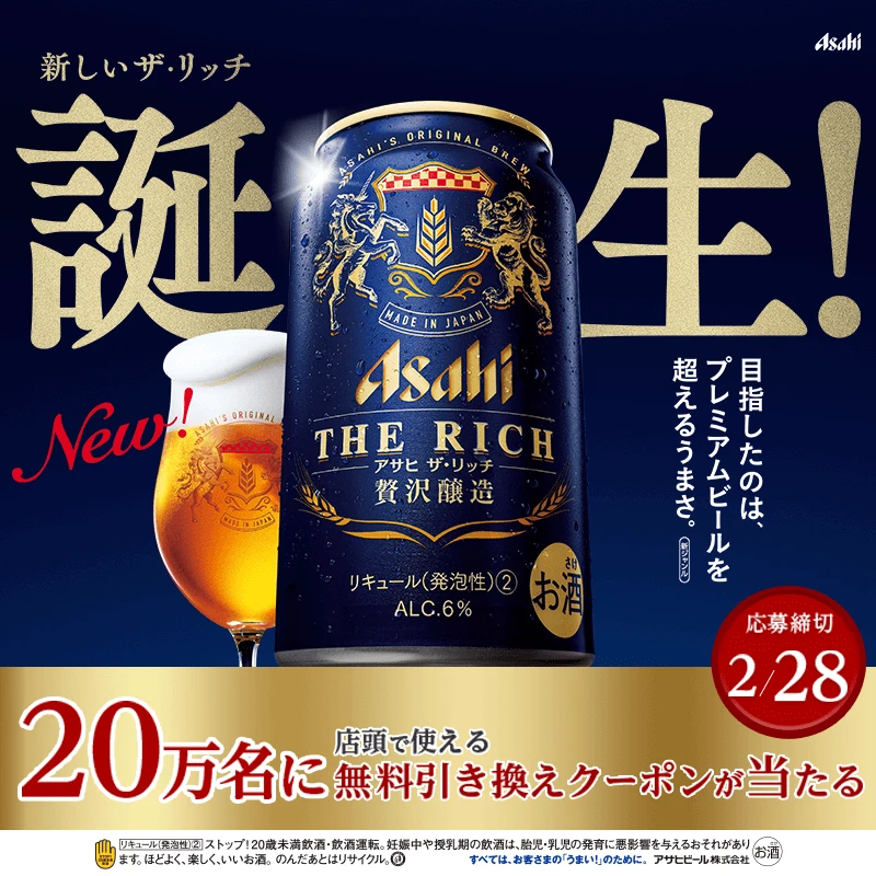
Crossing the frame diagonally, large bold blue Japanese characters for 'Nama' (draft) dominate the composition. The poster features a Suntory beer can and a filled glass positioned on the right side against a clean white background, with Japanese text on the left reading a slogan about draft beer being delicious and the Suntory brand name appearing in smaller print above the main product imagery.
The layout employs an asymmetrical balance with oversized typography creating dynamic visual movement from bottom-left to top-right. A restricted color palette of deep navy blue and crisp white establishes strong brand recognition and high contrast. The photography style presents the beverage with realistic clarity, emphasizing the golden liquid texture and metallic can details.
Graphic designers reference this piece for its effective use of scale in typographic hierarchy within commercial advertising contexts. Marketing professionals analyze the campaign’s minimalist approach to conveying product freshness through visual weight distribution. Packaging specialists study the integration of photographic elements with bold lettering for beverage category branding applications.