Asahi Green Tea Japanese
Topics
Details
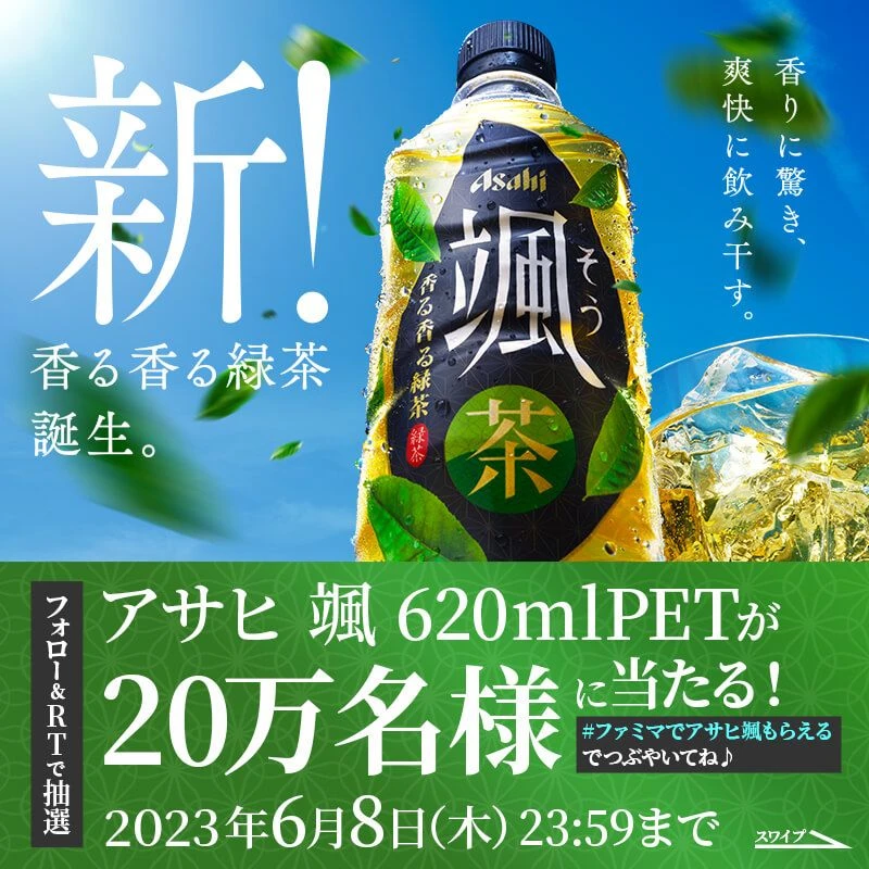
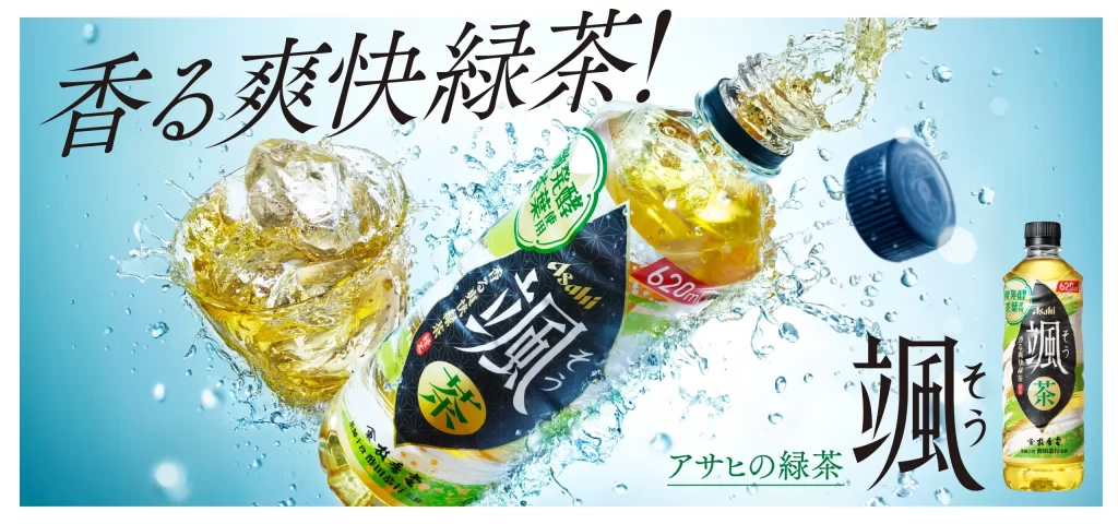
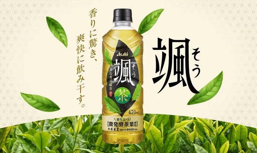
Painterly warm tones define the scene, which centers on a 620ml plastic bottle of Asahi’s ‘Sou’ (颯) fermented tea, featuring a black cap and a label with bold white kanji against a dark green background. The composition is set against a pale cream backdrop decorated with a subtle geometric pattern, while realistic green tea leaves float around the product and a dense field of foliage anchors the bottom. Vertical Japanese text on the left reads ‘香りに驚き、爽快に飲み干す,’ which translates to being surprised by the aroma and drinking it refreshingly, alongside the large stylized character for ‘Sou’ on the right.
The layout employs a clean, centralized structure that draws the eye directly to the packaging through generous use of negative space. Typography plays a crucial role, utilizing a mix of elegant vertical script and heavy, brush-stroke style calligraphy to convey both tradition and modern energy. A natural color palette of vibrant greens and earthy yellows is paired with high-quality photography that emphasizes the freshness of the ingredients.
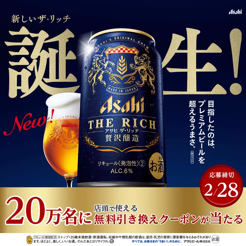
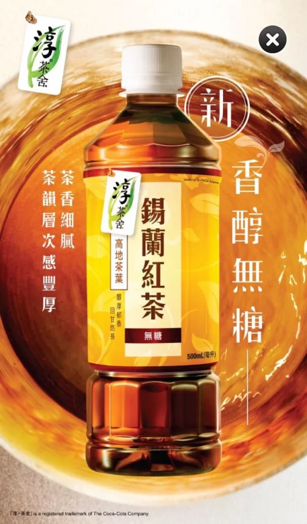
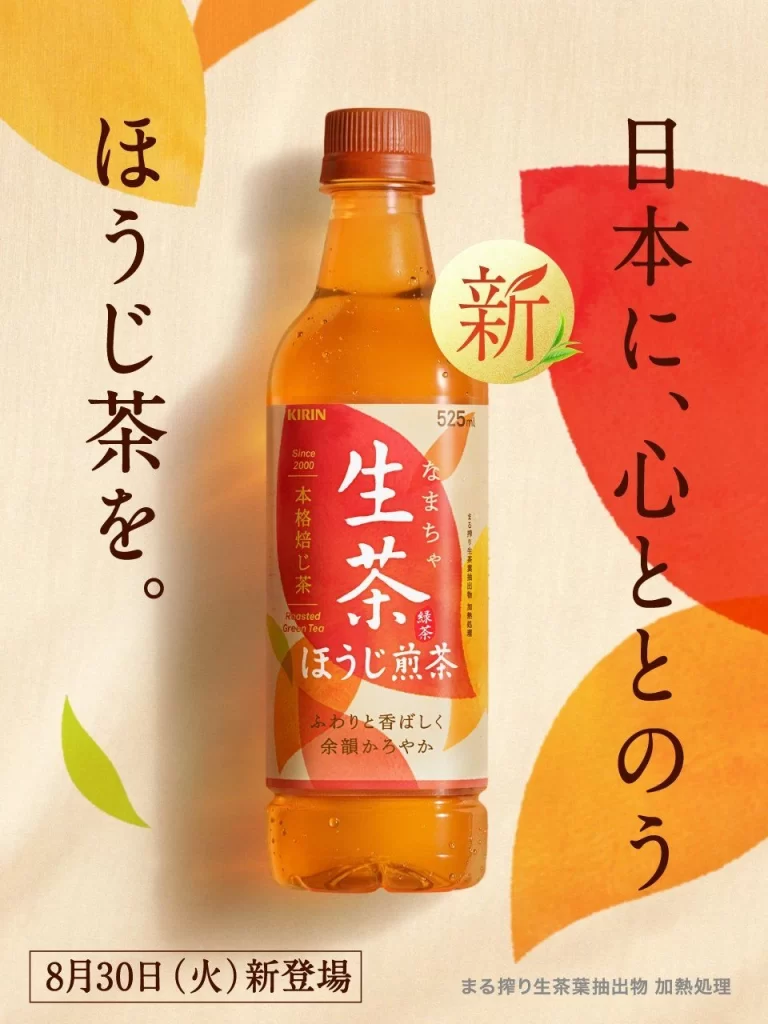
Graphic designers often examine such compositions to understand how to balance product photography with decorative elements without cluttering the visual field. Marketing students utilize these examples to analyze how specific typefaces and color choices influence consumer perception of flavor profiles. Packaging specialists reference the label hierarchy to see how brand identity is maintained while introducing new sub-brands or product lines.