New Japanese Green Tea Advertisement
Topics
Details
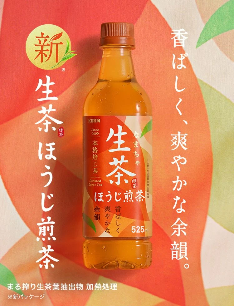
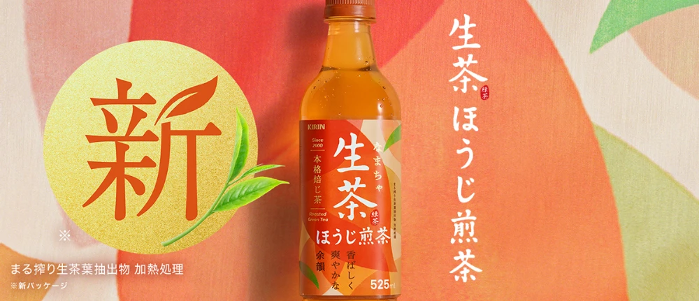
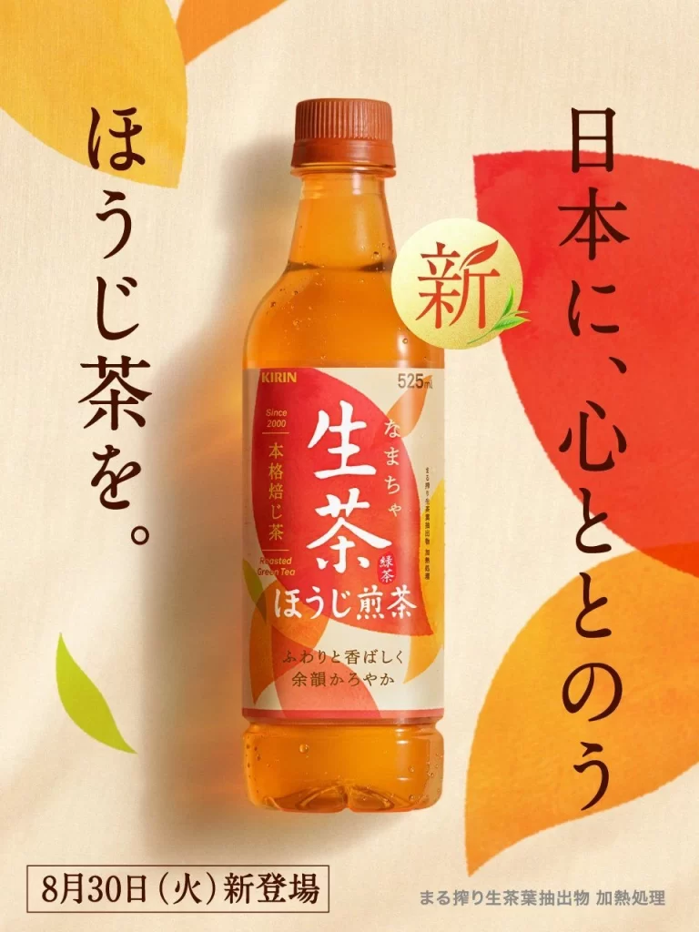
Balanced on the center of the frame is a 525ml plastic bottle of Kirin’s ‘Nama-cha’ (Raw Tea) with a reddish-brown cap and amber liquid, featuring a label with bold red and white Japanese typography for ‘Raw Tea’ and ‘Houjicha Roasted Tea.’ The bottle is surrounded by abstract leaf shapes in yellow, orange, and deep red, accompanied by vertical Japanese text reading ‘To the hearts of Japan’ on the right and ‘Let’s have Houjicha tea’ on the left.
The layout employs a clean, centralized composition that draws immediate focus to the product against a textured cream background. Typography varies significantly in scale, from the massive product name to smaller descriptive text, creating a clear visual hierarchy. A warm color palette of earthy tones and vibrant autumnal hues evokes a sense of organic freshness and seasonal comfort.
Advertising professionals utilize such visuals to analyze effective use of negative space and product-centric framing strategies. Marketing students examine how specific typographic choices convey brand heritage and product authenticity. Packaging designers reference the balance between modern graphic elements and traditional Japanese aesthetic cues found in this campaign material.