Green Tea Bottle Marketing Poster
Topics
Details
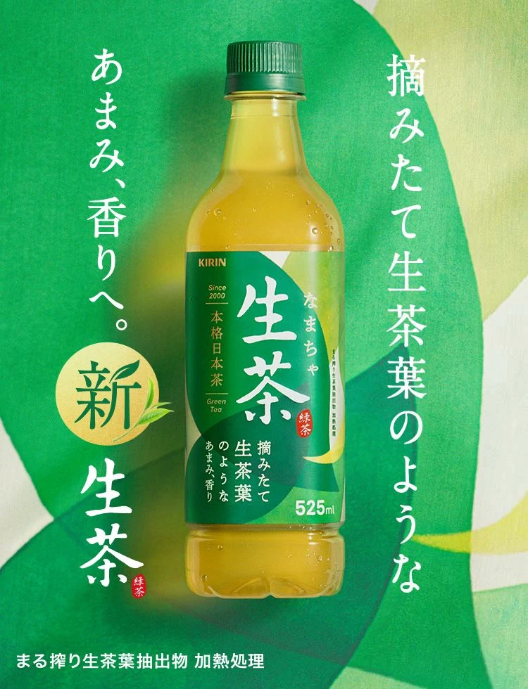
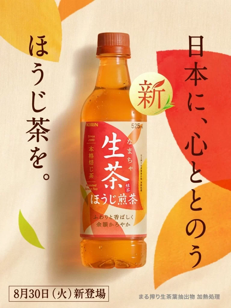
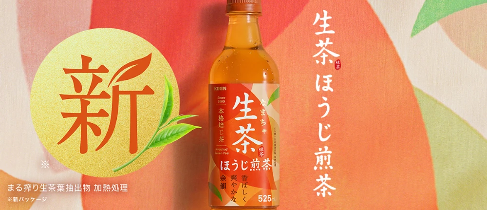
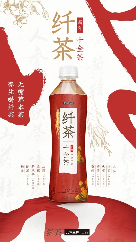
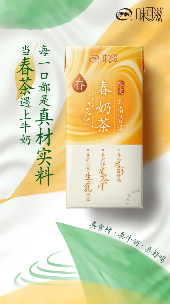
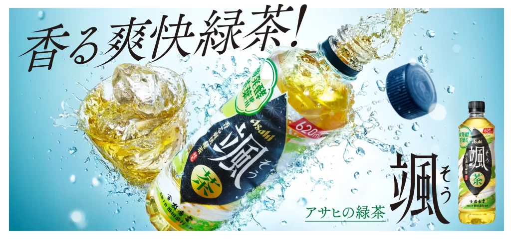
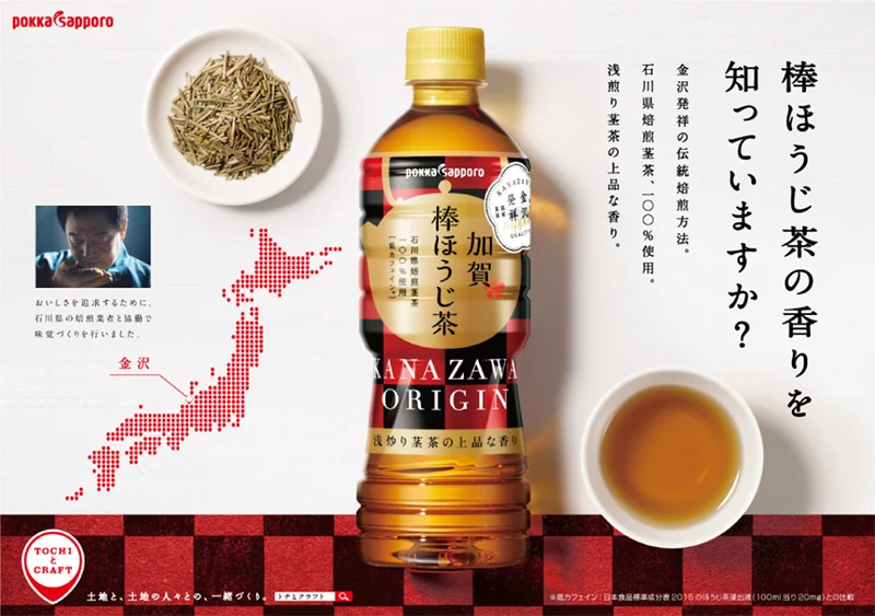
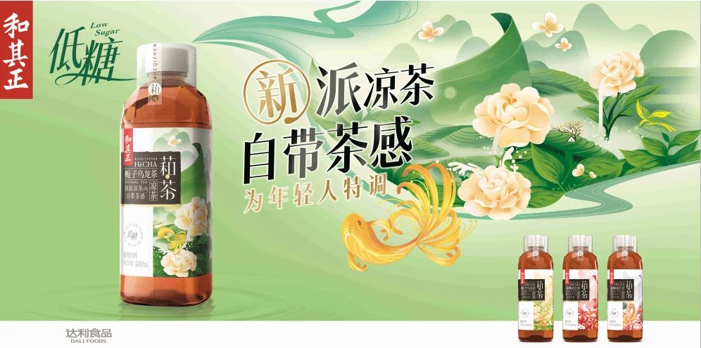
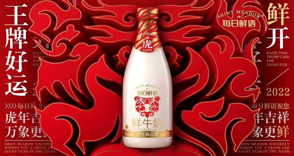
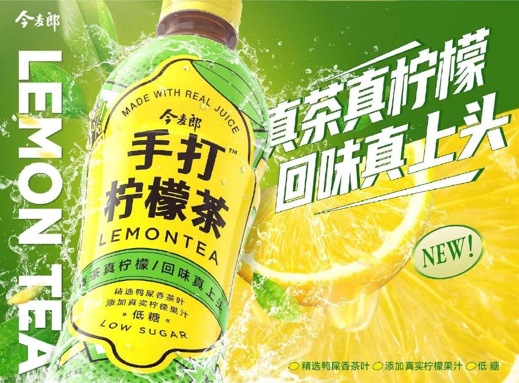
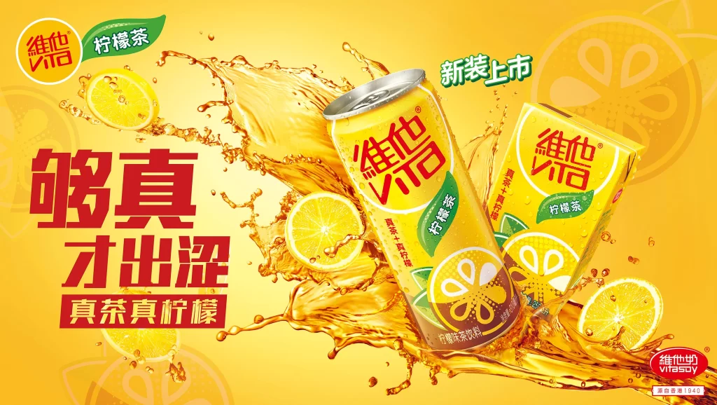
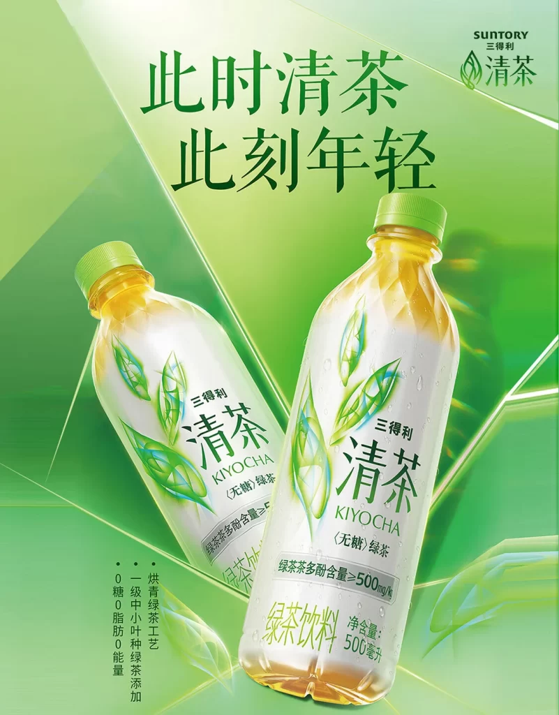
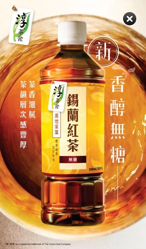
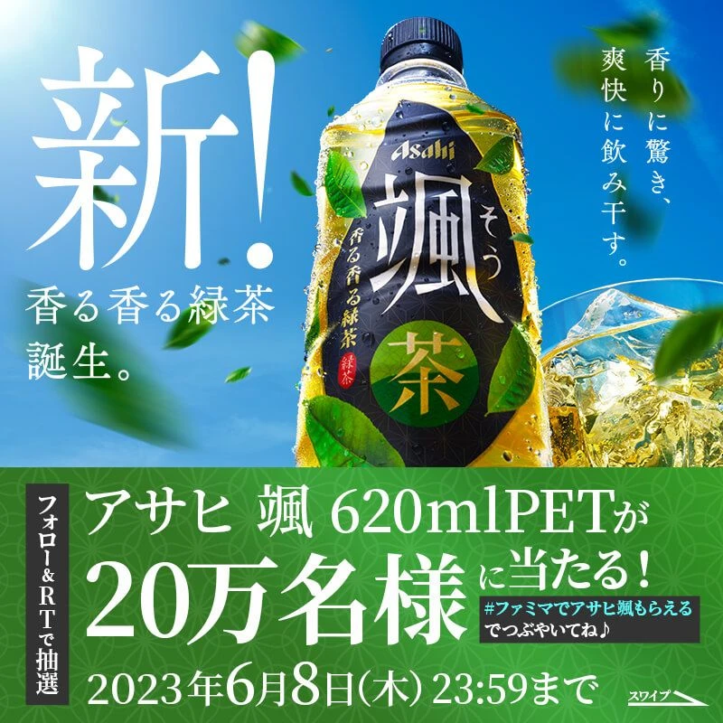
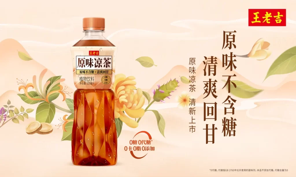
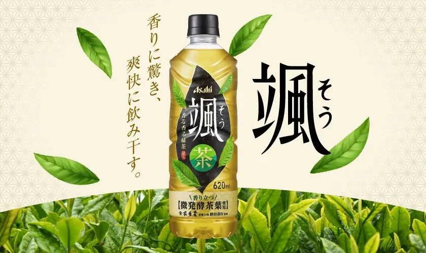
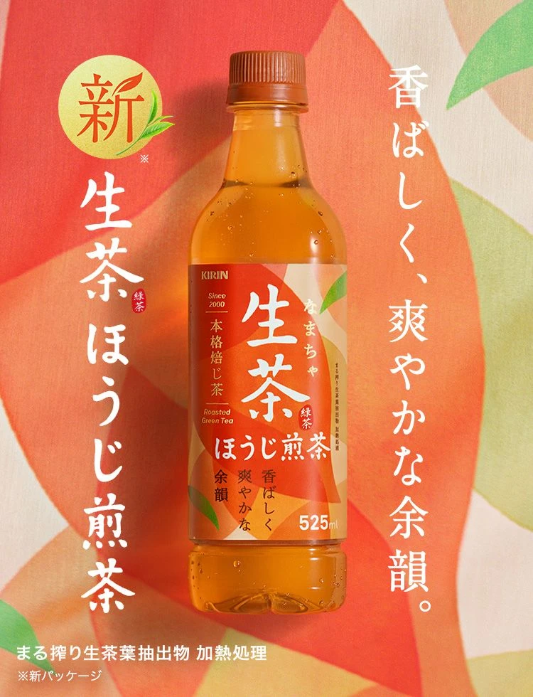
Carved into the center of the frame is a transparent bottle of Kirin ‘Nama-cha’ (Raw Tea) containing a golden-brown liquid, set against an abstract background of overlapping red and green brushstrokes. The packaging features bold white Japanese kanji for the product name, the Kirin brand logo in the upper left corner, and vertical text columns describing the tea’s aromatic and refreshing qualities. A small yellow circular badge with the character for ‘New’ sits prominently above the main vertical slogan on the left side of the composition.
The layout employs a strong vertical rhythm, balancing the central product photography with large-scale typography that draws the eye from top to bottom. Designers utilized a warm color palette dominated by terracotta reds and organic greens to evoke natural freshness, while the typeface choices mix traditional calligraphic styles with clean modern fonts for legibility. Soft, diffused lighting highlights the liquid’s clarity inside the bottle, creating a premium aesthetic without harsh shadows or glare.
Marketing professionals and graphic design students frequently analyze such compositions to understand how traditional Japanese aesthetics integrate with contemporary commercial packaging needs. Brand managers reference these visuals when developing campaigns that require balancing heritage elements with modern shelf appeal. Packaging engineers also study the label-to-bottle ratio and information hierarchy to optimize their own consumer goods designs.