Herbal Kampo Tea Advertisement
Topics
Details
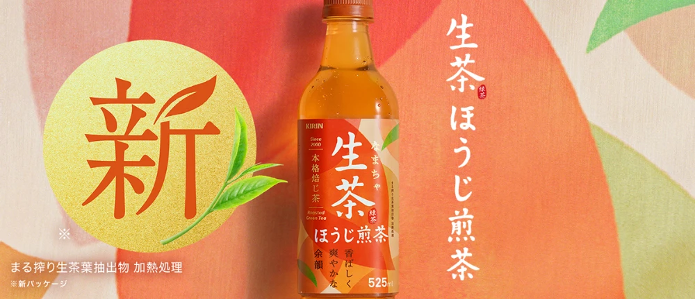
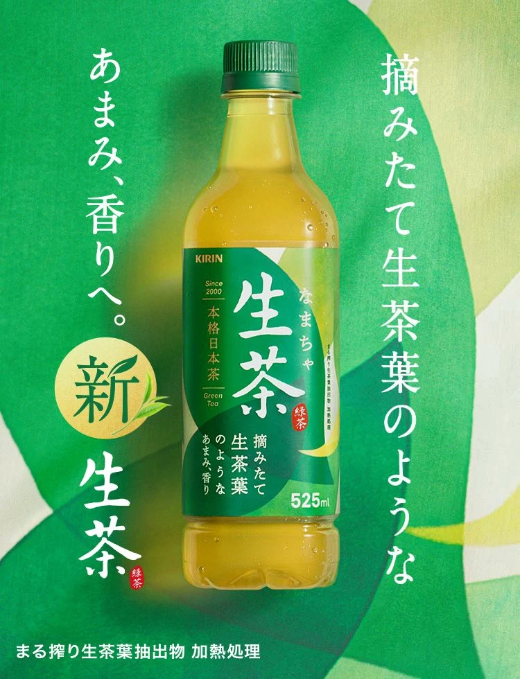
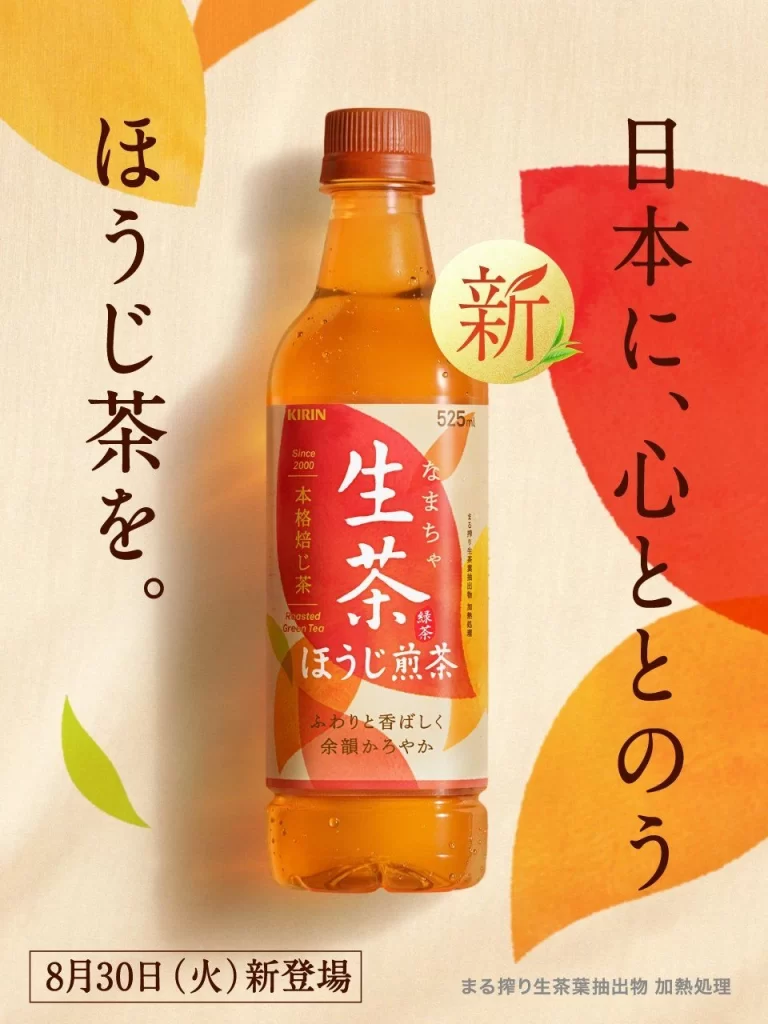
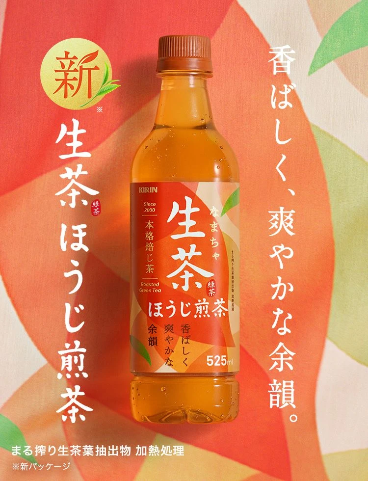
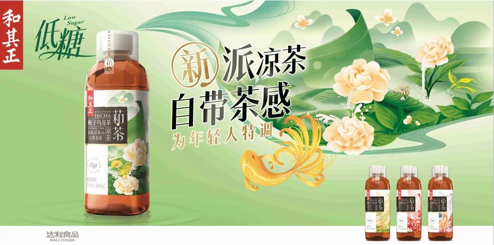
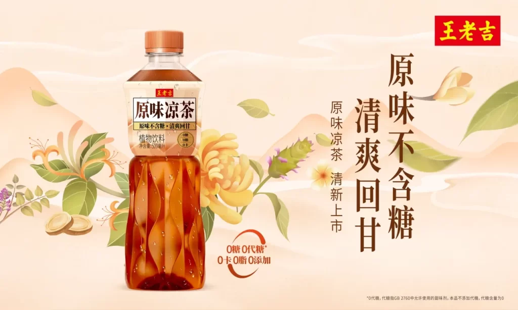
Reflected in the frame is a translucent bottle of ‘枇杷秋梨露’ (Loquat Autumn Pear Dew) by the brand 魔水师, containing a pale yellow liquid. The label features traditional Chinese medicinal aesthetics with green and red accents, while the background displays large, textured calligraphy reading ‘润’ (moisturize) alongside vertical text stating ‘Traditional Craft Extraction’ and ‘Chinese Herbal Wisdom’. A red seal stamp sits near the top left of the main character, and the bottom right corner includes manufacturing details in English and Chinese.
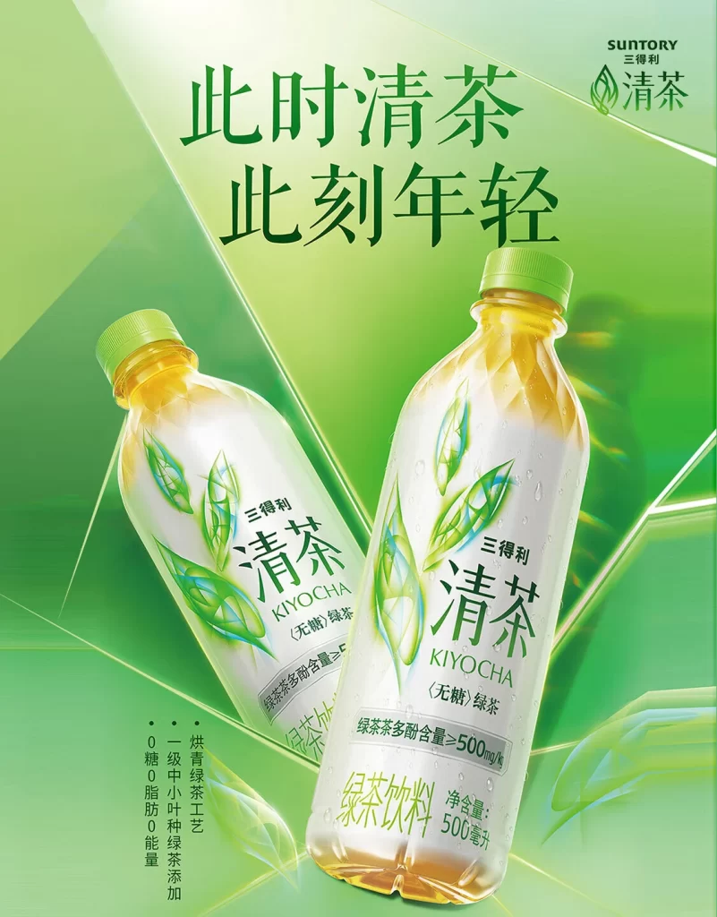
The composition utilizes a dynamic diagonal orientation for the product against a minimalist cream backdrop, allowing the bold, ink-wash style typography to dominate the visual field. Color choices are strictly limited to deep forest greens, warm beiges, and the amber hue of the beverage, creating an organic and authentic atmosphere. The photography employs soft, diffused lighting that highlights the texture of the liquid inside the bottle without creating harsh reflections on the plastic surface.
Graphic designers often examine this specific layout to understand how to balance oversized cultural typography with physical product placement. Marketing professionals utilize it as a case study for positioning heritage brands within modern health-conscious markets. Packaging specialists reference the label’s intricate border work and vintage currency-inspired motifs when developing premium wellness goods.