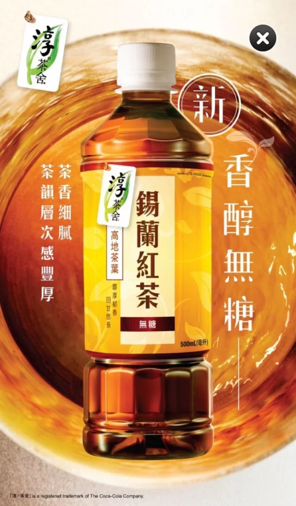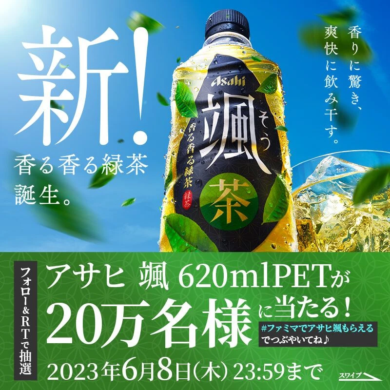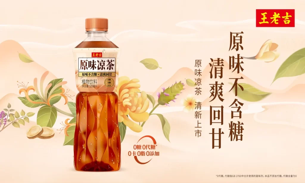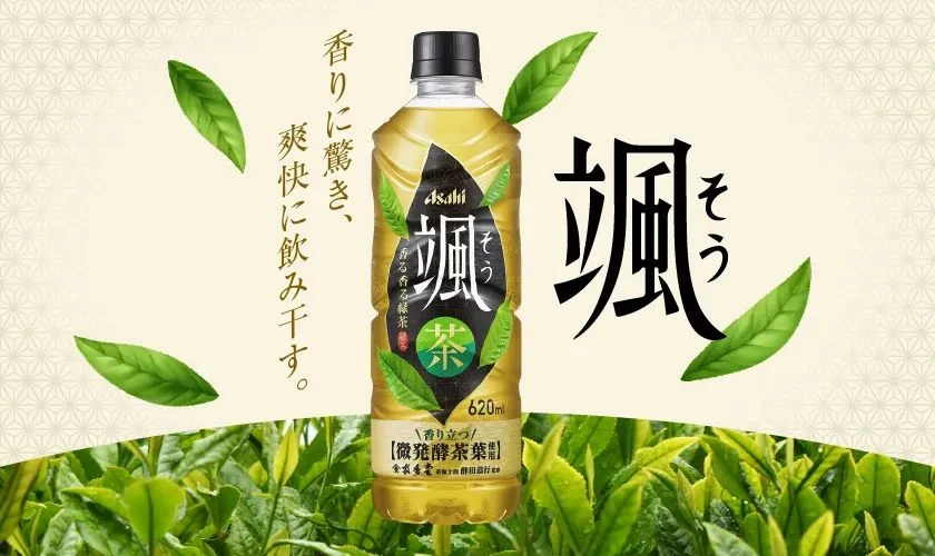
Japanese Green Tea New Launch Advertisement
Topics
Details
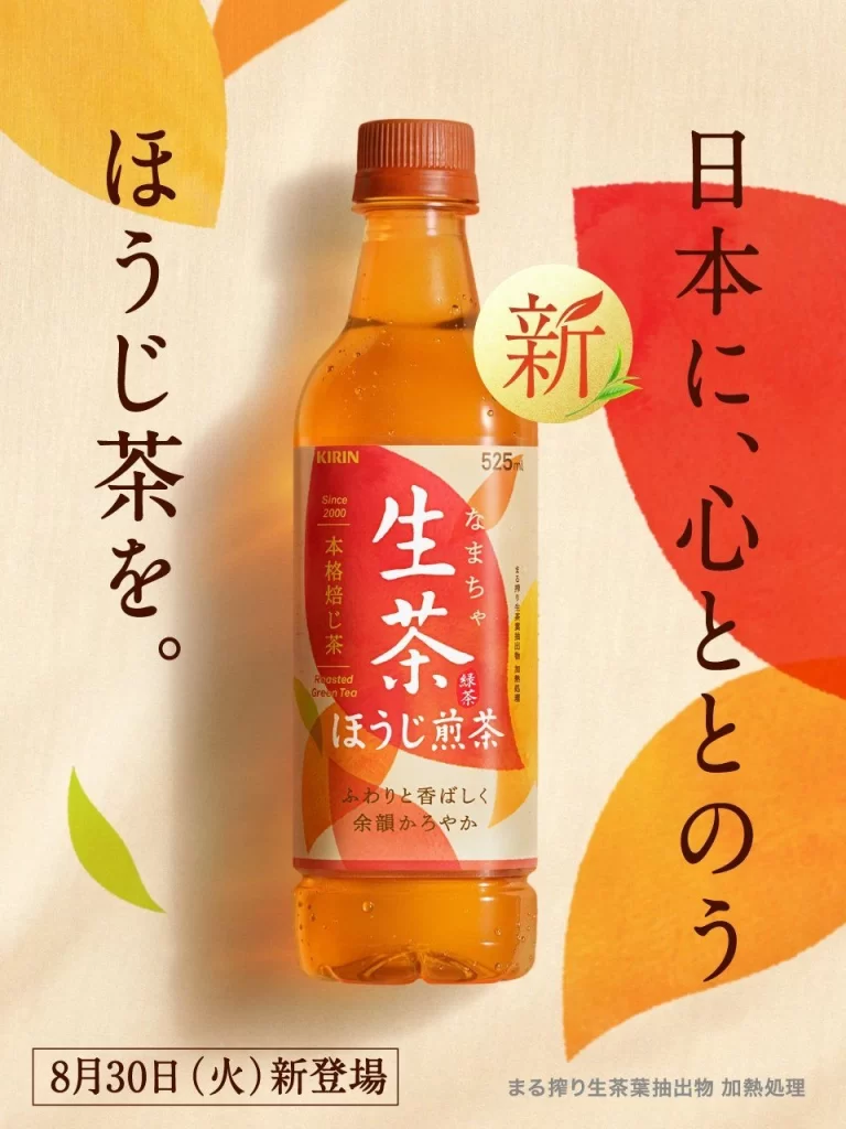
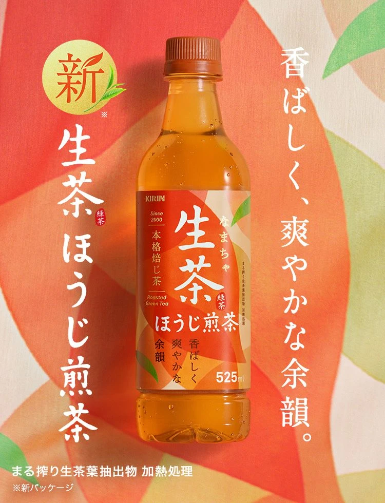
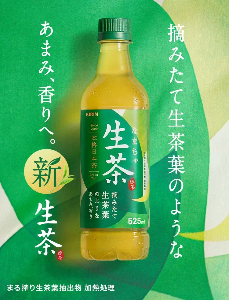
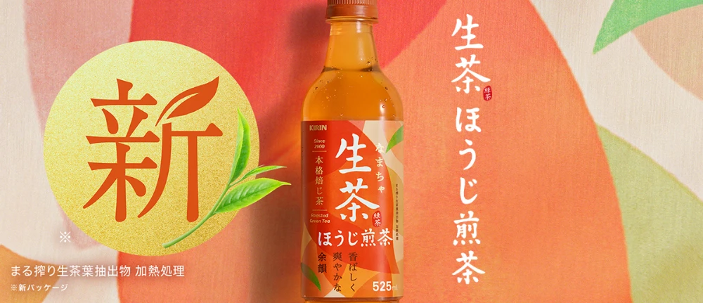
Drifting over a backdrop of abstract, overlapping organic shapes in warm coral, peach, and sage green is a 525ml bottle of Kirin ‘Nama-cha Houjisencha’ (Raw Tea Roasted Green Tea). To the left of the bottle sits a large golden-yellow circle containing the red kanji character for ‘New’ (新), accented by a stylized green tea leaf. Vertical Japanese text reading ‘Nama-cha Houjisencha’ runs along the right edge, while smaller text at the bottom left notes that the product is made from unfermented tea leaf extract and heat-treated.
The layout employs a clean, modern composition that balances the central product photography with bold graphic elements and vertical typography. A harmonious color palette of earthy oranges and fresh greens evokes the natural origins of the tea while maintaining a vibrant, contemporary feel. The typography mixes traditional calligraphic strokes with clean sans-serif fonts, creating a visual bridge between heritage and modern convenience.
Graphic designers often examine this poster to understand how to effectively integrate packaging photography with large-scale graphic symbols without cluttering the visual field. Marketing professionals utilize the color psychology and text placement as a case study in launching premium beverage products in competitive retail environments. Brand strategists reference the visual language to see how established companies refresh their identity for new product lines while retaining core brand recognition.