Green Tea Bottles Japanese Advertisement
Topics
Details
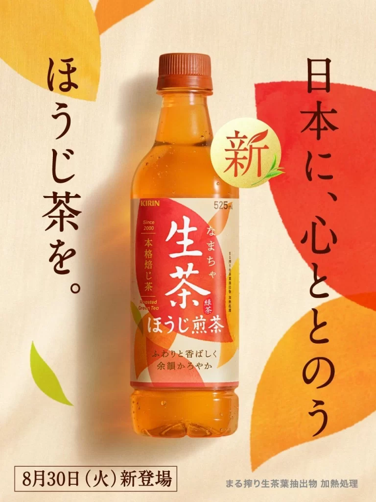
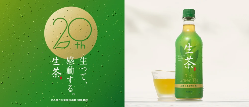
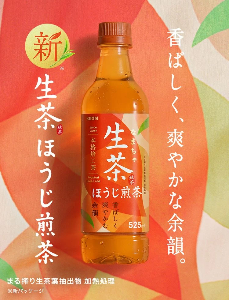
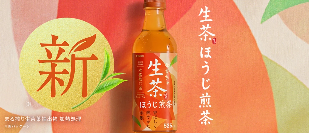
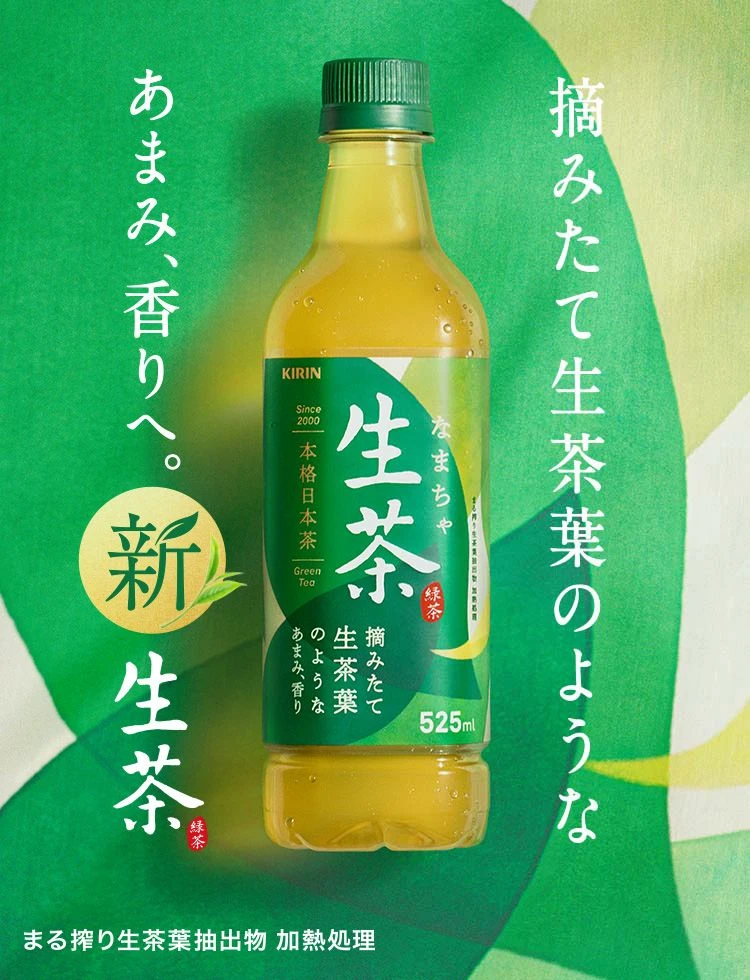
A Kirin brand bottle of 'Nama-cha' (raw green tea) stands centered against a layered green background with abstract leaf shapes. The label features large white Japanese characters for the product name, surrounded by vertical text reading '摘みたて生茶葉のような' (like freshly picked raw tea leaves) and 'あまみ、香りへ。' (towards sweetness and aroma). A prominent gold circular seal on the left contains the character '新' (new) above '生茶', while the bottom specifies 525ml volume and processing details about fresh tea leaf extraction with heat treatment.
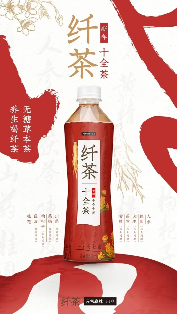
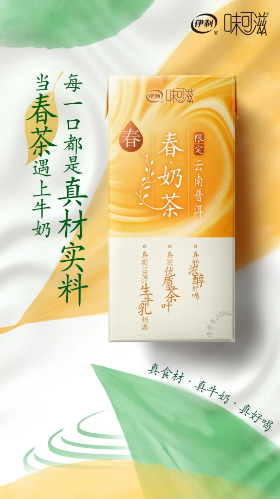
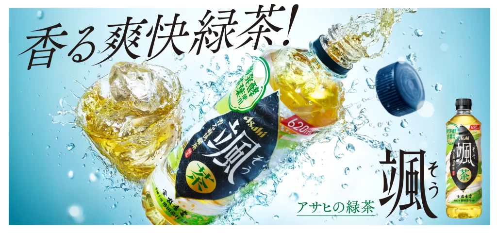
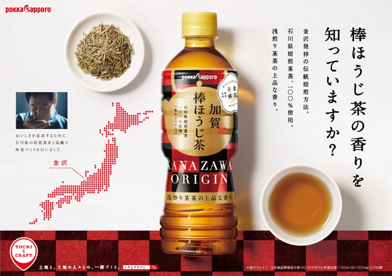
The composition employs a clean, symmetrical layout that draws immediate focus to the translucent yellow-green liquid inside the clear plastic bottle. Typography mixes bold, traditional Japanese calligraphy with modern sans-serif fonts, creating a hierarchy that balances heritage with contemporary appeal. The color palette relies on various shades of forest and lime green accented by golden yellow elements, evoking freshness and natural origins through both photographic realism of the product and stylized graphic backgrounds.
Advertising professionals examine such visuals to understand how beverage brands communicate product authenticity through minimal yet culturally resonant design elements. Marketing students analyze the strategic placement of text to convey key selling points like 'freshly picked' without cluttering the visual field. Packaging designers reference the label integration and color psychology to inform their own work on health-focused drink campaigns targeting quality-conscious consumers.