Luckin Iced Tea Series Advertisement
Topics
Details
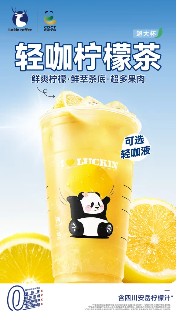
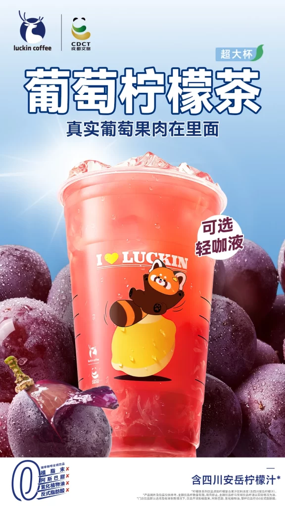
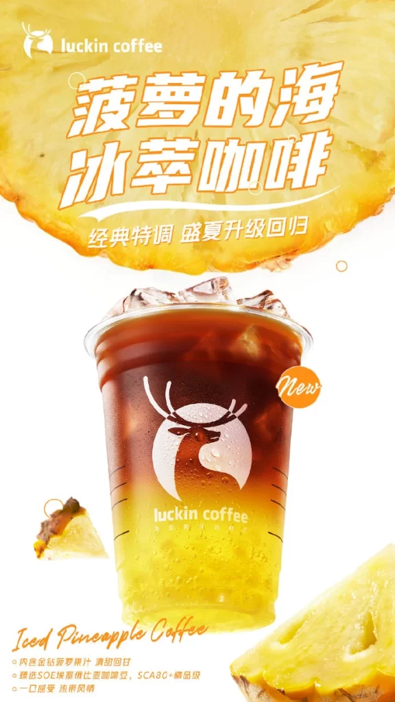
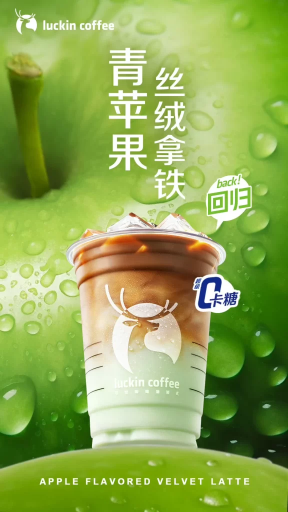
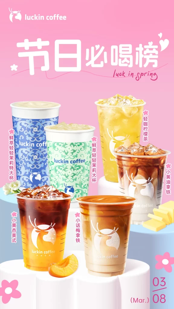
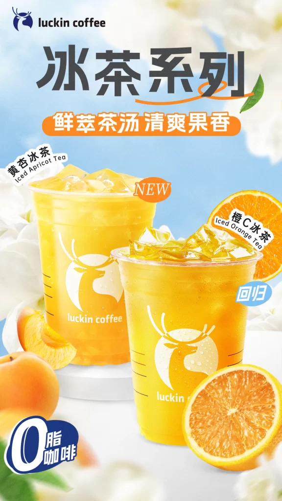
The Luckin Coffee brand logo appears at the top left, introducing a promotional poster for their 'Iced Tea Series' written in bold Chinese characters. Two translucent plastic cups filled with bright yellow beverages sit centrally, labeled as 'Iced Apricot Tea' with a red 'NEW' badge and 'Iced Orange Tea' marked with a blue 'Return' tag. The composition includes fresh fruit slices of apricots and oranges scattered around the base, alongside a blue badge in the corner stating '0 Fat' and 'Coffee'.
Visual hierarchy is established through large, heavy-weight typography for the main headline, contrasted by rounded orange pill-shaped containers for the sub-headline text. The color palette relies on vibrant citrus yellows and oranges against a soft, airy blue background to evoke a sense of cold refreshment and summer vibes. Product photography utilizes high-key lighting to make the drinks appear translucent and icy, while the brand's signature deer icon is clearly visible on the cup packaging.
Marketing professionals utilize this specific layout to analyze how seasonal product launches are visually differentiated using color-coded tags for new versus returning items. Graphic design students often reference the balance between photographic realism and graphic overlays when studying beverage advertising aesthetics. Brand managers review such materials to ensure consistent visual identity across different product lines within the same retail environment.