Japanese Beverage Alcohol Refreshing Drink Strong Flavor Can
DownloadTopics
Details
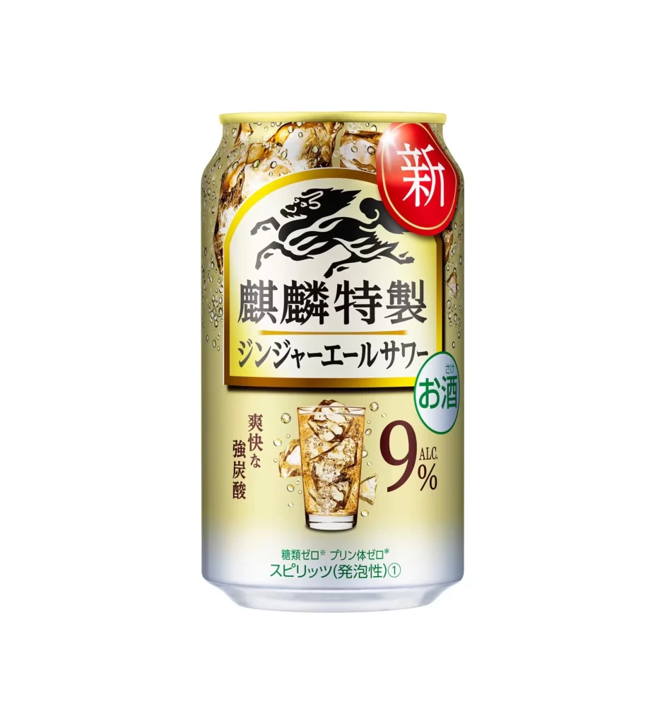
A cylindrical aluminum beverage can stands upright, featuring a metallic gold gradient that transitions to silver at the base. The central label displays a black Kirin logo above bold Japanese characters reading "麒麟特製" and "ジンジャーエールサワー", while a red circular badge with the white character "新" sits in the upper right corner. Ice crystals appear to cling to the can's surface, and a glass filled with the amber liquid and ice cubes is illustrated in the lower portion alongside the text "9% ALC." and vertical characters indicating "爽快な強炭酸" (refreshing strong carbonation).
Visual hierarchy on this packaging relies heavily on contrasting elements: the warm gold background makes the black mythical creature emblem pop, while the bright red "new product" sticker creates an immediate focal point for retail shelves. The inclusion of photographic ice textures combined with vector-style typography demonstrates how Japanese beverage brands balance traditional aesthetics with modern refreshment cues. Designers studying this reference can examine how the 9% alcohol content is emphasized through oversized typography to signal potency without overwhelming the brand identity.
Product photographers and packaging designers might utilize this asset to study lighting techniques that highlight condensation effects on curved metal surfaces. Beverage industry marketers could reference the color palette when developing campaigns for high-alcohol sparkling drinks targeting adult consumers who prefer bold flavors. The complete high-resolution file is accessible at no cost for those needing detailed texture work or typographic analysis of Japanese alcohol labeling standards.