Hibiki Whisky Japanese Harmony Handcrafted
DownloadTopics
Details
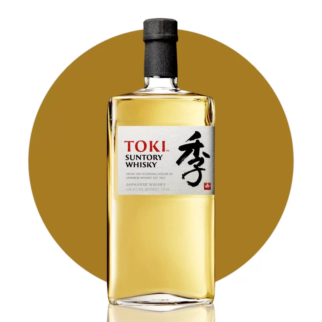
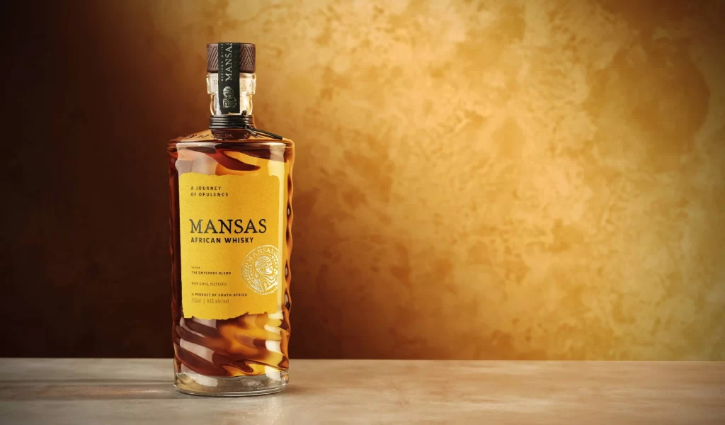
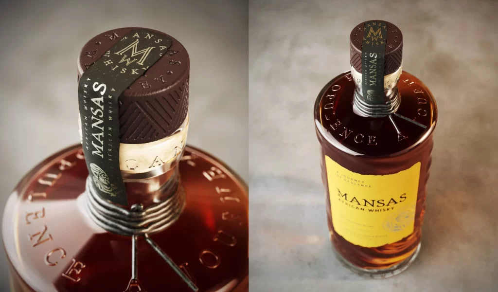
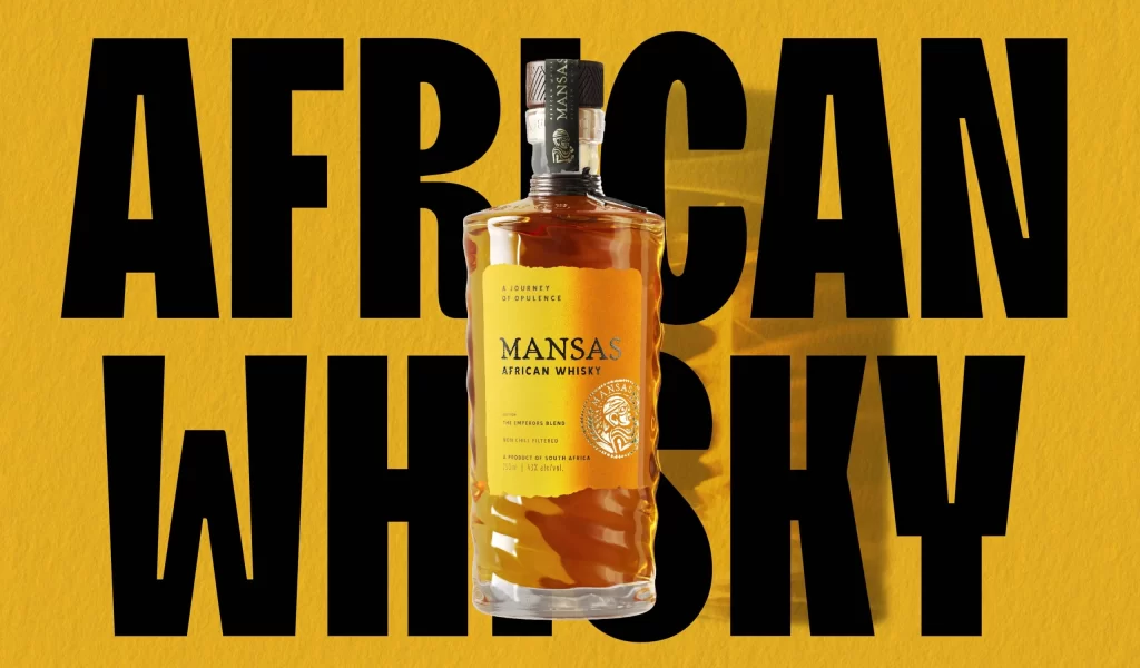
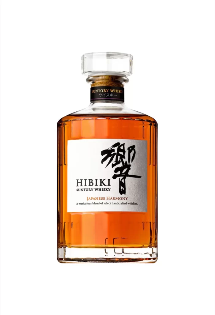
Amber liquid fills a rectangular glass bottle with vertical faceting and a heavy, clear stopper. A white label dominates the front, bearing the word HIBIKI in serif capitals beneath bold black calligraphy, while SUNTORY WHISKY and JAPANESE HARMONY appear in smaller type below. The neck features a dark band printed with Suntory Whisky and Japanese characters, all photographed straight-on under even lighting that reveals the bottle's transparency against a neutral backdrop.
Visual distinction arises from the tension between traditional brushwork and modern typographic precision on the label. The faceted glass catches light along its vertical ridges, creating subtle highlights that emphasize the whisky's golden hue without distracting from the central branding. Designers studying this composition will appreciate how the calligraphic character anchors the layout while the clean English text provides legible hierarchy.
Product photographers might analyze the lighting setup to replicate similar clarity for beverage catalog work. Brand identity specialists could examine the balance of Eastern and Western typography as a case study in cross-cultural packaging. Anyone needing sharp detail for texture studies or color matching can access the full-resolution file at no cost through the site's repository.