Suntory Takohai Soda Advertisement
Topics
Details
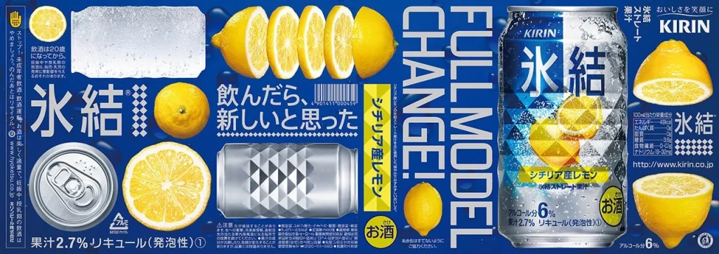
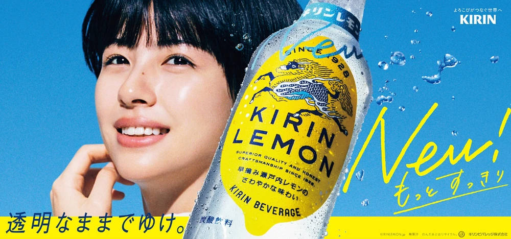
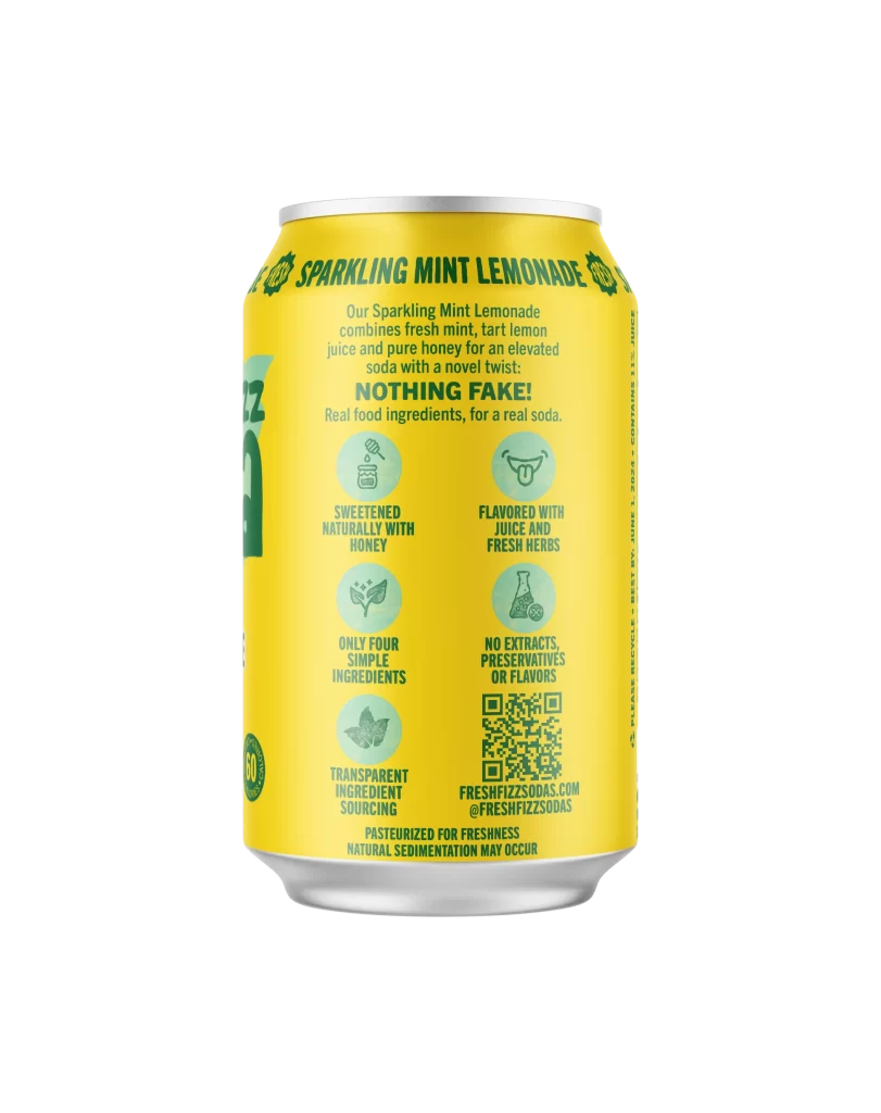
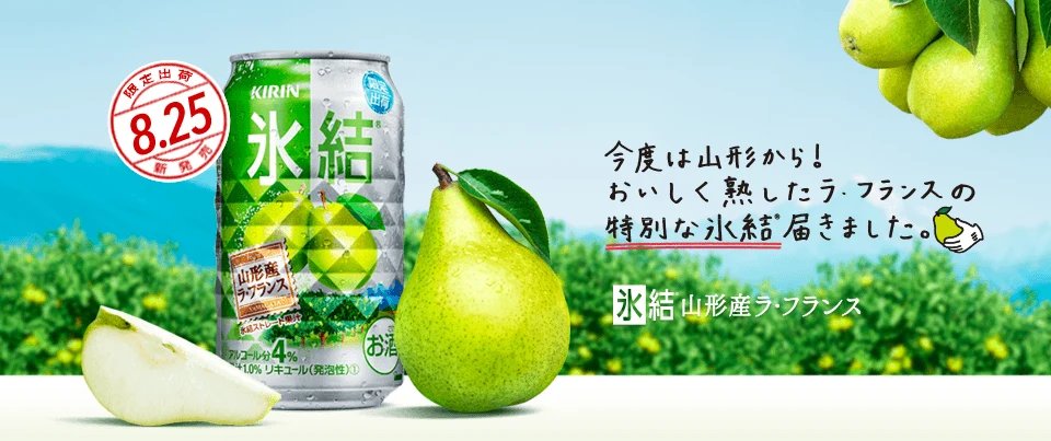
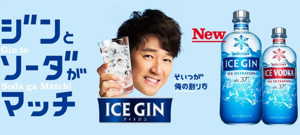
A Suntory Takohai canned soda advertisement features a woman holding a glass of the beverage against a bright blue background. The composition includes two product cans at the bottom right, with prominent Japanese text in white and dark blue. The Suntory logo appears in the top right corner, while various descriptive phrases about the drink's taste surround the central figure.
The layout employs dynamic diagonal text blocks that create visual movement across the frame, balancing the photographic subject with bold typographic elements. A vibrant cyan-blue color palette dominates the design, providing high contrast for the white Japanese characters and product photography. The photography style presents a natural, approachable aesthetic with soft lighting that emphasizes the refreshing quality of the beverage.
Advertising professionals utilize this image to analyze effective integration of photography and typography in beverage marketing campaigns. Marketing students reference the poster to understand how color psychology influences consumer perception of alcoholic soda products. Brand managers study the visual hierarchy techniques used to communicate multiple flavor variants within a single cohesive advertisement.