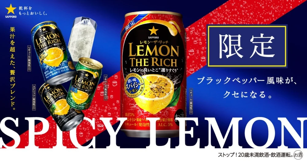
Spicy Lemon Soda Cans Advertisement
Topics
Details
The advertisement showcases Suntory's LEMON THE RICH canned beverage line, with a large red can of the Spicy Lemon variant positioned centrally against a dynamic blue and red split background. Japanese text appears throughout, including the prominent kanji '限定' (limited edition) in a gold-bordered box and the English phrase 'SPICY LEMON' in oversized white serif lettering at the bottom. Three additional flavor variants in blue, green, and black cans are arranged to the left alongside a glass filled with ice and liquid.
Visual hierarchy is established through dramatic scale contrast between the hero product and supporting elements, while diagonal color blocking creates energetic movement across the frame. Typography mixes bold sans-serif for product naming with traditional Japanese characters, utilizing metallic gold accents to signify premium positioning. The photography style emphasizes refreshing condensation droplets on the cans and vibrant yellow citrus imagery to communicate sensory qualities of the drink.
Graphic designers reference this composition when studying effective use of limited-edition branding cues and multi-SKU product layouts within retail advertising contexts. Marketing analysts examine how bold color segmentation and localized typography drive consumer urgency around seasonal beverage releases. Packaging specialists utilize the visual treatment as a case study for balancing flavor-specific iconography with consistent brand identity across product variants.