Kirin Mets Bitter Soda Advertisement
Topics
Details
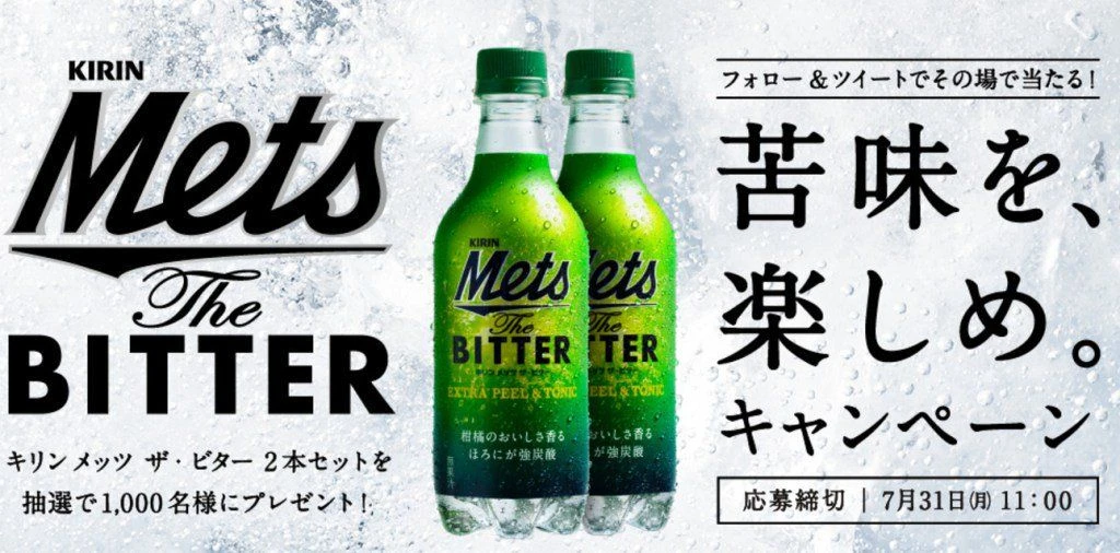
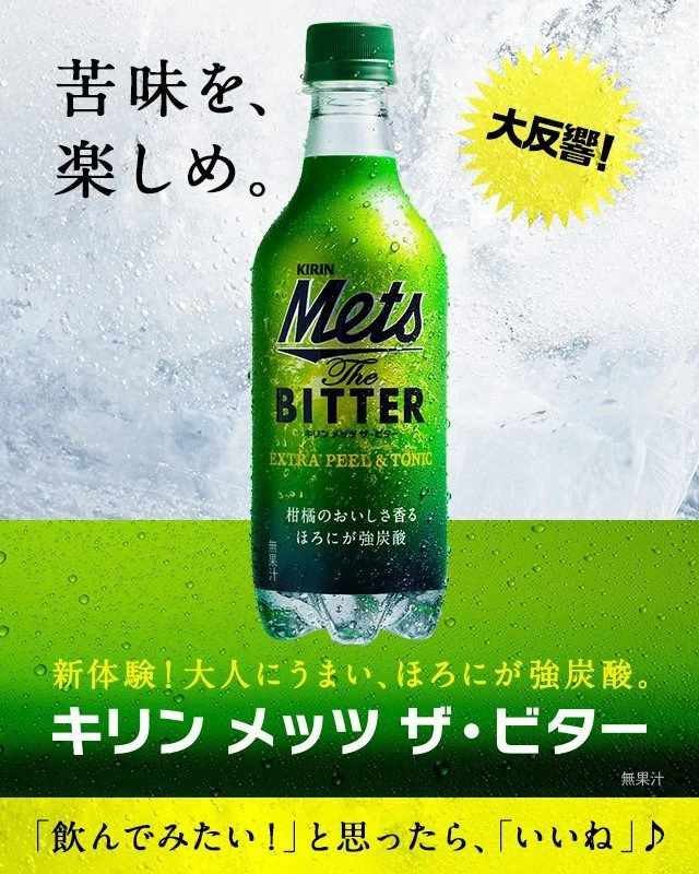
Positioned near the center of the frame is a green plastic bottle of Kirin Mets The Bitter, featuring a dark green cap and condensation droplets. The background consists of a textured, icy white surface transitioning into a solid lime-green band at the bottom. Prominent Japanese text appears throughout, including the slogan ‘苦味を、楽しみ。’ (Enjoy the bitterness) and a yellow starburst containing ‘大反響!’ (Huge response!).
The layout employs a strong vertical alignment that draws the eye directly to the product, utilizing high-contrast typography to differentiate brand elements from flavor descriptions. A vibrant color palette of electric greens and sharp yellows creates an energetic, refreshing aesthetic against the cool-toned photographic backdrop. The typeface selection mixes bold, modern sans-serifs for the logo with clean, legible fonts for the informational copy.
Graphic designers often examine such compositions to understand how negative space and color blocking can emphasize physical packaging. Marketing professionals utilize this case study to analyze how specific copywriting and visual cues communicate a ‘bitter’ flavor profile effectively. Brand strategists reference these materials when developing cohesive campaigns that bridge the gap between bottle design and print media.