Kirin Beer Can Design Advertisement
Topics
Details
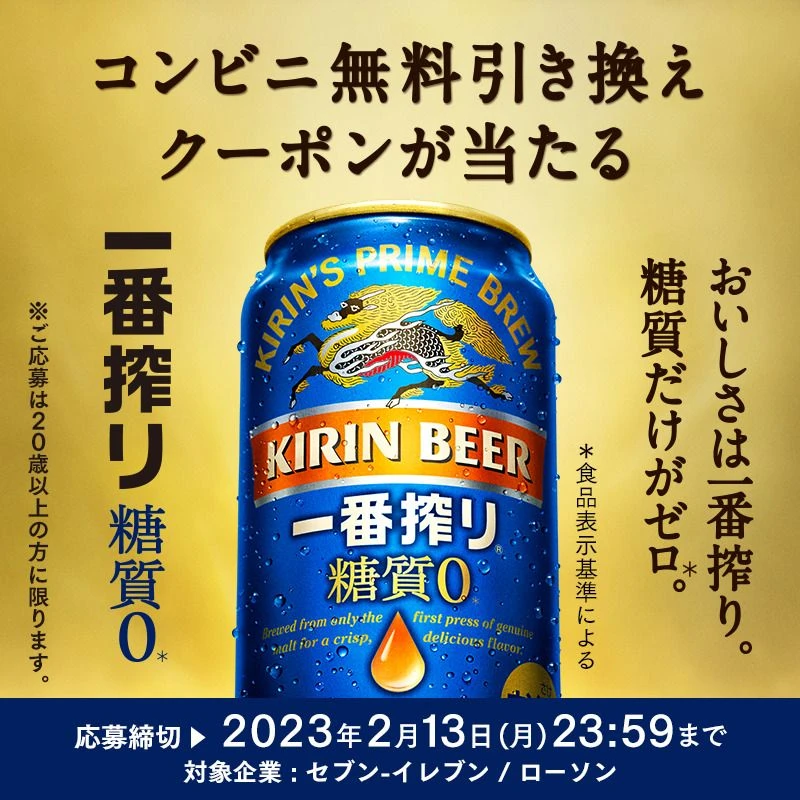
A blue Kirin Beer can labeled 'KIRIN'S PRIME BREW' and '一番搾り 糖質0' sits centered against a warm golden-yellow gradient background. The can features the iconic Kirin creature illustration, a droplet of liquid, and English text describing the first-press brewing method. Japanese text surrounds the product, announcing a free coupon exchange campaign with an application deadline of February 13, 2023, and noting that sugar content is zero according to food labeling standards.
Bold black Japanese typography frames the central product image, with large vertical characters on the left reading '一番搾り 糖質0' and promotional details on the right. The color palette relies on the striking contrast between the cool metallic blue of the aluminum can and the rich, inviting gold backdrop. Traditional illustrative elements blend with modern sans-serif fonts to create a premium yet accessible visual hierarchy that draws immediate focus to the zero-sugar claim.
Advertising professionals examine such layouts to understand how to balance product photography with dense informational text in a single cohesive composition. Marketing students analyze the strategic placement of health-conscious claims like 'sugar zero' alongside established brand heritage markers. Packaging designers reference the specific way metallic textures and condensation effects are rendered to suggest freshness and quality in beverage advertising.