Title

Kirin Beer Packaging O


Topics

BeerDrink CanKirin Beer

Details

Uploaded user: Leo

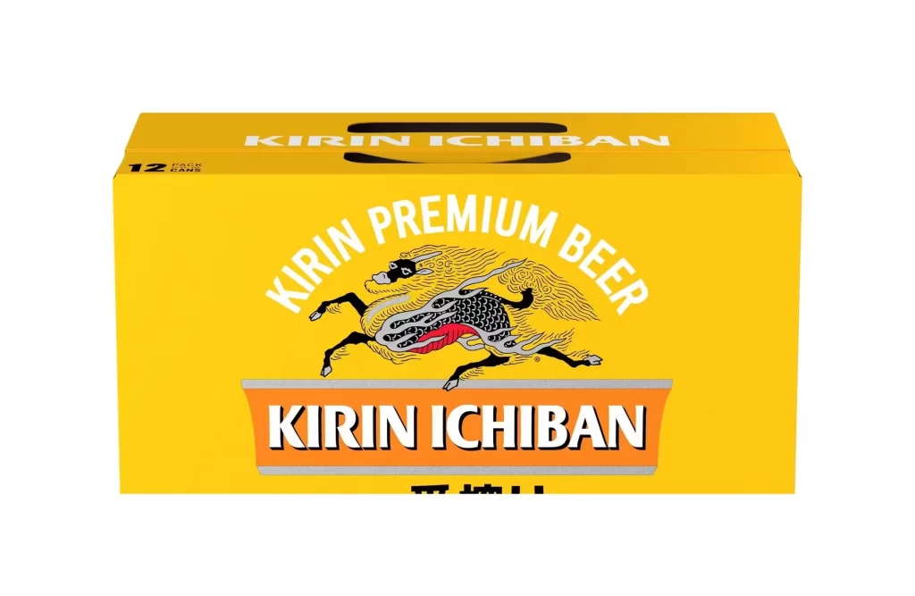
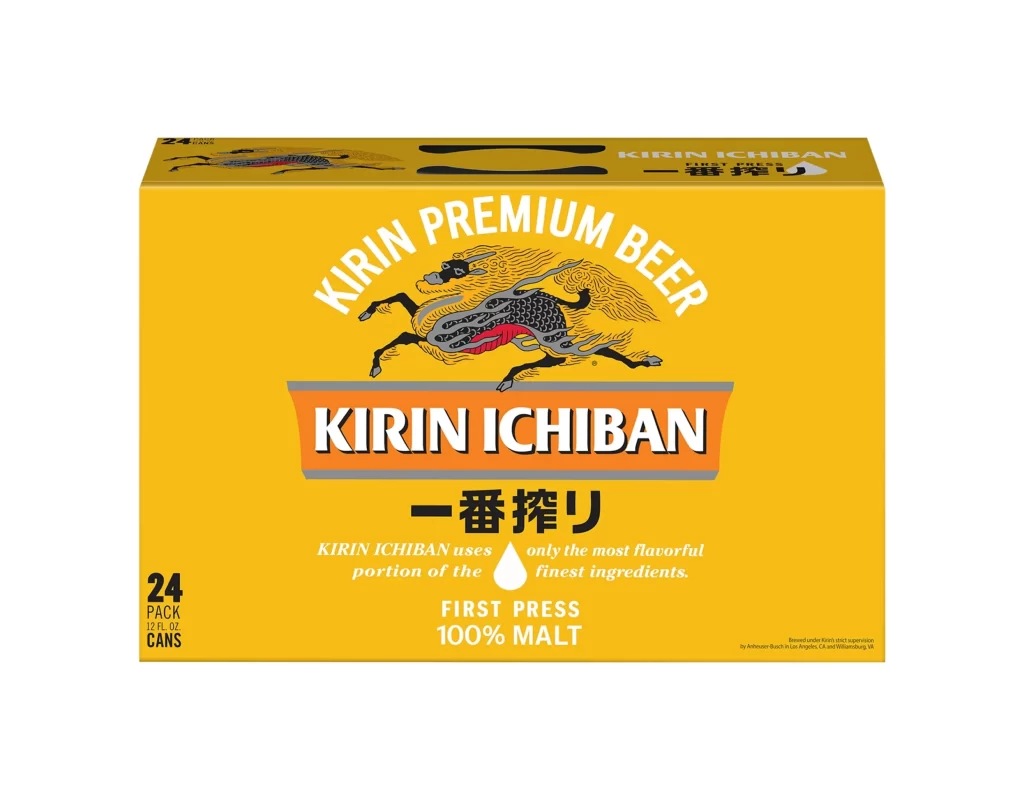
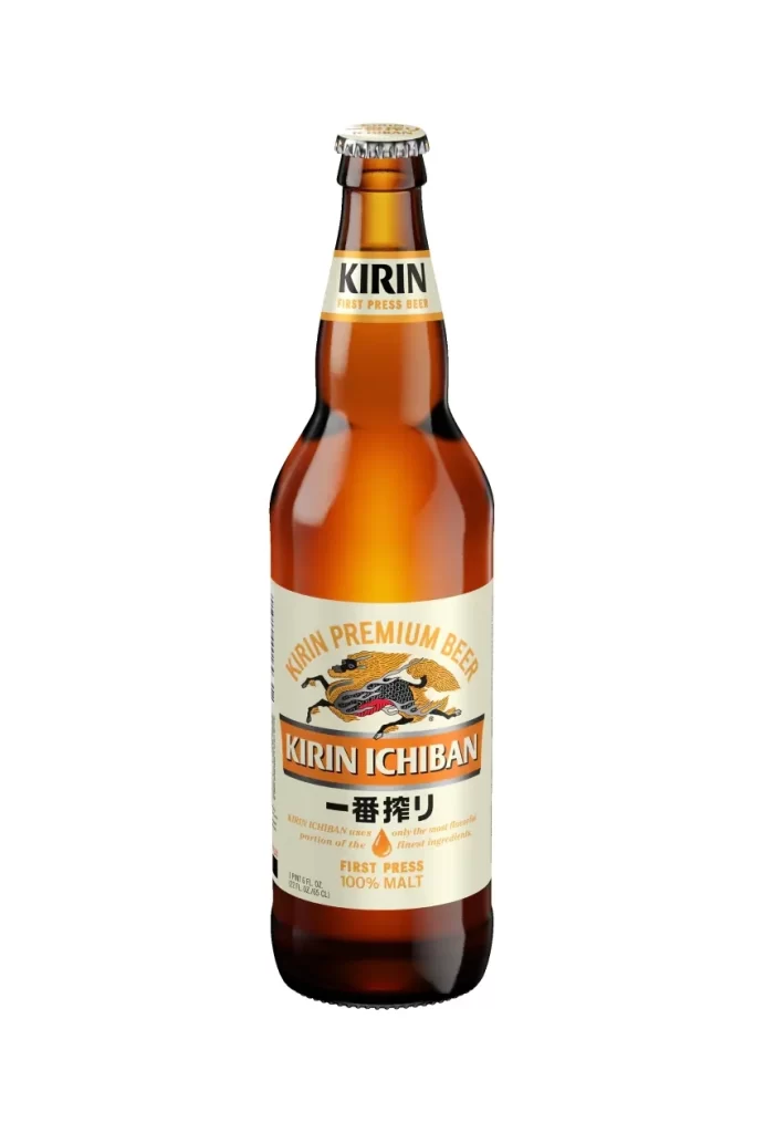
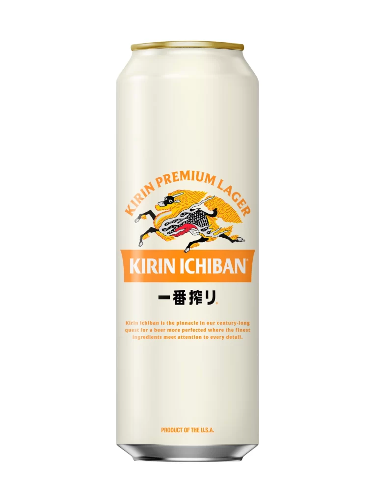
Six cylindrical aluminum cans of Kirin Ichiban beer stand in a tight, staggered formation against a seamless white void. The packaging features a clean, off-white base accented by a vibrant orange band that bisects the label, while the iconic golden Kirin creature leaps dynamically across the center. Bold black Japanese characters for 'Ichiban' sit directly beneath the brand name, accompanied by a single amber droplet icon and the text 'First Press 100% Malt' in a smaller, refined typeface.

Visual hierarchy is masterfully controlled through the strategic use of the signature orange hue, which draws the eye immediately to the product name and its premium brewing claim. The mythical beast illustration adds a layer of traditional heritage that contrasts sharply with the modern, minimalist layout of the typography. Such a design successfully balances cultural identity with contemporary commercial aesthetics, ensuring high shelf visibility through its distinct color blocking and clear informational architecture.

Brand strategists might analyze this composition to understand how heritage symbols can be integrated into modern consumer goods without appearing dated. Packaging engineers could study the spatial arrangement of text elements to optimize readability on curved surfaces. Furthermore, color theorists will find value in examining how a limited palette of cream, orange, and gold creates a cohesive and luxurious visual identity for a mass-market beverage.