Title

Kirin Beer Packaging P


Topics

BeerDrink CanKirin Beer

Details

Uploaded user: Leo

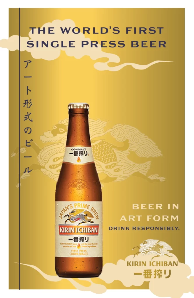
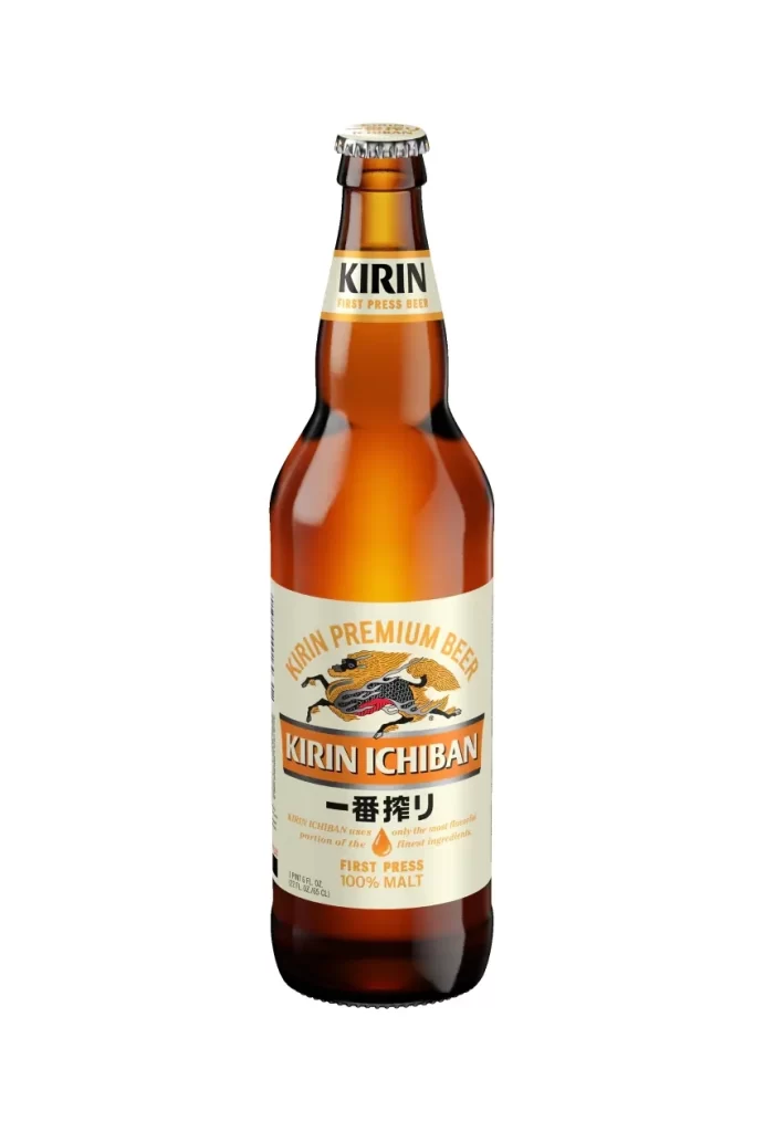
The amber glass vessel tapers upward into a classic conical silhouette, sealed by a silver crown cap. A cream-colored label anchors the visual weight in the lower half, featuring the Kirin mythological beast rendered in gold and black ink above bold red typography spelling 'KIRIN ICHIBAN'. Below the English branding, black kanji characters for '一番搾り' accompany a golden droplet icon and the 'FIRST PRESS' designation.

Visual hierarchy operates through deliberate chromatic contrast between the warm brown glass and the cool off-white label field. The mythical Kirin creature serves as the primary illustrative anchor, lending heritage authority to the product, while the red banner creates an immediate focal point for brand recognition. Typographic layering—arched premium text, horizontal brand name, and vertical Japanese script—establishes a structured information architecture that balances Eastern and Western design sensibilities.

Packaging analysts might examine this composition to study how traditional motifs integrate with modern beverage marketing strategies. Industrial designers could reference the label proportions and color distribution when developing new glass-container identities for Asian markets. Brand strategists may utilize this case study to understand how multilingual text placement affects consumer perception of product authenticity and quality positioning.