Title

Kirin Beer Packaging G


Topics

BeerDrink CanKirin Beer

Details

Uploaded user: Leo

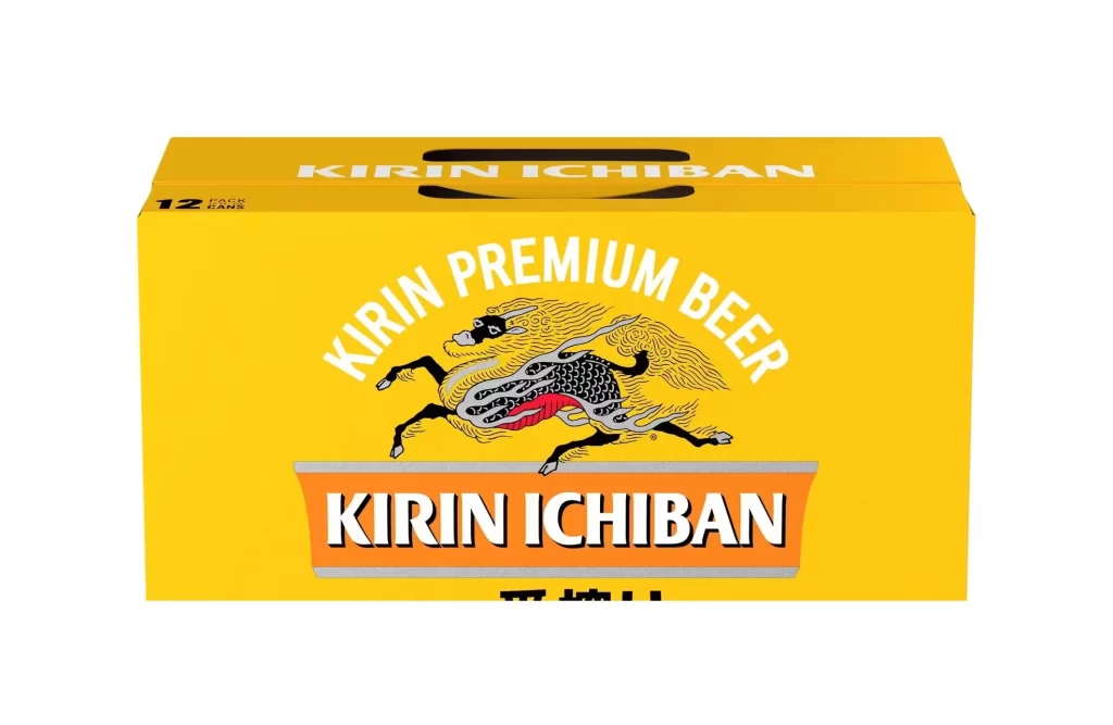
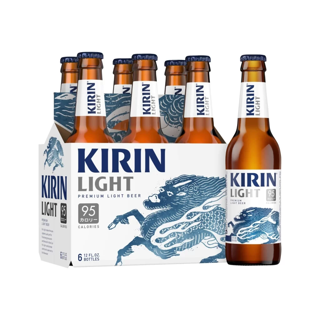
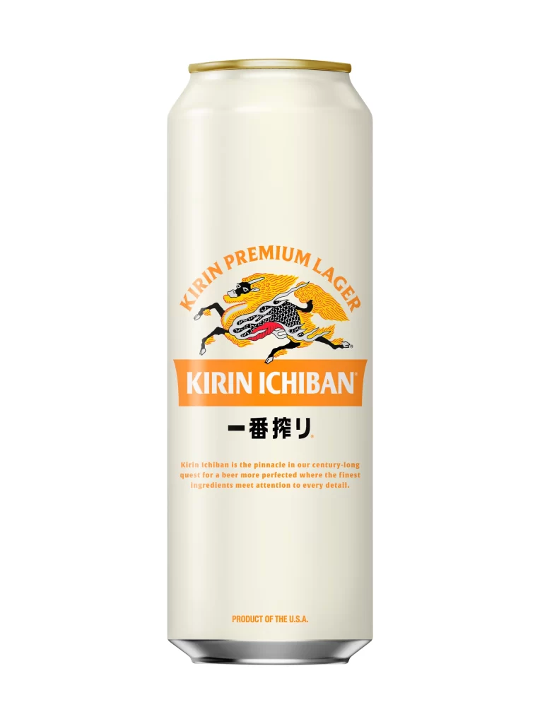
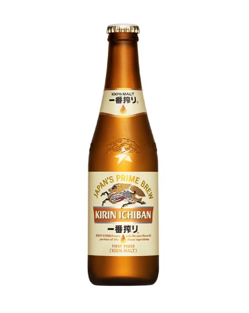
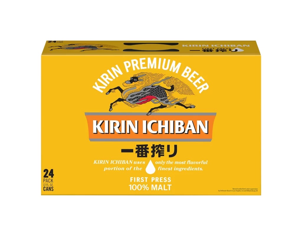
A six-pack of Kirin Ichiban beer occupies the frame in a three-quarter studio view that highlights the cardboard carrier's structural geometry and pale gold base color textured with subtle condensation droplets. The packaging features the brand's signature mythical creature rendered in black, yellow, and red, alongside six brown glass bottles with silver caps displaying 'KIRIN FIRST PRESS BEER' labels in black text on cream backgrounds with gold bands.

Visual distinction emerges from the dynamic interplay between traditional Japanese heraldry and modern industrial beverage packaging. The kirin creature’s stylized anatomy—featuring flowing manes and scaled bodies—creates organic movement that contrasts sharply with the rigid rectangular format of the carrier. Color blocking proves particularly effective, as the vibrant orange banner containing ‘KIRIN ICHIBAN’ anchors the composition while the bilingual text elements balance Eastern calligraphy with Western sans-serif clarity.

Brand strategists analyzing Asian market entry strategies would examine this artifact to understand how heritage motifs translate to mass-market retail environments. Packaging engineers might study the carrier’s structural folds and bottle-neck visibility ratios for similar product lines. Cultural historians could utilize the specific iconography to track the evolution of corporate identity within Japan’s brewing industry during the late twentieth century.