Kirin Beer Packaging u
Topics
Details
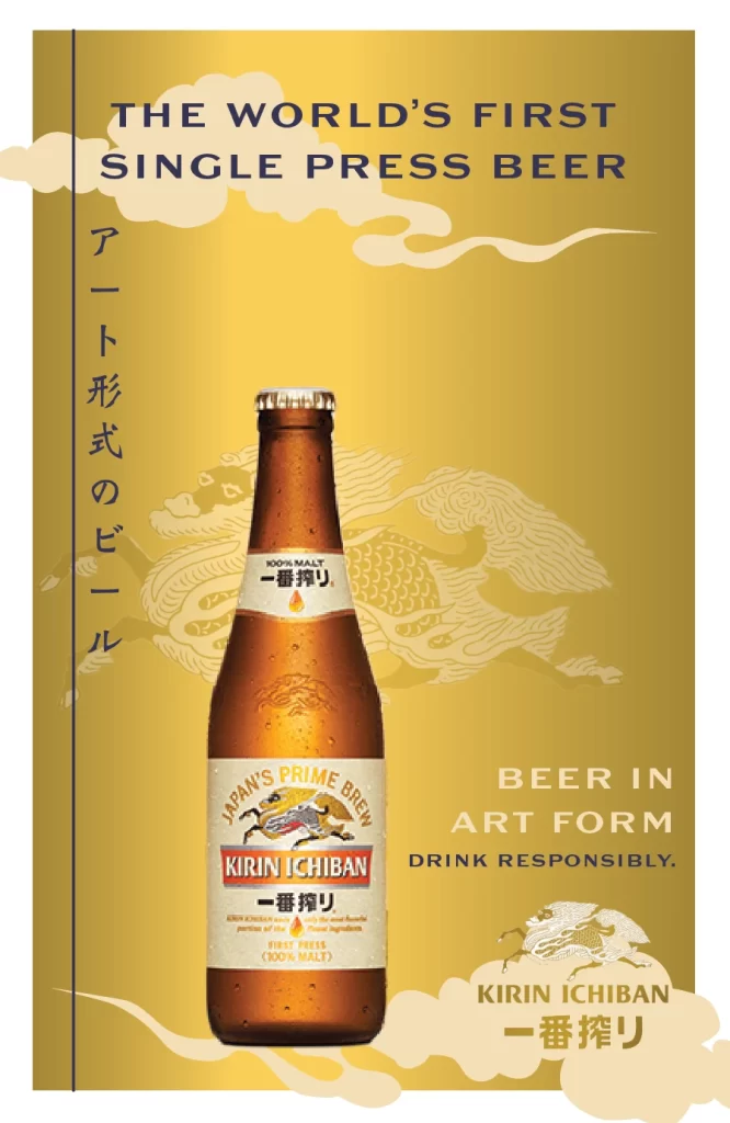
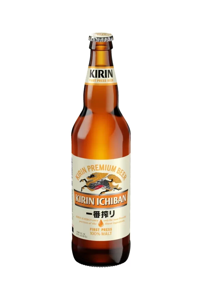
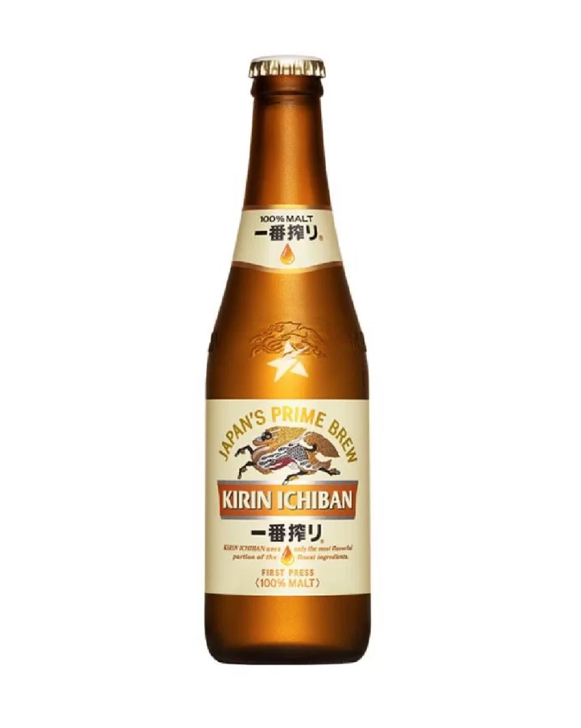
Amber glass forms the tall, straight silhouette of the Kirin Ichiban bottle, sealed at the top by a silver crown cap. A cream-colored neck label displays the brand name in rust-orange serif type above the golden Kirin mythological beast, while the main body label mirrors this palette with 'KIRIN ICHIBAN' and Japanese characters set against a white background.
Visual hierarchy commands attention through the strategic use of metallic gold foil against matte cream backgrounds, creating a premium tactile impression even in two dimensions. The mythical creature illustration serves as the anchor graphic, its dynamic posture contrasting with the rigid typographic blocks surrounding it. Subtle details like the arched ‘FIRST PRESS’ text and the droplet motif reinforce the product’s brewing philosophy without cluttering the composition.
Brand historians analyzing Japanese beverage marketing evolution will find this packaging iteration particularly useful for studying color psychology in alcoholic beverages. Packaging engineers can examine the label-to-glass ratio and typography scaling for similar premium product lines. Beverage photographers might study the lighting setup that achieves such even glass transparency without distracting reflections.