Kirin Beer Packaging N
Topics
Details
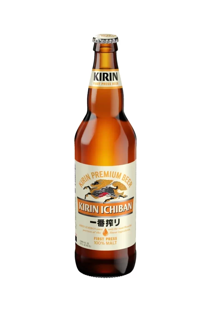
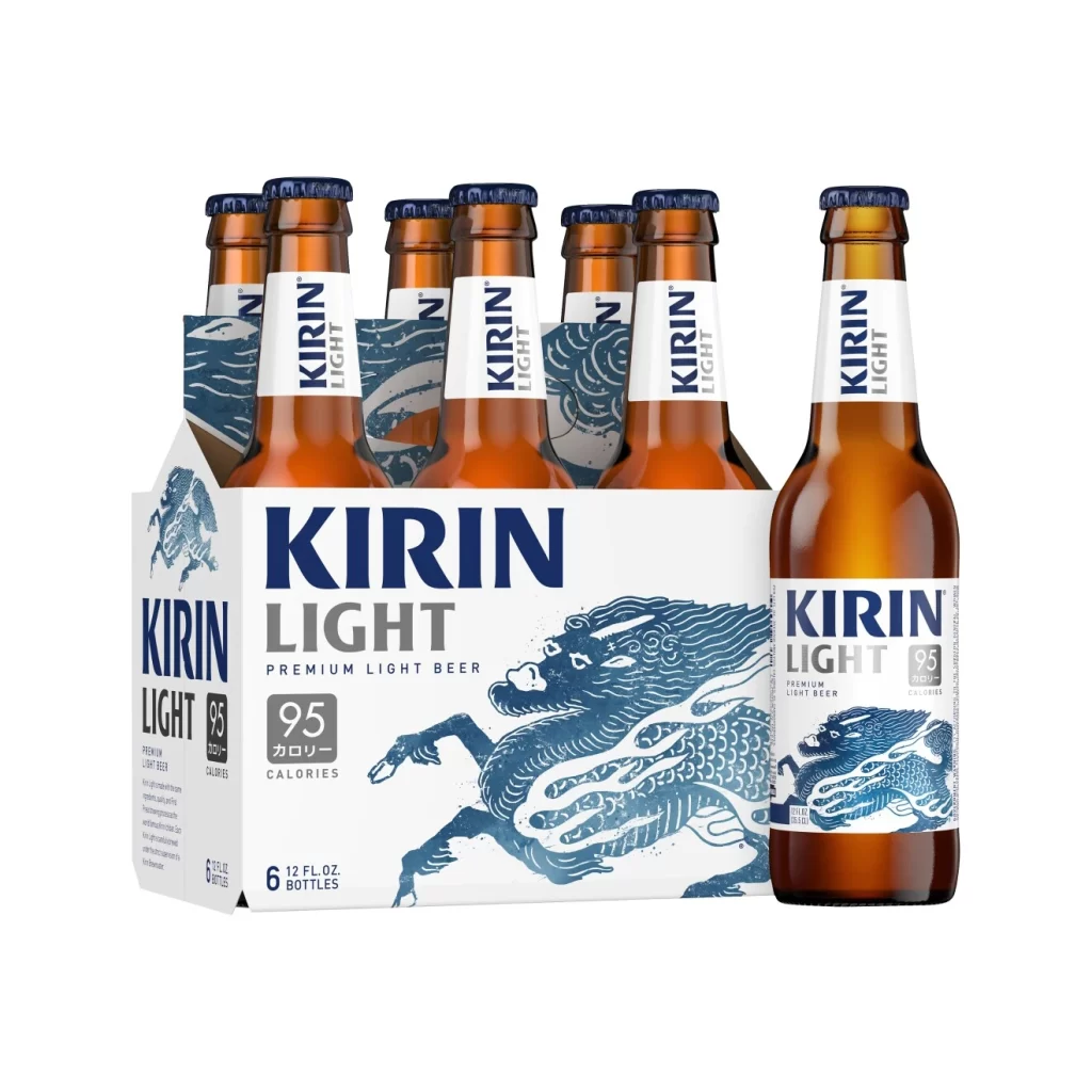
Two brown glass beer bottles flank a tall, curved pilsner glass filled with golden liquid and a thick white head on a solid pale cream backdrop. The left bottle features Kirin Ichiban branding with a white label, orange accents, and a gold Kirin creature illustration, while the right bottle displays Kirin Light with a white label, blue dragon artwork, and silver text indicating 95 calories.
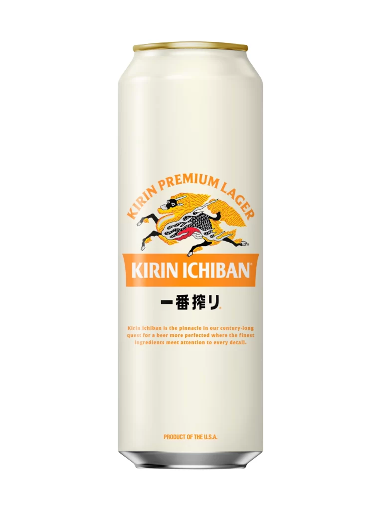
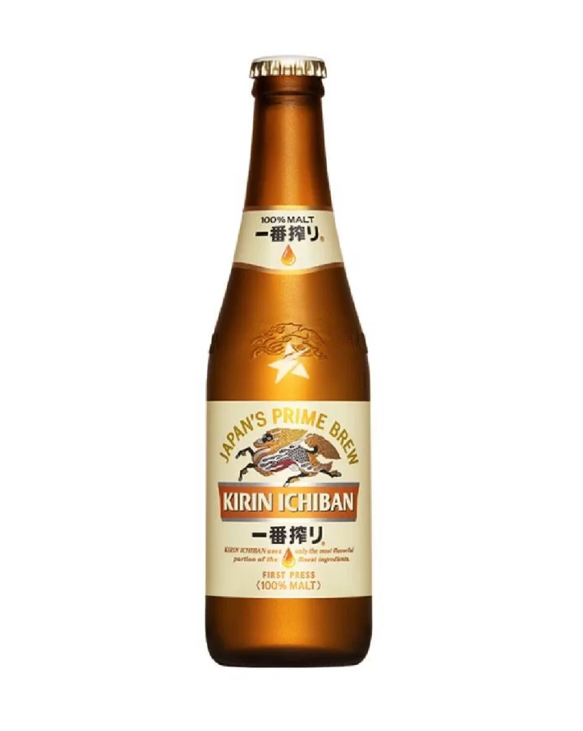
Visual distinction arises from the contrasting color palettes assigned to each product variant, where warm orange tones signal the premium lager and cool blue hues denote the lighter option. The consistent placement of mythical creature illustrations across different label designs creates a cohesive brand identity while allowing immediate differentiation between product lines. Typography choices further separate the two, with bold sans-serif lettering on the light beer contrasting against the more traditional serif elements on the premium label.
Packaging designers studying beverage labeling systems can examine how color coding and iconography work together to distinguish product variants within a single brand family. Marketing teams developing visual identity guidelines might reference this composition when establishing hierarchy between flagship and specialty items in a product lineup. Illustrators tasked with creating mascot systems for alcoholic beverages could analyze how the stylized creatures integrate with typography without overwhelming the essential nutritional and origin information.