Kirin Beer Packaging {
Topics
Details
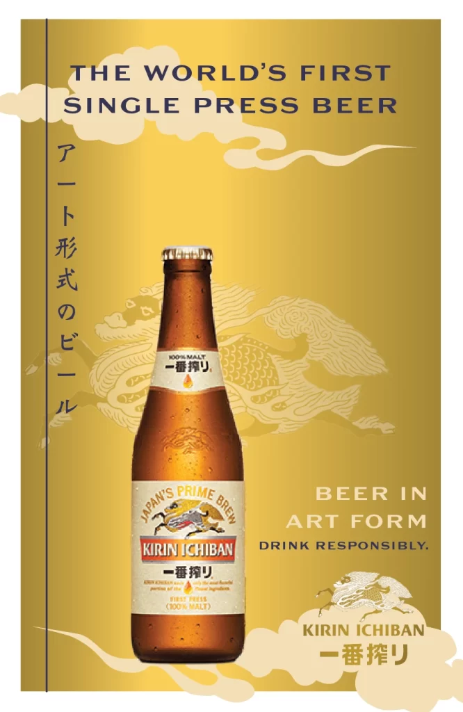
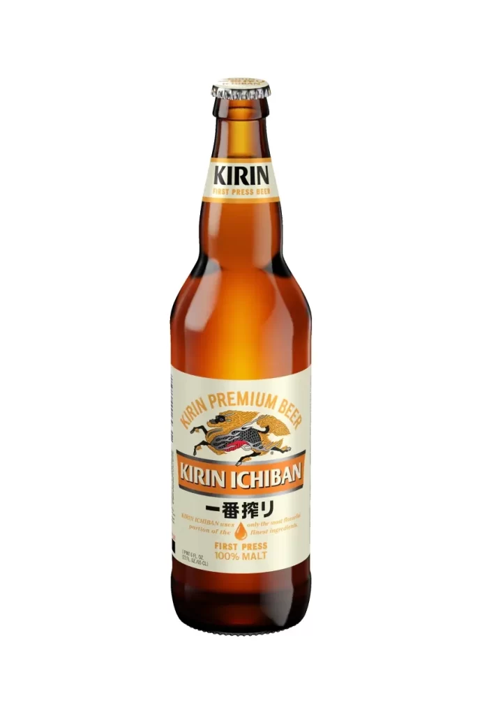
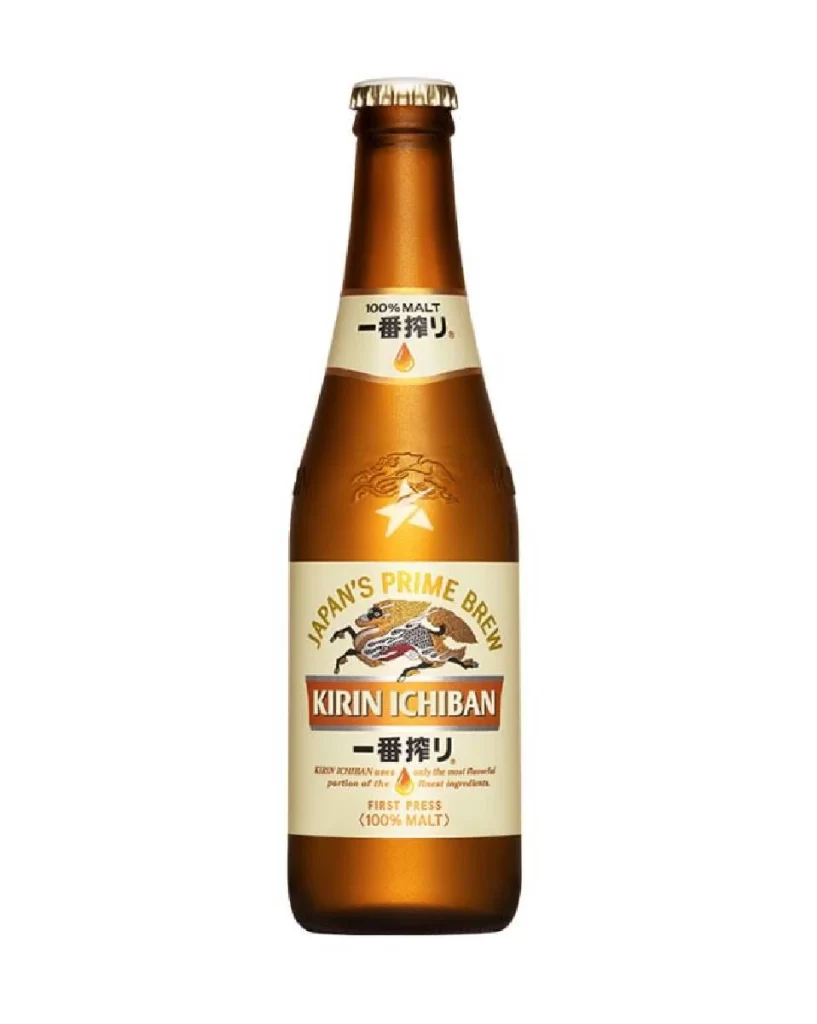
A single amber glass bottle stands in a rigid frontal orientation, its surface catching a soft highlight along the left shoulder that emphasizes the curvature of the brown glass and the metallic gold of the crown cap. Dominating the label is the Kirin Ichiban branding, featuring bold white typography set within an orange rectangular field, surmounted by
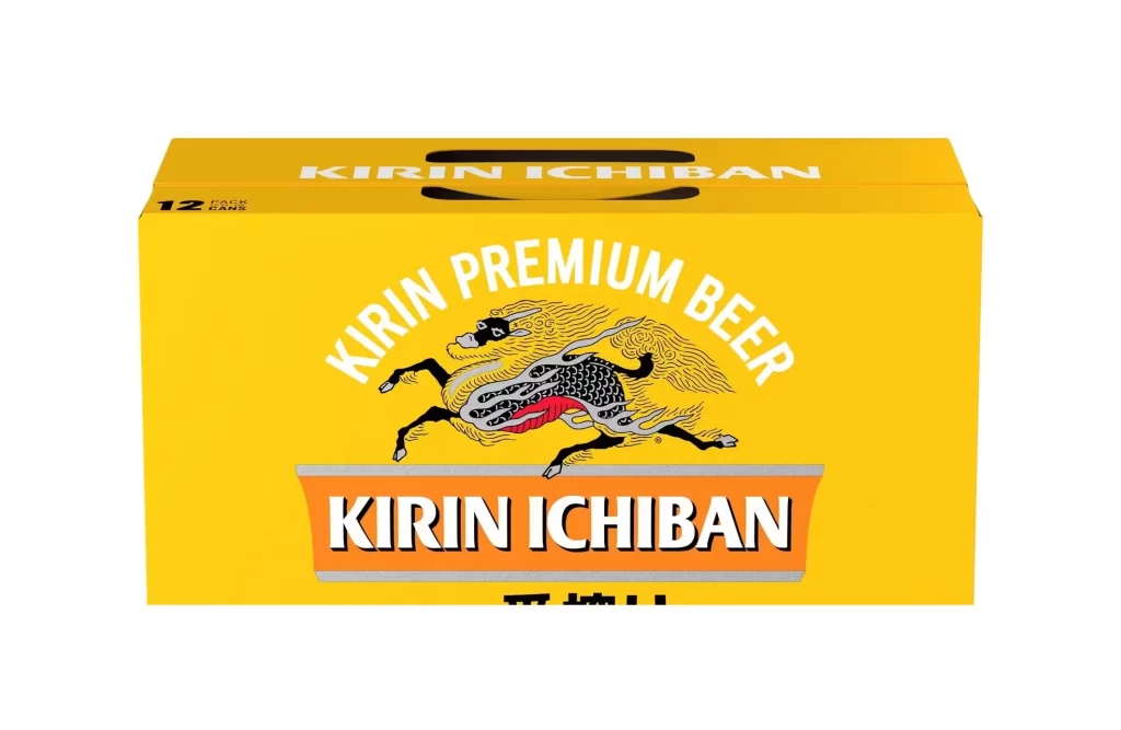
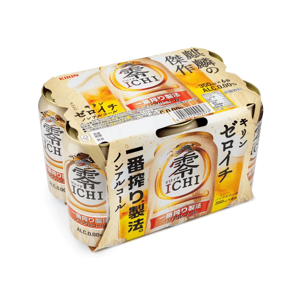
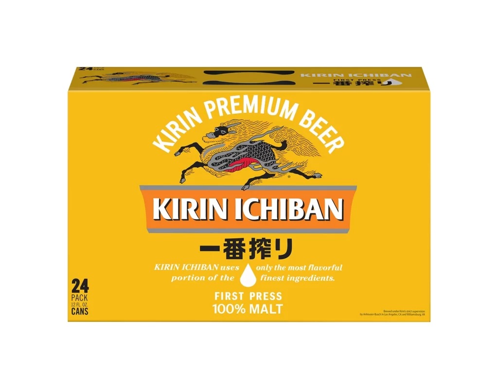
Visual hierarchy is established through the stark contrast between the warm amber substrate and the vibrant orange and white graphic elements. The inclusion of the traditional Japanese beast adds a layer of cultural narrative that distinguishes this lager from minimalist Western counterparts. Furthermore, the specific typographic arrangement—balancing English text with Japanese Kanji—creates a bilingual aesthetic that appeals to both local and international markets.
Brand strategists might utilize this composition to analyze how heritage imagery reinforces product identity in competitive beverage markets. Packaging engineers could examine the interplay between the bottle’s silhouette and the label’s aspect ratio to optimize shelf presence. Additionally, color theorists will find value in studying how the specific palette of burnt orange and deep amber evokes feelings of warmth and premium quality.