Kirin Beer Packaging H
Topics
Details
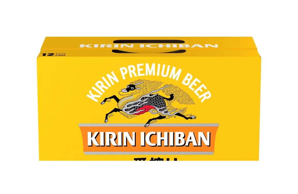
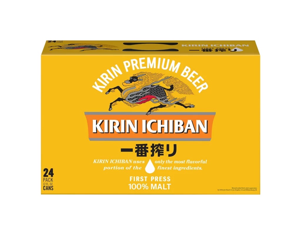
A golden-yellow cardboard carrier dominates the frame, featuring a subtle texture of condensation droplets across its surface. Centered within the packaging is a photographic representation of a 330ml aluminum can, displaying the Kirin Ichiban branding in bold black English typography and vertical Japanese characters. The composition is shot straight-on against a stark white background, with the bottom left corner marked by the word 'Imported' and the lower right detailing the volume as '330mL × 6 CANS' alongside multilingual alcohol warnings.
Visual interest stems from the interplay between the matte, fibrous texture of the outer carton and the metallic sheen of the depicted beverage can. The strategic placement of water droplet graphics creates an illusion of chilled freshness, while the bilingual text layout balances Western sans-serif fonts with traditional East Asian calligraphy. Such packaging effectively communicates product origin and premium positioning through its restrained color palette of gold, black, and crimson accents.
Brand managers analyzing competitive beverage packaging in Southeast Asian markets would find this layout useful for studying import labeling requirements. Packaging engineers could examine the structural design of six-pack carriers and the integration of moisture-resistant graphical elements. Marketing teams might reference the specific typographic hierarchy used to convey 'First Press' brewing methods to international consumers.