Title

Kirin Beer Packaging d


Topics

BeerDrink CanKirin Beer

Details

Uploaded user: Leo

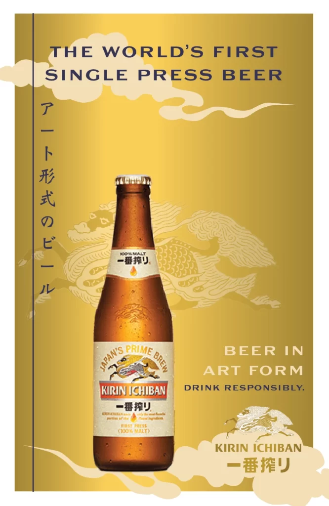
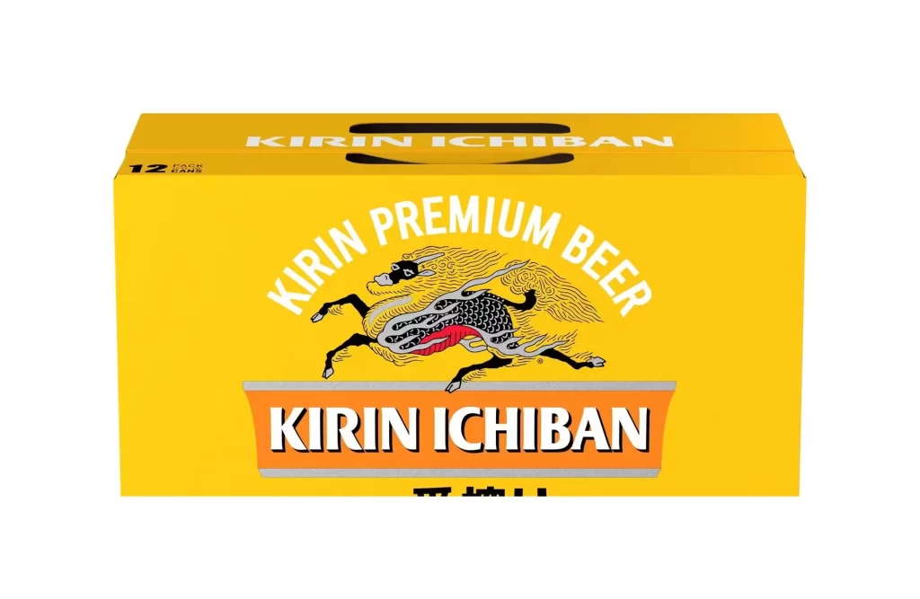
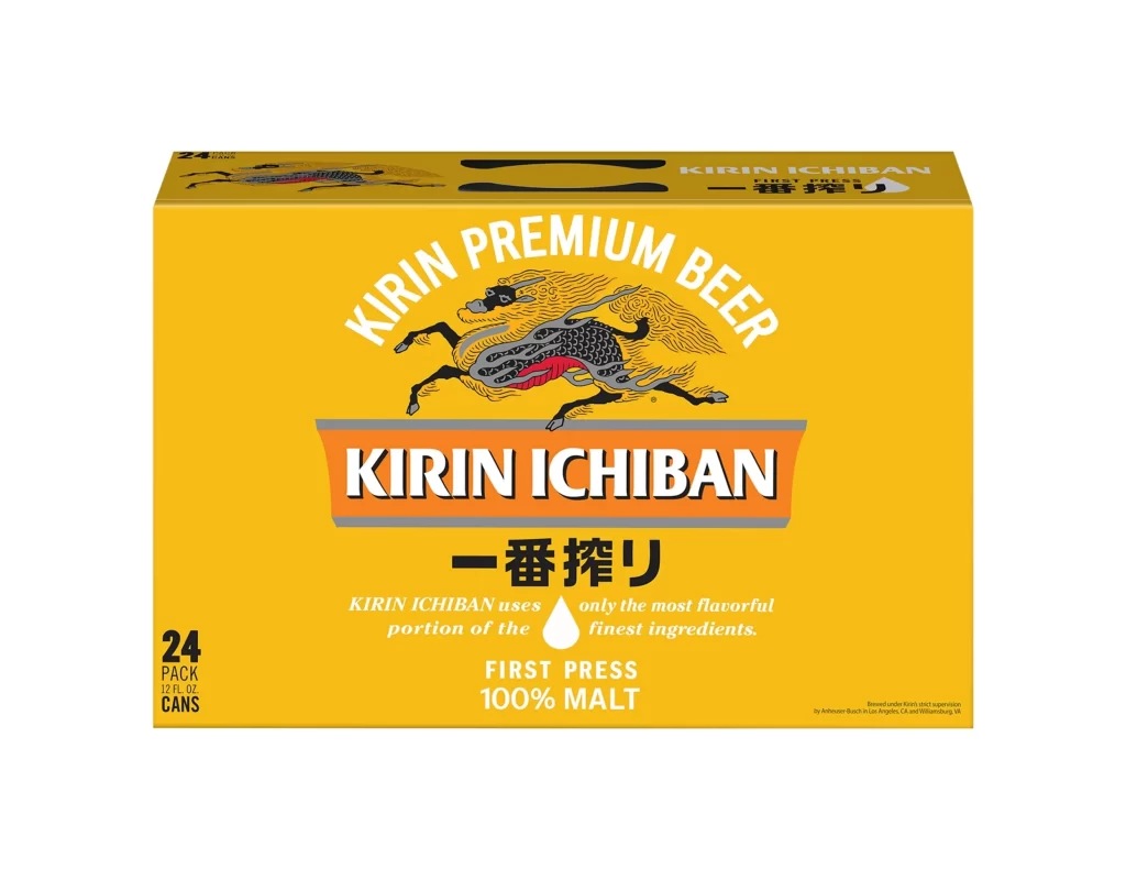
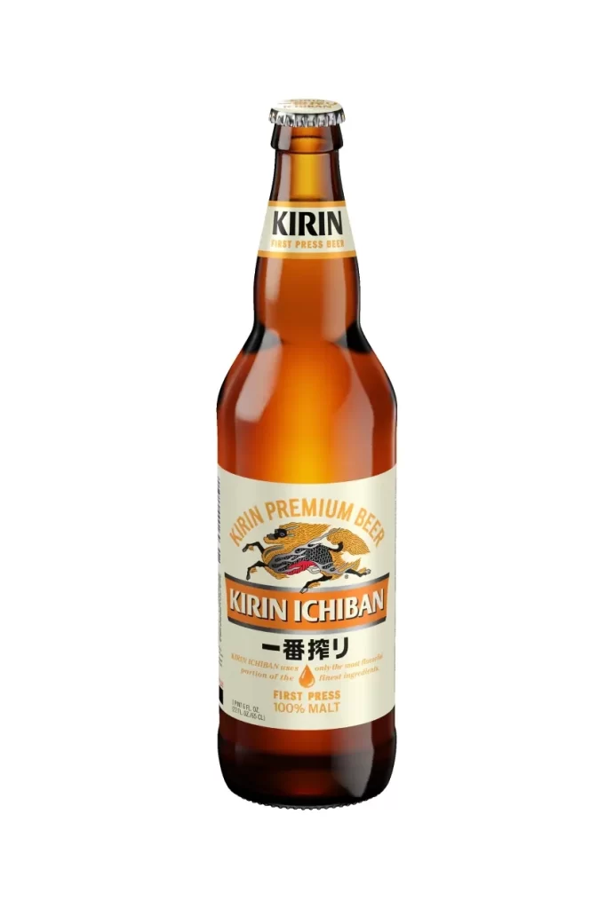
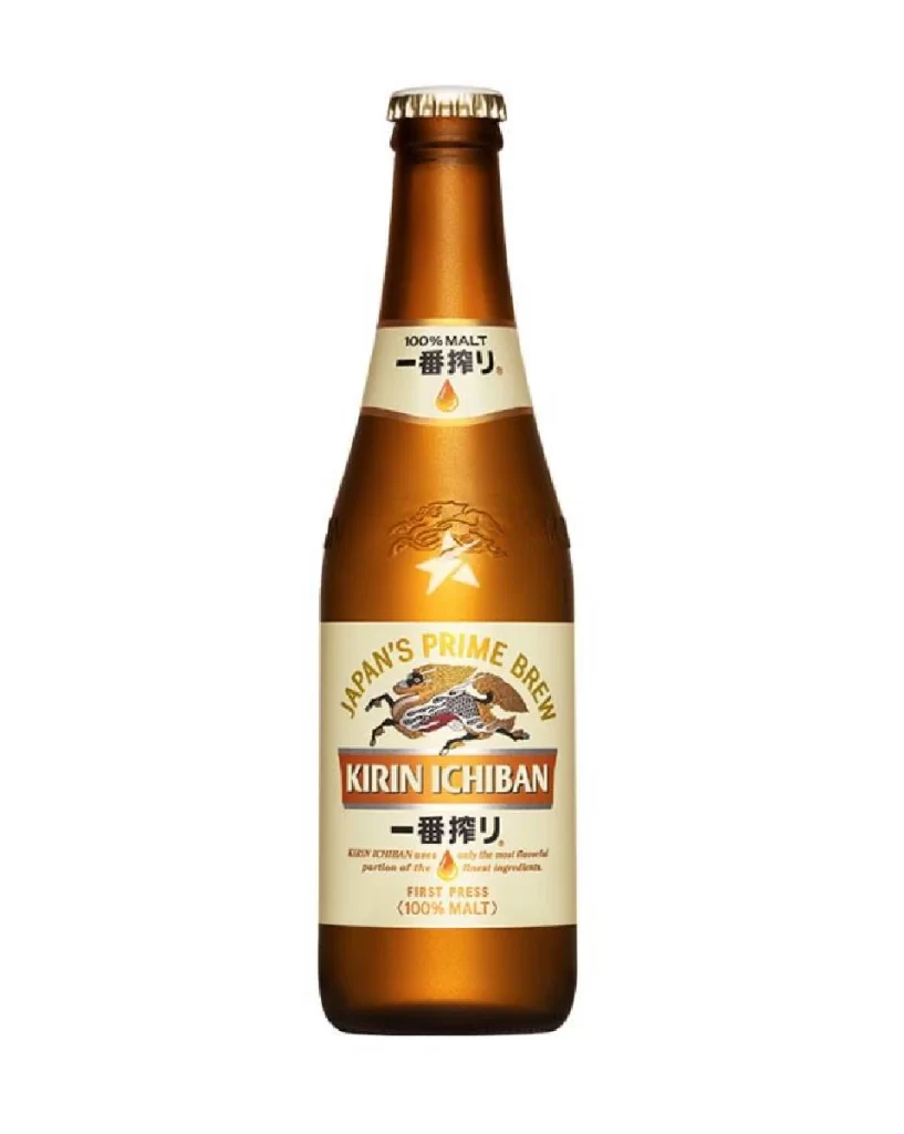
A single amber glass bottle of Kirin Ichiban stands on the central vertical axis, viewed from a direct, frontal perspective that eliminates distortion. The vessel features a metallic silver crown cap and a white label dominated by the brand's signature red logotype, flanked by the Japanese characters 一番搾り and the English declaration '100% MALT'. Behind the bottle, an intricate black and gold illustration of a mythical Kirin creature stretches across a saturated cadmium yellow field.

Visual tension emerges from the juxtaposition of industrial packaging precision against organic, mythological illustration, where the creature’s sinuous form appears to propel the product forward through negative space. The restricted palette of amber, crimson, ivory, and jet black creates a high-contrast hierarchy that directs attention immediately to the typographic lockup while allowing the background iconography to provide cultural depth without cluttering the primary subject. Such deliberate layering transforms standard beverage photography into a narrative composition that leverages heritage symbolism to elevate mass-market positioning.

Brand strategists examining cross-cultural visual identity systems would find this arrangement instructive for balancing contemporary packaging constraints with traditional artistic motifs. Art directors developing campaigns for premium alcoholic beverages could analyze how the mythical creature’s posture reinforces perceived quality without overwhelming legible information. Additionally, illustrators studying the integration of line-work with photographic elements might reference this execution when attempting to merge hand-drawn assets with studio-lit products.