
Kirin Beer Packaging V
Topics
Details
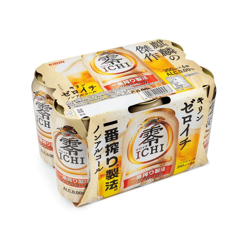
A six-pack of Kirin Zero Ichi non-alcoholic beer sits at a slight three-quarter angle on a white surface, revealing the front shrink-wrap and individual cans beneath. The packaging features a warm, creamy beige palette accented by vibrant yellow gradients and bold red banners highlighting the 'Ichiban Shibori' brewing method. Visible text includes the Kirin brand name, 'Zero Ichi' in large characters, 'Non-Alcohol,' and specifications for 350ml × 6 cans with 0.00% alcohol content.
What makes this particular iteration stand out is its sophisticated use of transparency and layering to simulate condensation and liquid freshness without using actual photography of the drink. The typography is a compelling mix of traditional Japanese characters and modern sans-serif fonts, creating a visual hierarchy that guides the eye from the brand mark down to the product benefits. Furthermore, the texture work on the cardboard carrier mimics wood grain, adding a tactile, premium quality that contrasts sharply with the metallic sheen of the aluminum cans peeking through the plastic film.
3D environment artists modeling convenience store assets will find the specular highlights on the curved can tops invaluable for understanding how light interacts with cylindrical metal surfaces. Branding specialists studying Asian market trends can analyze how the layout balances dense nutritional information with bold marketing claims. Additionally, illustrators looking to practice rendering translucent materials can use the frosted glass effects on the main label as a perfect study in opacity and refraction.





























![Kirin Beer Packaging ]](https://gropicture-1323946364.cos.na-siliconvalley.myqcloud.com/wp-content/uploads/2026/07/CLG-4443841-0__87553-1024x842.webp)



















