Kirin Beer Packaging ]
Topics
Details
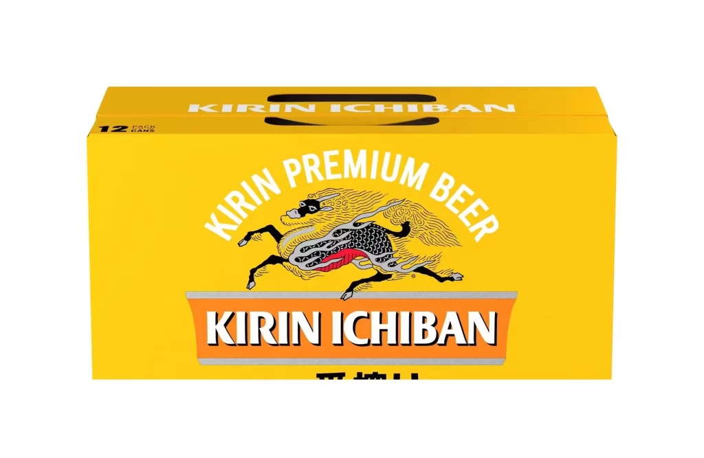
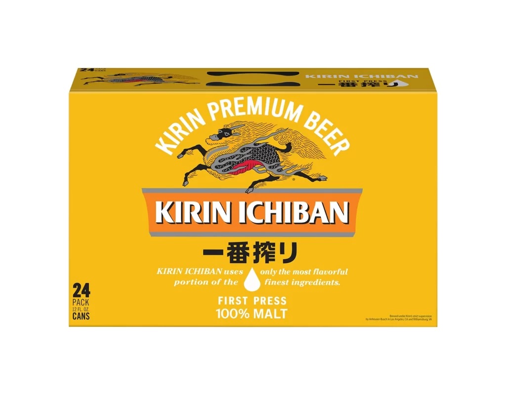
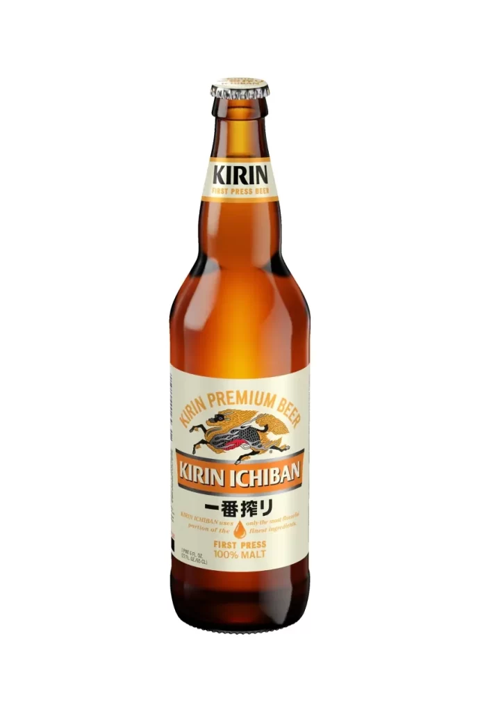
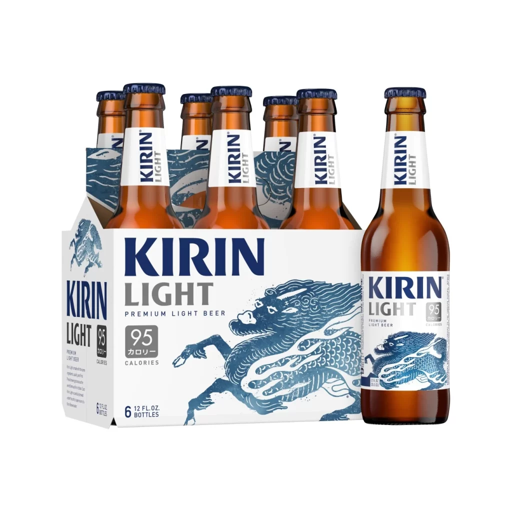
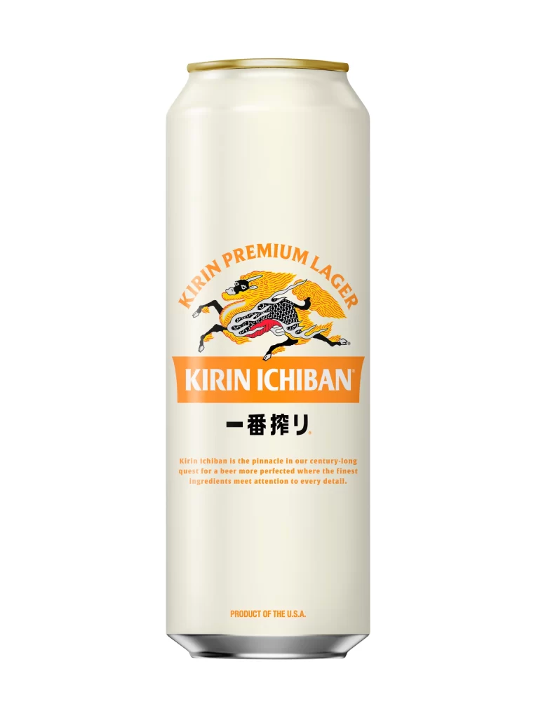
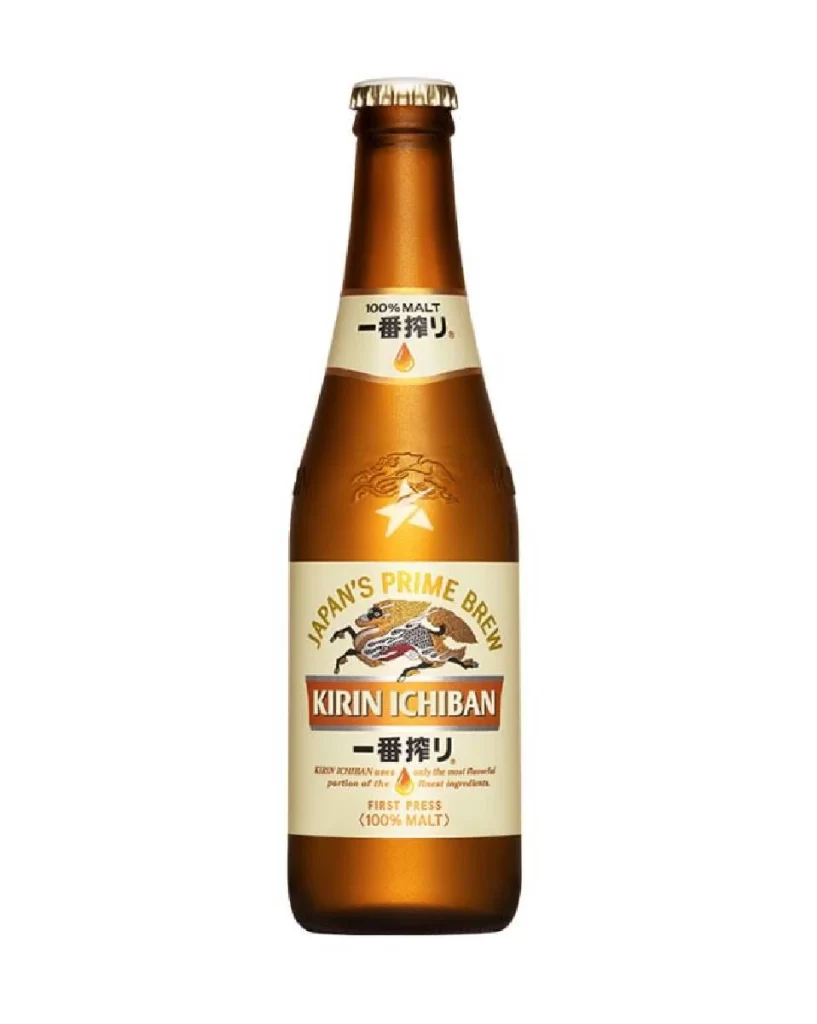
A rectangular cardboard case of Kirin Ichiban beer presents its front and left side panels from a three-quarter perspective, resting on a white surface. Pale cream packaging forms the base, accented by a solid gold band running along the bottom edge, while the iconic Kirin mythical creature dominates the center in black, white, and gold with red highlights. The design features 'JAPAN'S PREMIUM BEER' arched above the creature and 'KIRIN ICHIBAN' in bold lettering on a brown banner below.

Visual interest stems from the intricate linework of the Kirin beast, which provides a traditional Japanese aesthetic that contrasts sharply with the clean, modern typography of the English text. The color palette relies on a sophisticated combination of muted cream and metallic gold tones to convey a sense of premium quality and heritage. Furthermore, the layout balances the dynamic movement of the central illustration with the rigid geometry of the text blocks, creating a cohesive identity that stands out on retail shelves through its specific use of heraldic imagery rather than standard photographic elements.
Brand historians and packaging analysts might utilize this visual to study how Japanese breweries adapt traditional mythology for international markets. Graphic designers working on beverage branding could examine the hierarchy between the English and Japanese logotypes to understand effective bilingual layout strategies. Additionally, illustrators looking to incorporate mythological beasts into commercial art would find the stylized rendering of the Kirin a useful example of simplifying complex creatures for print production.