Kirin Beer Packaging [
Topics
Details
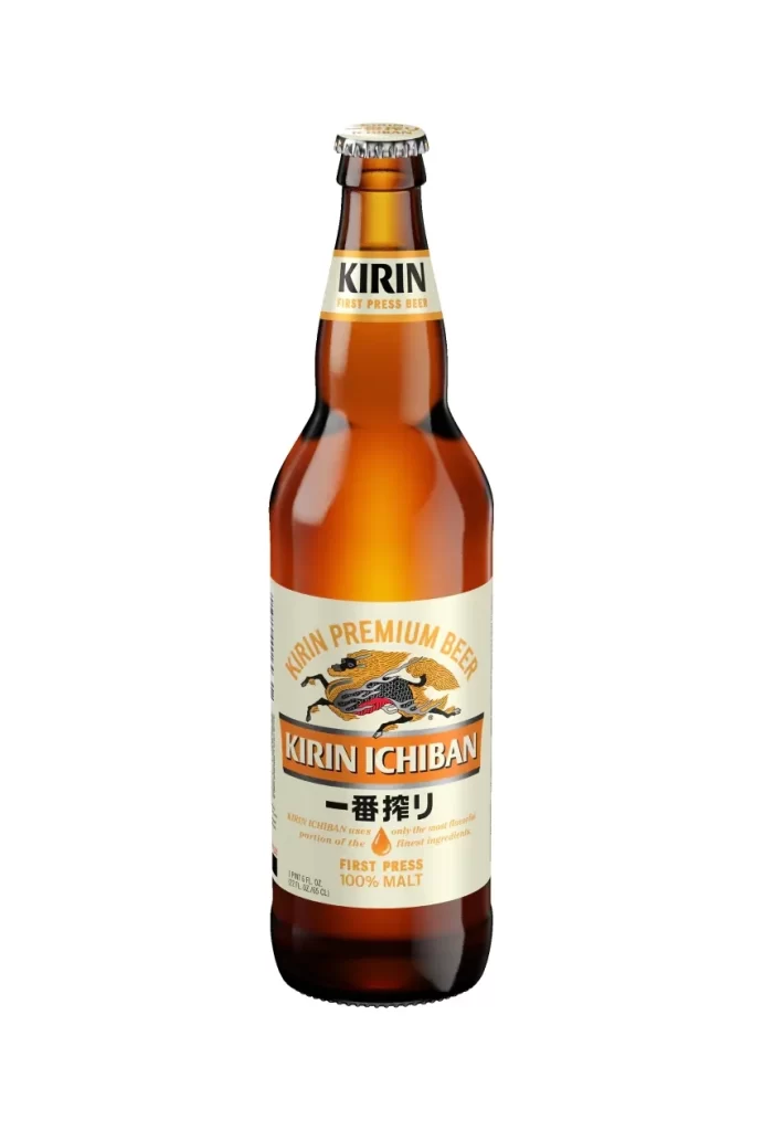
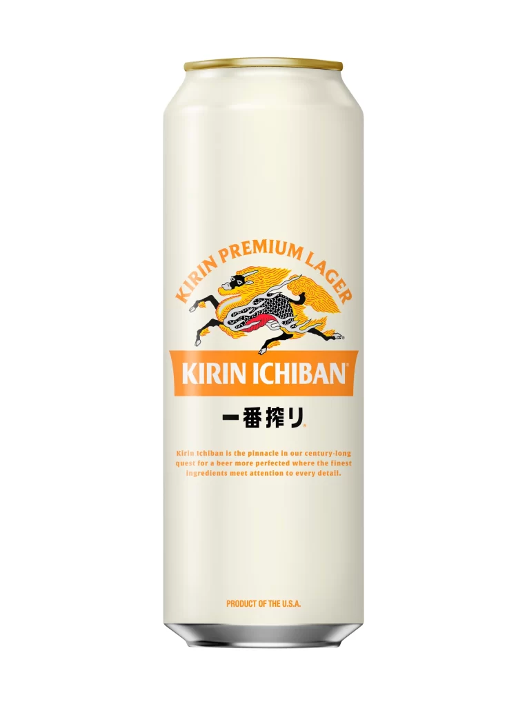
A cylindrical aluminum Kirin Ichiban can stands upright on a white surface, viewed from a direct frontal perspective that highlights its symmetrical design. The vessel features a pale cream base color with a thin gold rim at the top, while the upper arc displays 'KIRIN'S PRIME BREW' in bold orange serif lettering. Dominating the middle section is the iconic
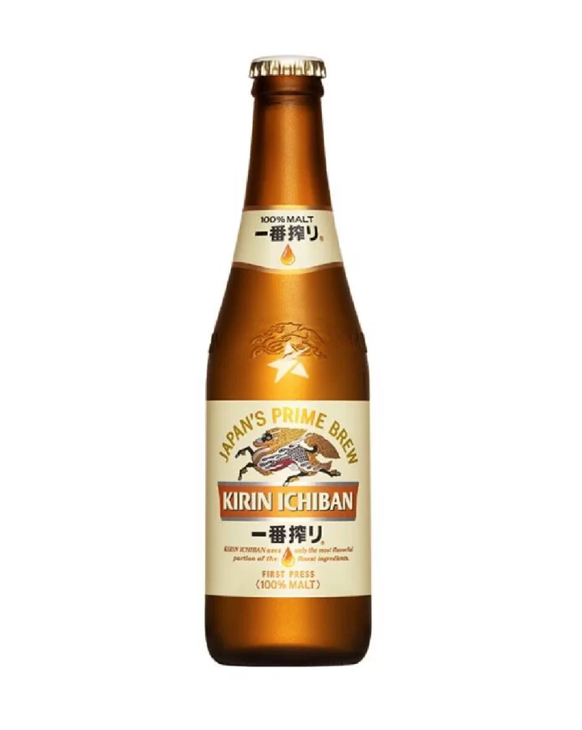
Visual hierarchy plays a crucial role here, with the warm orange palette creating immediate brand recognition while the cream background provides sophisticated contrast for the detailed mythological illustration. The strategic placement of the amber droplet icon between descriptive text blocks subtly reinforces the brewing process narrative without cluttering the composition. Circular elements like the red ‘啤酒’ badge and ‘麦芽100%’ notation anchor the lower portion, balancing the curved header text and establishing a cohesive Eastern-meets-Western aesthetic that feels both traditional and refreshingly modern.
Packaging designers studying beverage market trends would find this specimen particularly useful for analyzing how heritage brands maintain visual equity across international markets through bilingual typographic systems. Illustrators researching mythological motifs in commercial applications could examine the stylization techniques used to adapt the Kirin creature for print reproduction at various scales. Marketing teams developing premium positioning strategies might reference this layout when crafting narratives around ingredient purity and craftsmanship, especially the integration of technical brewing claims within an elegant visual framework.