Title

Kirin Beer Packaging D


Topics

BeerDrink CanKirin Beer

Details

Uploaded user: Leo

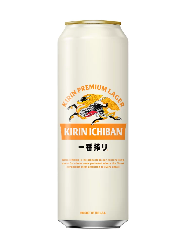
A cylindrical aluminum can finished in pale cream stands vertically, capped by a golden rim at the top. The central graphic features a dynamic Kirin creature rendered in black, white, and vibrant orange, with text elements including 'KIRIN PREMIUM LAGER' in an orange arc above the beast and a bold orange rectangle containing 'KIRIN ICHIBAN' positioned below it.

Visual interest stems from the striking contrast between the minimalist cream substrate and the saturated orange accents that dominate the branding hierarchy. The mythical Kirin illustration introduces a traditional Japanese aesthetic motif that distinguishes this lager from Western counterparts, while the clean typographic layout ensures immediate legibility. Subtle details like the small registered trademark symbol and the bottom-aligned ‘PRODUCT OF THE U.S.A.’ text complete the composition without cluttering the primary visual field.

Brand historians and packaging analysts might examine this artifact to study cross-cultural marketing strategies in beverage design. Industrial designers could utilize the color palette and spatial arrangement as a case study in premium product positioning within the competitive beer market. Students of typography may find value in analyzing how the bilingual text integration maintains visual balance across different script systems.