
Kirin Beer Packaging F
Topics
Details
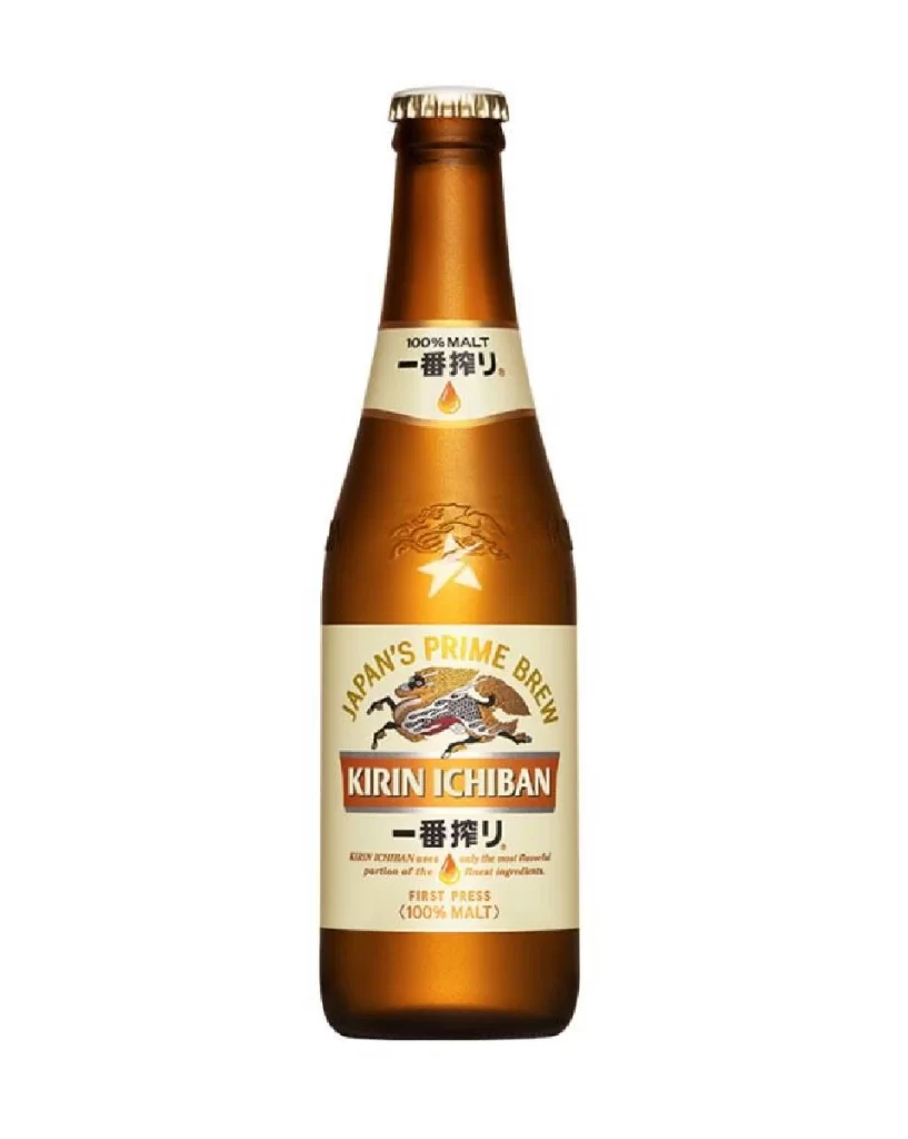
A tall amber glass bottle of Kirin Ichiban stands in a straight-on studio shot, its surface featuring an embossed Kirin logo and star just above the main label. The cream-colored label displays the brand name 'KIRIN ICHIBAN' in bold red serif lettering beneath the gold-arched text 'JAPAN'S PRIME BREW', while a neck band wraps the upper portion with '100% MALT' and Japanese characters.
Visual hierarchy is established through the contrast between the warm, translucent brown glass and the crisp, light-colored paper labels. The central illustration of the mythical Kirin beast adds a layer of traditional Japanese artistry that distinguishes this specific packaging from more minimalist Western beer designs. Furthermore, the subtle tactile details like the raised glass emblem and the specific placement of the ‘FIRST PRESS’ subtext create a sense of premium craftsmanship and authenticity.
Product photographers might utilize this composition to study how to effectively isolate glass objects without losing highlight definition. Brand strategists could analyze the integration of English and Japanese typography to understand how global brands maintain local cultural relevance. Additionally, 3D modelers often require such clear, unobstructed views to accurately recreate the curvature of commercial glassware and the specific texture of printed adhesive labels for virtual environments.





























![Kirin Beer Packaging ]](https://gropicture-1323946364.cos.na-siliconvalley.myqcloud.com/wp-content/uploads/2026/07/CLG-4443841-0__87553-1024x842.webp)



















