Kirin Beer Packaging Q
Topics
Details
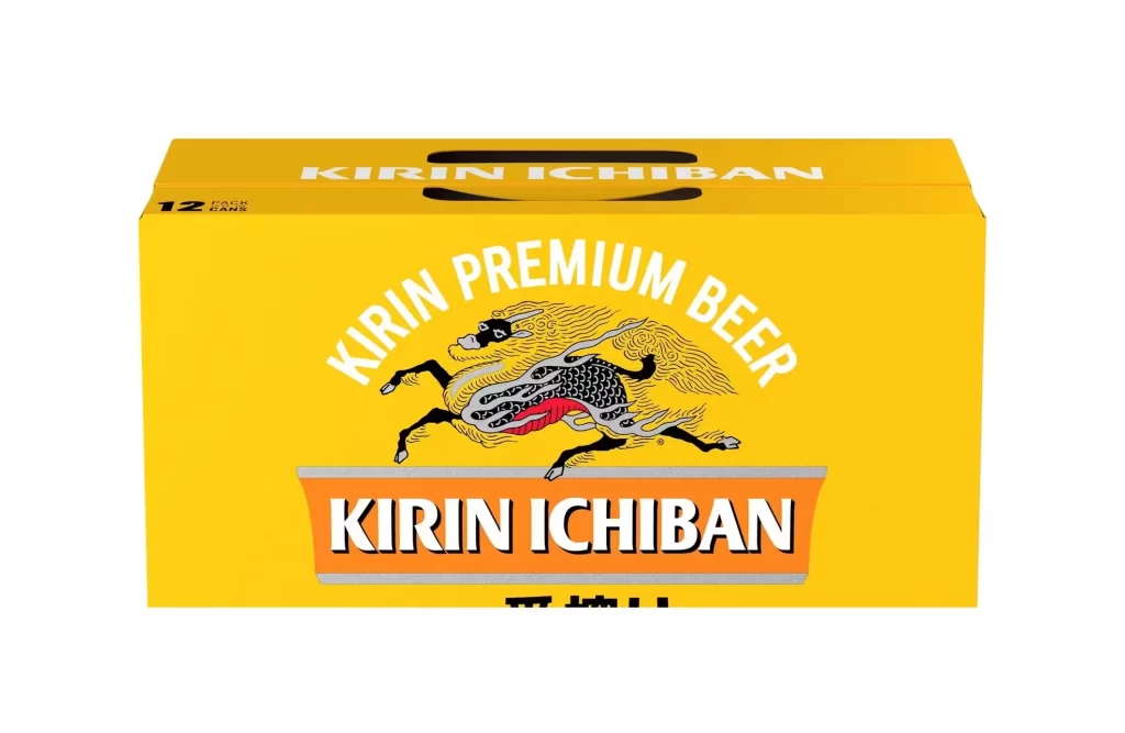
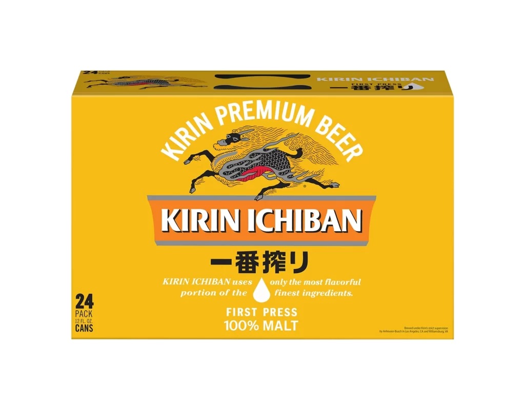
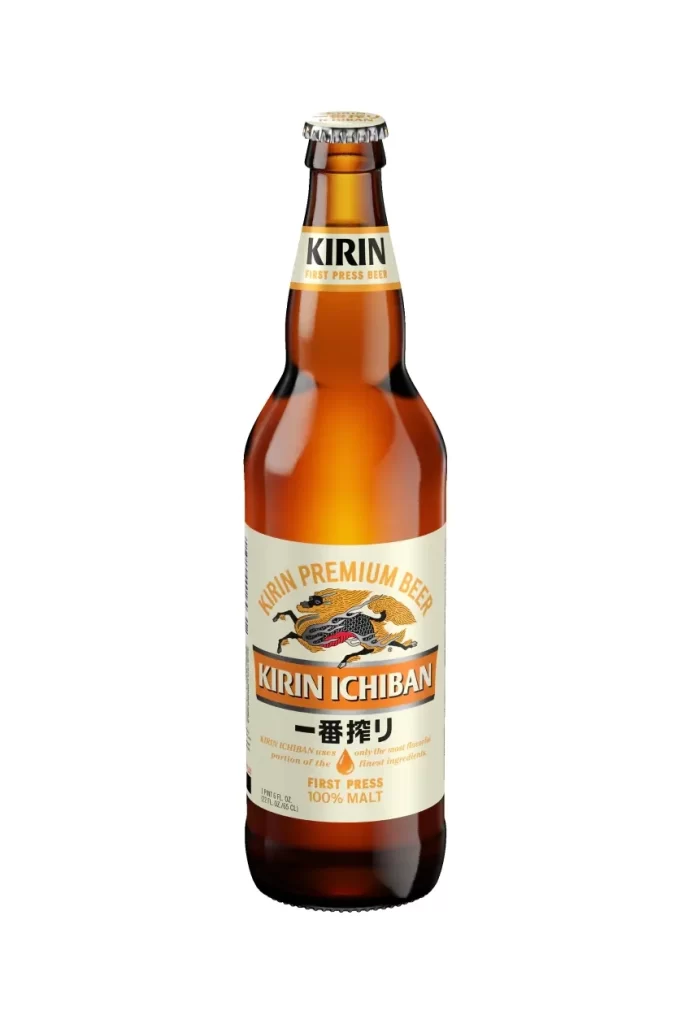
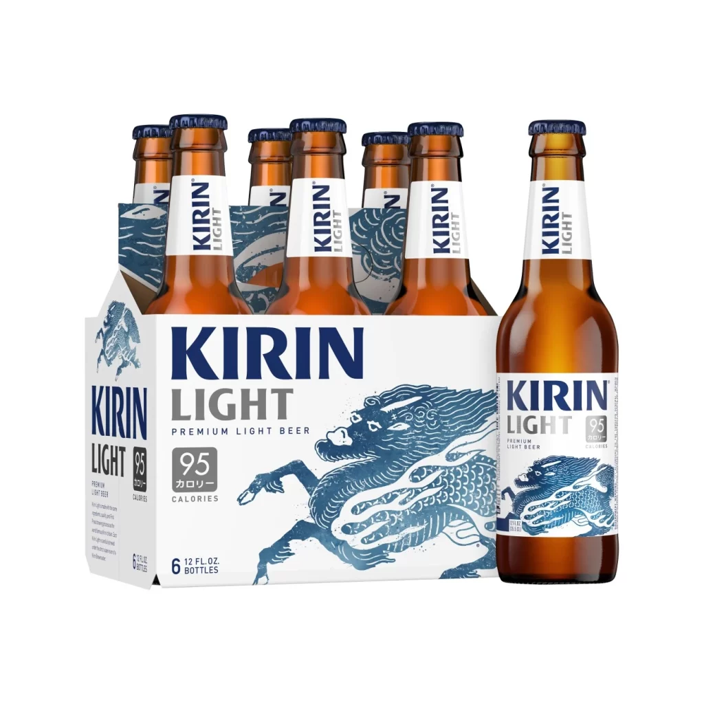
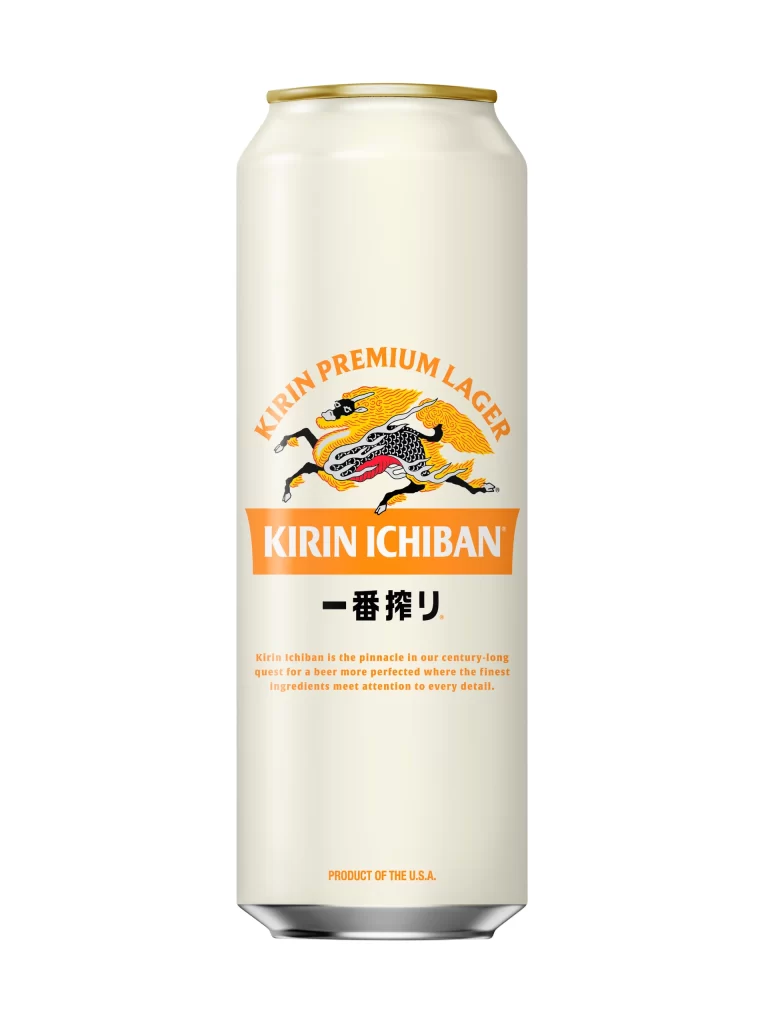
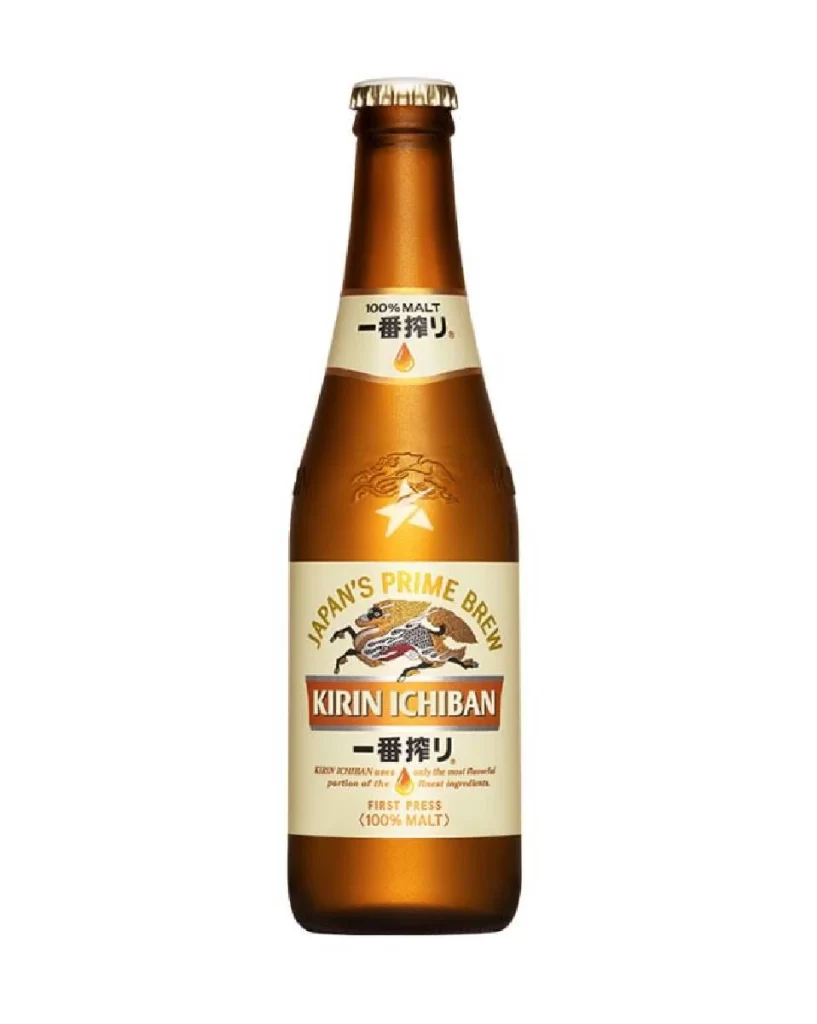
A cream-colored aluminum can with a golden rim stands beside a matching cardboard carrier, both displaying the Kirin Ichiban branding in orange and black. The mythical Kirin creature appears in a dynamic leaping pose on each item, its flowing golden mane and intricate scales rendered against a white background. This 12-pack of 12 fl oz cans features the Japanese text 一番搾り below the brand name, with '5% ALC BY VOL' noted on the carrier's upper right corner.
Visual interest stems from the striking contrast between the traditional mythological imagery and the clean, modern layout of the text elements. The use of a limited color scheme ensures that the detailed illustration of the dragon-horse hybrid remains the focal point without overwhelming the consumer. Furthermore, the consistent application of the logo across both the cylindrical can surface and the flat box face demonstrates strong brand cohesion through geometric adaptation.
Brand strategists might examine this layout to understand how heritage symbols can be integrated into contemporary beverage marketing without appearing dated. Packaging engineers could utilize the spatial arrangement of the 12-can carrier to study efficient cardboard die-line structures for retail display. Illustrators looking to blend Eastern folklore with commercial aesthetics will find the linework of the central creature particularly instructive for their own vector projects.