
Kirin Beer Packaging A
Topics
Details
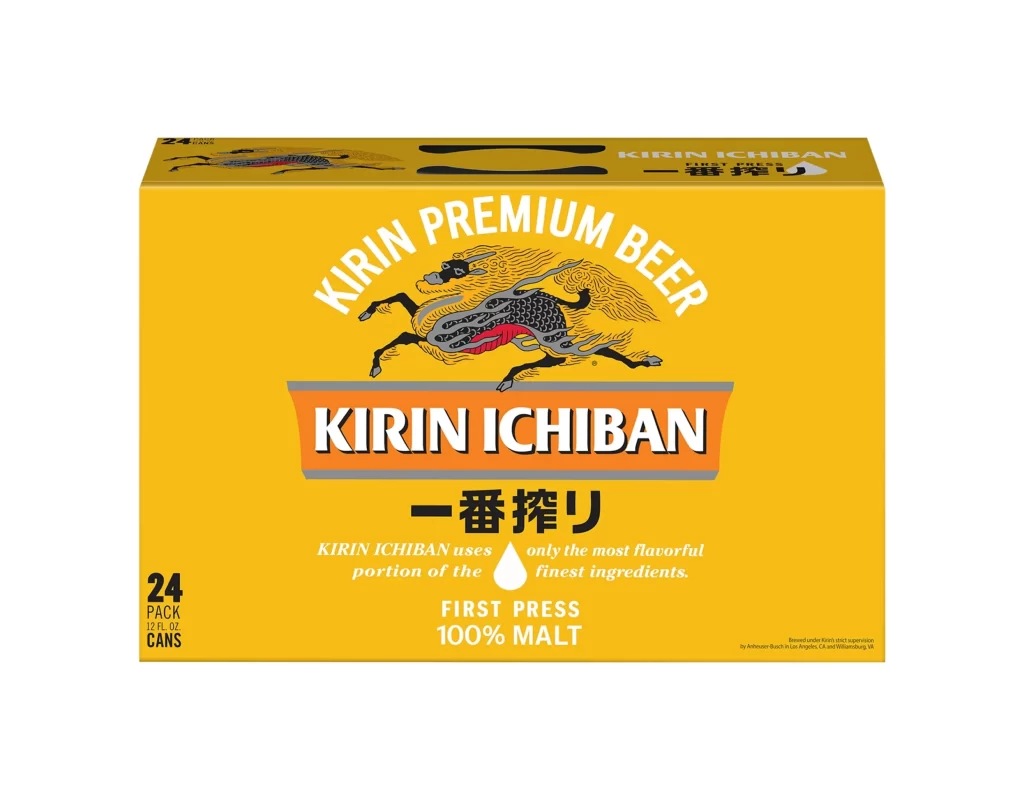
A vibrant golden-yellow cardboard box dominates the frame, presenting a 24-pack of Kirin Ichiban beer cans against a stark white studio background. The front face features a dynamic, stylized kirin creature in black and red with flowing mane details, positioned above the brand name set within an orange and grey horizontal banner. Japanese characters appear prominently below the English text, while the lower left corner specifies the pack size as twenty-four 12 fluid ounce containers.
Visual hierarchy is established through the contrast between the saturated yellow field and the crisp white typography of the 'KIRIN PREMIUM BEER' arc. The central mythological beast serves as a distinctive cultural anchor, rendered with intricate line work that suggests movement and tradition simultaneously. A small white droplet icon cleverly reinforces the 'First Press' brewing method claim without cluttering the composition.
Brand strategists might examine this layout to understand how heritage imagery supports modern beverage marketing in international markets. Packaging engineers could reference the specific placement of regulatory text versus decorative elements when planning similar multi-can carriers. Students of commercial illustration would find value in studying how the mythical figure is integrated with corporate identity systems to create memorable shelf presence.




























![Kirin Beer Packaging ]](https://gropicture-1323946364.cos.na-siliconvalley.myqcloud.com/wp-content/uploads/2026/07/CLG-4443841-0__87553-1024x842.webp)



















