
Kirin Beer Packaging C
Topics
Details
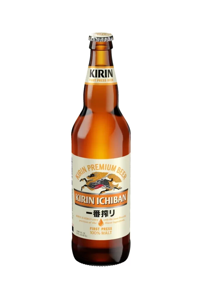
A single amber glass bottle of Kirin Ichiban stands in sharp focus, featuring a traditional long-neck silhouette capped with silver metal that catches the light across its curved shoulder. The cream-colored main label displays the iconic Kirin mythological beast rendered in gold, black, and crimson, positioned directly above bold orange typography spelling out the brand name. Japanese characters reading 一番搾り appear below the English text, with 'FIRST PRESS' and '100% MALT' noted at the label's base against a clean white background.
Visual hierarchy plays a crucial role here, with the neck label establishing brand authority through stark black lettering before the eye travels down to the intricate central artwork. The warm amber hue of the glass creates a luminous backdrop that makes the cream label and metallic accents pop with premium contrast. Such deliberate layering of text—from the English product name to the ‘First Press 100% Malt’ technical details—demonstrates how packaging can balance heritage imagery with modern clarity.
Brand historians analyzing East Asian beverage marketing will find this composition invaluable for studying color psychology in alcohol packaging. 3D artists constructing photorealistic consumer product scenes often seek such clean, isolated views to understand material interactions between glass, paper, and metal. Marketing teams developing premium lager campaigns could examine the spacing and font weights to inform their own label layout strategies.




























![Kirin Beer Packaging ]](https://gropicture-1323946364.cos.na-siliconvalley.myqcloud.com/wp-content/uploads/2026/07/CLG-4443841-0__87553-1024x842.webp)



















