
Kirin Beer Packaging X
Topics
Details
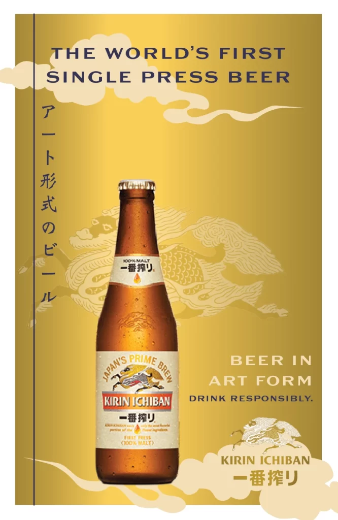
A chilled Kirin Ichiban beer bottle with amber glass and visible condensation stands as the central focal point, its white label displaying 'JAPAN'S PRIME BREW' above the red 'KIRIN ICHIBAN' brand name. Vertical Japanese text reading 'アート形式のビール' runs along the left edge, while bold navy English typography at the top declares 'THE WORLD'S FIRST SINGLE PRESS BEER'. A faint, stylized Kirin creature illustration appears behind the bottle on the radiant golden background.
Visual distinction arises from the fusion of traditional Japanese aesthetics with modern commercial branding, utilizing a monochromatic gold palette that evokes luxury and craftsmanship. The ‘First Press’ brewing method is highlighted through specific labeling details and the unique ‘Art Form’ positioning, which separates this product from standard mass-market lagers. Subtle cloud motifs and the intricate background linework create a sense of heritage and premium quality that extends beyond the liquid itself.
Brand strategists might examine this layout to understand how cultural symbolism can be integrated into global product marketing without losing clarity. Packaging designers could study the balance between the prominent English headlines and the elegant vertical Japanese script to inform bilingual label layouts. Marketing teams looking to elevate a commodity product into a lifestyle item would find the ‘art form’ concept particularly relevant for high-end campaign development.





























![Kirin Beer Packaging ]](https://gropicture-1323946364.cos.na-siliconvalley.myqcloud.com/wp-content/uploads/2026/07/CLG-4443841-0__87553-1024x842.webp)



















