
Kirin Beer Packaging W
Topics
Details
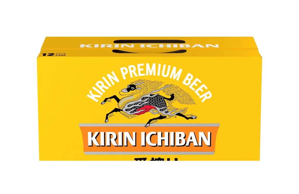
A vibrant, saturated yellow dominates the rectangular cardboard carrier, which is photographed head-on against a seamless white void. Centered on the front face, the iconic Kirin mythical creature gallops in mid-stride, rendered with intricate black linework and silver scales that contrast sharply against the bold background. Above this leaping beast, 'KIRIN PREMIUM BEER' arches in clean white sans-serif capitals, while the brand name 'KIRIN ICHIBAN' anchors the composition below within a horizontal orange banner flanked by grey borders.
Visual impact here derives from the aggressive chromatic contrast between the electric yellow substrate and the detailed monochrome illustration of the Kirin. The packaging leverages traditional Japanese heraldic imagery—specifically the dragon-horse hybrid—to establish immediate premium positioning without relying on photographic realism. Furthermore, the typographic hierarchy creates a clear reading path, guiding the eye from the product category at the top down to the specific brand identifier at the bottom.
Brand strategists analyzing legacy beverage identities would find this composition useful for studying how heritage symbols adapt to modern retail environments. Packaging engineers might examine the structural cutout at the top to understand ergonomic handling solutions for twelve-pack formats. Additionally, color theorists could reference this specific shade of golden yellow when researching appetite-stimulating palettes within the alcoholic beverage sector.





























![Kirin Beer Packaging ]](https://gropicture-1323946364.cos.na-siliconvalley.myqcloud.com/wp-content/uploads/2026/07/CLG-4443841-0__87553-1024x842.webp)



















